Untangling Web Typography

When I was a carpenter, I noticed how homeowners often had this deer-in-the-headlights look when the contractor I worked for would ask them to make tons of decisions, seemingly all at once.
Square or subway tile? Glass or ceramic? Traditional or modern trim details? Flat face or picture frame cabinets? Real wood or laminate flooring? Every day the decisions piled up and were usually made in the context of that room, or that part of that room. Rarely did the homeowner have the benefit of taking that particular decision in full view of the larger context of the project. And architectural plans? Sure, they lay out the broad strokes, but there is still so much to decide.
Typography is similar. Designers try to make sites that are easy to use and understand visually. They labour over the details of line height, font size, line length, and font weights. They consider the relative merits of different typographical scales for applications versus content-driven sites. Frequently, designers consider all of this in the context of one page, feature, or view of an application. They are asked to make a million tiny decisions.
Sometimes designers just bump up the font size until it looks right.
I don’t see anything wrong with that. Instincts are important. Designing in context is easier. It’s OK to leave the big picture until later. Design a bunch of things, and then look for the patterns. You can’t always know everything up front. How does the current feature relate to all the other features on the site? For a large site, just like for a substantial remodel, the number of decisions you would need to internalize to make that knowable would be prohibitively large.
When typography goes awry
I should be honest. I know very little about typography. I struggle to understand vertical rhythm and the math in Tim Ahrens’s talks about the interaction between type design and rendering technology kind of melted my brain. I have an unusual perspective because I’m not the one making the design decisions, but I am the one implementing them and often cleaning up when a project goes off the rails.
I’ve seen projects with thousands of font-size declarations and headings. One project even had over ten thousand margin declarations. So while I appreciate creative exploration, I’m also eager to establish patterns in typography and make sure we aren’t choosing not to choose. Or, choosing all the things.
Analyzing a site’s typography
Most of my projects start out with an evaluation of the client’s existing CSS. I look for duplication in the CSS by using Grep, though functionality is landing soon in CSS Lint to do the same thing automatically. The goal is to find the underlying missing abstractions that, once in place, would allow developers to create new functionality without needing to write additional CSS. In addition to that, my team and I would comb through each site (generally, around ten pages is enough to get the big picture), and take screenshots of each of the components we found.
In this way, we could look for subtle visual differences that were unlikely to add value to the user. By correcting these differences, we could help make the design more consistent, and at the same time the code leaner and more performant. Typography is much like a homeowner who chooses to incorporate too many disparate design elements, pairing a mid-century modern sofa with flowered country cottage curtains. Often the typography of a site ends up collecting an endless array of new typefaces as the site’s overall styles evolve. Designers come and go on a project, and eventually no one can remember how the 16px Verdana got into the codebase.
Automation
We used to do this work by hand. It was incredibly tedious. We’d go through the site, taking screenshots and meticulously documenting the style information we found. We didn’t have to do that many times before it became incredibly clear that the task needed to be automated. So we built a little tool called the Type-o-matic that could do it for us.
To try it on your site:
- Download and install the Firebug extension to Firefox
- Download and install the Type-o-matic extension to Firebug (I know, I fully intend to port it to Chrome)
- Now, visit the site you’d like to test
- Right click and choose Inspect element with Firebug
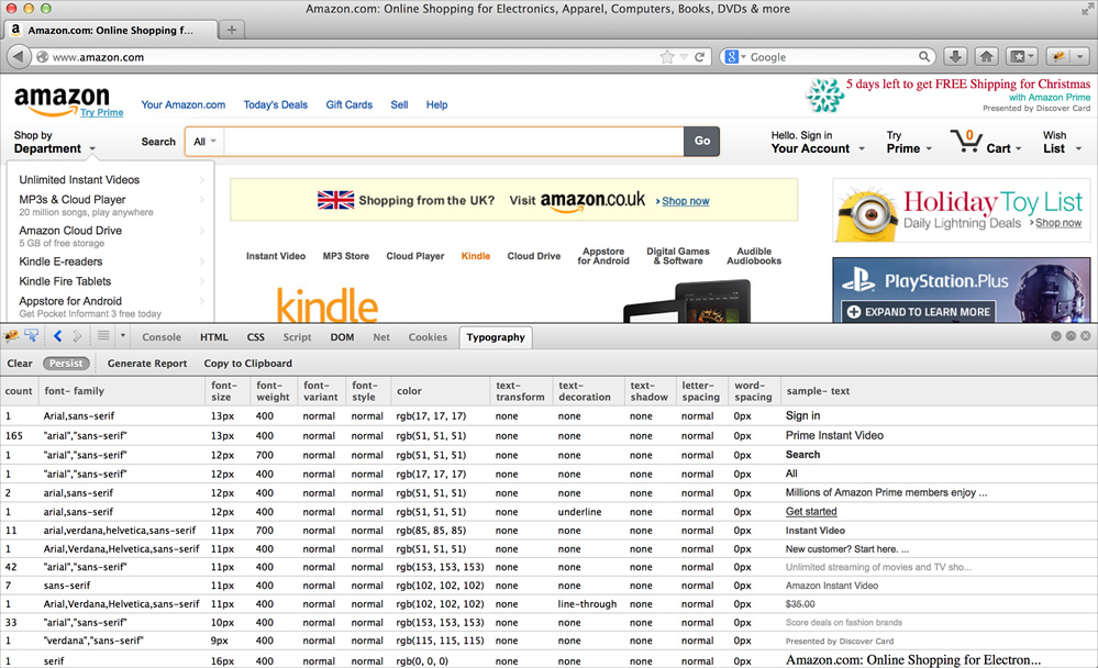
- Now click on the Typography tab
- Click Persist
- Click Generate Report
- Choose which pages to analyze (we’ve found that ten is a good number to get the big picture, but you can analyze as many as you’d like — it will even work on just one page!)
- Now navigate to other pages, and on each subsequent page, click Generate Report
- The table of results can be a bit difficult to interact with, so you can always click Copy to clipboard, and copy the results (JSON).
What does this data mean?
When you’ve analyzed as many pages or different views as you’d like, you’ll start to see some interesting patterns emerge in the data. In the right-hand column, you’ll see examples of how each kind of typography we found has been used in a real context on your site. It is organized by color and then by size so you can easily see how you are using typography.
The next thing you’ll want to take a look at is in the first column, called “Count”. We’ve counted how many times you’ve used each combination of typographical styles. This can be incredibly helpful when deciding which styles were intentional, versus one-off color pick errors or experiments that never got removed from the code base. If you’ve used one color blue 1,400 times, and another just 23, it’s pretty obvious which is more in line with broader site-wide styles.
Consistency before perfection
It can be really tempting to try to make everything perfect — to try to make every decision final. When you use the data you can collect from this tool, I’d recommend trying to get to consistent before you try to make things perfect. Stop using fifteen different shades of blue type first, and then if you want to change to a new blue, go for it! You’ll be able to make design changes much more easily once you’ve reduced the total number of typographical styles you rely on.
Lower the importance of the decisions you are making. Our sites, like ourselves, are always a work in progress. Or, as a carpenter I used to work with said, “You’re not building a fucking piano.” We’re not building houses. We can choose one typeface today and a different one tomorrow. It is OK to experiment. Be brave.
About the author
Nicole is a UI performance nerd living and working in San Francisco. She helps companies make their CSS smaller and their UI more manageable. She is also an author, most recently contributing to the Web Performance Daybook Volume 2.
Brought to you by
Related articles
-
An Introduction to Variable Fonts
Jason Pamental forges a path through the freshly laid snowy landscape of variable fonts. Like a brave explorer in a strange new typography topology let Jason show you the route to some fantastic font feats. Everything you thought you knew has changed.
-
Interactivity and Animation with Variable Fonts
Mandy Michael turns the corner on our variable font adventure and stumbles into a grotto of wonder and amazement. Not forgetting the need for a proper performance budget, Mandy shows how variable fonts can free your creativity from bygone technical constraints.
-
Managing Flow and Rhythm with CSS Custom Properties
Andy Bell rings out a call for a more flexible method of achieving consistent vertical rhythm across components within a page. Using a technique of CSS custom properties to establish spacing inherited through the cascade, you can make sure your choir are all singing from the same song sheet.
-
Get the Balance Right: Responsive Display Text
Richard Rutter shepherds a tea towel onto our collective heads and describes a technique for responsively scaling display text to maintain a consistent feel in both landscape and portrait screen orientations. That should put things back into proportion.
-
Run Ragged
Mark Boulton completes our calendar with some typographic techniques to improve the reading experience. Typography, like Christmas and advent calendars, relies on the accumulation of small gains for its best effects.
-
Get Expressive with Your Typography
Richard Rutter adapts an extract from his forthcoming book on web typography and encourages us to be brave with type choices. By allowing type to express a website’s intentions from even before the moment a visitor starts to read, we can help set the tone and our users’ expectations.