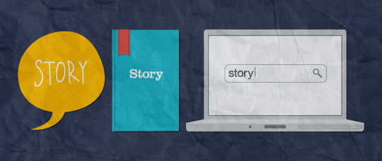
Design the Invisible to Tell Better Stories on the Web

For design to be meaningful we need to tell stories. We need to design the invisible, the cues, the messages and the extra detail hidden beneath the aesthetics. It’s all about the story.
From verbal exchanges around the campfire to books, the web and everything in between, storytelling allows us to share, organize and process information more efficiently. It helps us understand our surroundings and make emotional connections to people, places and experiences.
Web design lends itself perfectly to the conventions of storytelling, a universal process. However, the stories vary because they’re defined by culture, society, politics and religion. All of which need considering if you are to design stories that are relevant to your target audience.
The benefits of approaching design with storytelling in mind from the very start of the project is that we are creating considered design that allows users to quickly gather meaning from the website. They do this by reading between the lines and drawing on the wealth of knowledge they have acquired about the associations between colours, typyefaces and signs.
With so much recognition and analysis happening subconsciously you have to consider how design communicates on this level. This invisible layer has a significant impact on what you say, how you say it and who you say it to.
How can we design something that’s invisible?
By researching and making conscious decisions about exactly what you are communicating, you can make the invisible visible. As is often quoted, good design is like air, you only notice it when it’s bad. So by designing the invisible the aim is to design stories that the audience receive subliminally, so that they go somewhat unnoticed, like good air.
Storytelling strands
To share these stories through design, you can break it down into several strands. Each strand tells a story on its own, but when combined they may start to tell a different story altogether. These strands are colour, typefaces, branding, tone of voice and symbols. All are literal and visible but the invisible element is the meaning behind them – meaning that you can extract and share. In this article I want to focus on colour, typefaces and tone of voice and on how combining story strands can change the meaning.
Colour
Let’s start with colour. Red represents emotions such as love but can also signify war. Green is commonly used for all things environmental and purple is a colour that connotes wealth and royalty. These associations between colour and emotion or value have been learned over time and are continually reinforced through media and culture.
With this knowledge come expectations from your users. For example, they will expect Valentine’s Day sites to be red and kids’ sites to be bright and colourful. This is true in the same way audiences have expectations of certain genres of film or music. These conventions help savvy audiences decode texts and read between the lines or, rather, to draw meaning from the invisible. It’s practically an innate skill. This is why you need to design the invisible: because users will quickly deduce meaning from your site and fill in the story’s gaps, it’s important to give them as much of that story to begin with. A story relevant to their culture.
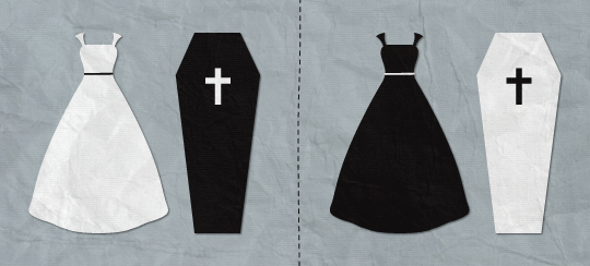
Of all the ways you can tell stories through web design, colour is the most fascinating and important. Not only does it evoke emotions in users but its meaning varies significantly between cultures. In the west, for example, white is a colour associated with weddings, and black is the colour of mourning. This is signified by the traditions of brides wearing white and those in mourning wearing black. In other cultures the meanings are reversed, as black is a colour that represents good luck and white is a colour that signifies mourning. If you assume the same values are true in all cultures then you risk offending the very people you are targeting.
When colours combine, the story being told can change. If you design using red, white and blue then it’s going to be difficult to shake off patriotic connotations because this colour combination is so ingrained as being American or British or French thanks largely to their flags. This extends to politics too. Each party has its own representative colour. In the UK, the Conservatives are blue and Labour is red so it would be inappropriate storytelling to design a Labour-related website in blue as there would be a conflict between the content and the design, a conflict that would result in a poor user experience.
Conflicts become more of an issue when you start to combine story strands. I once saw a No VAT advert use the symbol on the left:
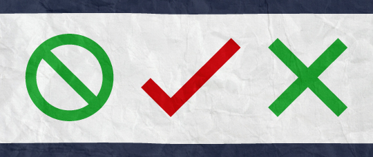
There’s a complete conflict in storytelling here between the sign and its colour. The prohibition sign was used over the word VAT to mean no VAT; that makes sense. But this is a symbol that is used to communicate to people that something is being prohibited or prevented, it mustn’t continue. So to use green contradicts the message of the sign itself; green is used as a colour to say yes, go, proceed, enter. The same would be true if we had a tick in red and a cross in green. Bad design here means the story is flawed and the user experience is compromised.
Typefaces
Typefaces also tell stories. They are so much more than the words that are written with them because they connote different values. Here are a few:
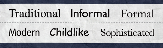
Serif fonts are more formal and are associated with tradition, sophistication and high-end values. Sans serif fonts, on the other hand, are synonymous with modernity, informality and friendliness. These perceptions are again reinforced through more traditional media such as newspaper mastheads, where the serious news-focused broadsheets have serif titles, and the showbiz and gossip-led tabloids have sans serif titles. This translates to the web as well. With these associations already familiar to users, they may see copy and focus on the words, but if the way that copy is displayed jars with the context then we are back to having conflicting stories like the No VAT sign earlier.
Let’s take official institutions, for example. The White House, the monarchy, 10 Downing Street and other government departments are formal, traditional and important organisations. If the copy on their websites were written in a typeface like Cooper Black, it would erase any authority and respect that they were due. They need people to take them seriously and trust them, and part of the way to do this is to have a typeface that represents those values.
It works both ways though. If Innocent, Threadless or other fun companies used traditional typefaces, they wouldn’t be accurate reflections of their core values, brand and personality. They are better positioned to use friendly, informal and modern typefaces. But still never Comic Sans.
Tone of voice
Closely tied to this is tone of voice, my absolute bugbear on the web. Tone of voice isn’t what is said but, rather, how it is said. When we interact with others in person we don’t just listen to the words they say, but we also draw meaning from their body language, and pitch and tone of voice. Just because the web removes that face-to-face interaction with your audience it doesn’t mean you can’t have a tone of voice.
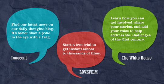
Innocent pioneered the informal chatty tone of voice that so many others have since emulated, but unless it is representative of your company, then it’s not appropriate. It works for Innocent because the tone of voice is consistent across all the company’s materials, both online and offline. Ben and Jerry’s takes the same approach, as does Threadless, but maybe you need a more formal or corporate tone of voice. It really depends on what your business or service is and who it is for, and that is why I think LoveFilm has it all wrong.
LoveFilm offers a film and game rental service, something fun for people in their downtime. While they aren’t particularly stuffy, neither is their tone of voice very friendly or informal, which is what I would expect from a service like theirs. The reason they have it wrong is in the language they use and the way their sentences are constructed.
This is the first time we’ve discussed language because, on the whole, designing the invisible isn’t concerned with language at all. But that doesn’t mean that these strands can’t still elicit an emotional response in users. Jon Tan quoted Dr Mazviita Chirimuuta in his New Adventures in Web Design talk in January 2011:
Although there is no absolute separation between language and emotion, there will still be countless instances where you have emotional response without verbal input or linguistic cognition. In general language is not necessary for emotion.
This is even more pertinent when the emotions evoked are connected to people’s culture, surroundings and way of life. It makes design personal, something that audiences can connect with at more than just face value but, rather, on a subliminal or, indeed, invisible level.
It also means that when you are asked the inevitable question of why – why is blue the dominant colour? why have you used that typeface? why don’t we sound like Innocent? – you will have a rationale behind each design decision that can explain what story you are telling, how you discovered the story and how it is targeted at the core audience.
Research
This is where research plays a vital role in the project cycle. If you don’t know and understand your audience then you don’t know what story to design. Every project lends itself to some level of research, but how in-depth and what methods are most appropriate will be dictated by project requirements and budget restrictions – but do your research.
Even if you think you know your audience, it doesn’t hurt to research and reaffirm that because cultures and society do change, albeit slowly, but they can change. So ask questions at the start of the project during the research phase:
- What do different colours mean for your audience’s culture?
- Do the typeface and tone of voice appeal to the demographic?
- Does the brand identity represent the values and personality of your service?
- Are there any social, political or religious significances associated with your audience that you need to take into consideration so you don’t offend them?
Ask questions, understand your audience, design your story based on these insights, and create better user experiences in context that have good, solid storytelling at their heart.
Major hat tip to Gareth Strange for the beautiful graphics used within this article.
About the author
Robert Mills is Studio Manager at Bluegg and author of Designing the Invisible from Five Simple Steps. As a journalism graduate and former BBC Audience Researcher he likes words and data but mainly words.
In the day job Rob shares design decisions with clients and explains the rationale behind them. Aside from the general tasks needed to keep a studio ticking over he’s also chief proof reader and content ambassador for internal work and client work.
You might also spot him in .Net Magazine as part of their big question panel, opinion piece writer or awards judge. You can also find him on Twitter. He will write for coffee or Monster Munch but never for raisins or yoghurts with bits in.
Brought to you by
Related articles
-
Art Direction and the New WordPress Editor
Mel Choyce explores how the new WordPress editor (also know as Gutenberg) can be used to create more carefully art directed posts. Like gifts carefully arranged beneath the Christmas tree, it’s the contents that matters but the presentation that sells.
-
Be the Villain
Eric Bailey asks us to take on the role of King Herod in our projects to consider how the products, services and processes we design could be abused to cause harm rather than to do good. No matter how good our intentions, we must remember that not every user has pure motivations and that every tool is a weapon if you hold it right.
-
Creating a Weekly Research Cadence
Wren Lanier sets aside time to explore the benefits of a regular schedule for user research. Santa’s elves quickly discovered the benefits of working to a fixed schedule, which is of course why we don’t get presents at Easter.
-
How to Do a UX Review
Joe Leech offers a rundown on his UX review process, sharing tips about analysing data and creating personas, and setting out findings in a form that benefits clients. From quick wins to workshops, there are gifts here everyone will be grateful for.
-
How to Use Audio on the Web
Ruth John lets the bells ring out for Christmas with a look at a selection of inspiring sites with creative and effective use of audio. The days of jangly MIDI tunes to distract and annoy are thankfully long behind us, with browser APIs offering new and exciting ways to generate sound. Ahead is a beautiful sonic landscape. Ding dong!
-
What I Learned about Product Design This Year
Meagan Fisher casts a thoughtful glance back over her work this year and considers what it means to design a product rather than a marketing experience. Pour yourself a cup of eggnog, grab a mince pie or two and gather around the fireside. Are you sitting comfortably? Good, then we shall begin.