Golden Spirals

As building blocks go, the rectangle is not one to overwhelm the designer with decisions. On the face of it, you have two options: you can set the width, and the height. But despite this apparent simplicity, there are combinations of width and height that can look unbalanced. If a rectangle is too tall and slim, it might appear precarious. If it is not tall enough, it may simply look flat. But like a guitar string that’s out of tune, you can tweak the proportions little by little until a rectangle feels, as Goldilocks said, just right.
A golden rectangle has its height and width in the golden ratio, which is approximately 1:1.618. These proportions have long been recognised as being aesthetically harmonious. Whether through instruction or by intuition, artists have understood how to exploit these proportions over the centuries. Examples can be found in classical architecture, medieval book construction, and even in the recent #newtwitter redesign.
A mathematical curiosity
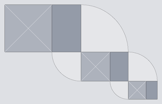
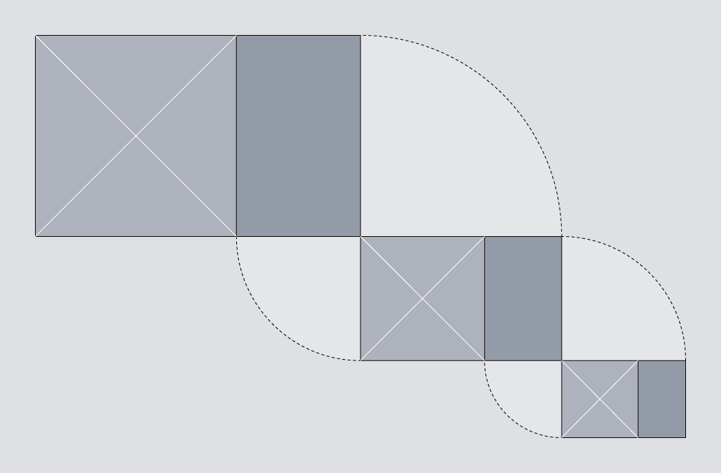
The golden rectangle is unique, in that if you remove a square section from it, what is left behind is itself a golden rectangle. The removal of a square can be repeated on the rectangle that is left behind, and then repeated again, as many times as you like. This means that the golden rectangle can be treated as a building block for recursive patterns. In this article, we will exploit this property to build a golden spiral, using only HTML and CSS.
The markup
The HTML we’ll use for this study is simply a series of nested <div>s.
<body>
	<div id="container">
		<div class="cycle">
			<div>
				<div>
					<div>
						<div class="cycle">
							<div>
								<div>
									<div>
										<div class="cycle">
											<div>
												<div>
													<div>
														<div class="cycle"></div>
													</div>
												</div>
											</div>
										</div>
									</div>
								</div>
							</div>
						</div>
					</div>
				</div>
			</div>
		</div>
	</div>
</body>
The first of these has the class cycle, and so does every fourth ancestor thereafter. The spiral completes a cycle every four steps, so this class allows styles to be reused on <div>s that appear at the same position in each cycle.
Golden proportions
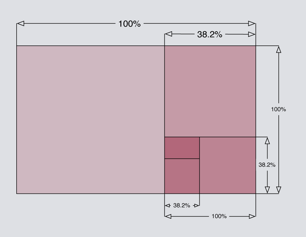
To create our spiral we are going to exploit the unique properties of the golden rectangle, so our first priority is to ensure that we have a golden rectangle to begin with. If we pick a length for the short edge – say, 288 pixels – we can then calculate the length of the long edge by multiplying this value by 1.618. In this case, 288 × 1.618 = 466, so our starting point will be a <div> with these properties:
#container > div {
  width: 466px;
  height: 288px;
}
The greater than symbol is used here to single out the immediate child of the #container element, without affecting the grandchild or any of the more distant descendants.
We could go on to specify the precise pixel dimensions of every child element, but that means doing a lot of sums. It would be much easier if we just specified the dimensions for each element as a percentage of the width and height of its parent. This also has the advantage that if you change the size of the outermost container, all nested elements would be resized automatically – something that we shall exploit later.
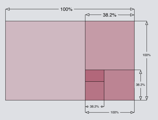
The approximate value of 38.2% can be derived from (100 × 1 − phi) ÷ phi, where the Greek letter phi (ϕ) stands for the golden ratio. The value of phi can be expressed as phi = (1 + √5 ) ÷ 2, which is approximately 1.618. You don’t have to understand the derivation to use it. Just remember that if you start with a golden rectangle, you can slice 38.2% from it to create a new golden rectangle.
This can be expressed in CSS quite simply:
.cycle,
.cycle > div > div {
  height: 38.2%;
  width: 100%;
}
.cycle > div,
.cycle > div > div > div {
  width: 38.2%;
  height: 100%;
}
You can see the result so far by visiting Demo One. With no borders or shading, there is nothing to see yet, so let’s address that next.
Shading with transparency
We’ll need to apply some shading to distinguish each segment of the spiral from its neighbours. We could start with a white background, then progress through shades of grey: #eee, #ddd, #ccc and so on, but this means hard-coding the background-color for every element. A more elegant solution would be to use the same colour for every element, but to make each one slightly transparent.
The nested <div>s that we are working with could be compared to layers in Photoshop. By applying a semi-transparent shade of grey, each successive layer can build on top of the darker layers beneath it. The effect accumulates, causing each successive layer to appear slightly darker than the last. In his 2009 article for 24 ways, Drew McLellan showed how to create a semi-transparent effect by working with RGBA colour. Here, we’ll use the colour black with an alpha value of 0.07.
#container div { background-color: rgba(0,0,0,0.07) }Note that I haven’t used the immediate child selector here, which means that this rule will apply to all <div> elements inside the #container, no matter how deeply nested they are. You can view the result in Demo Two. As you can see, the golden rectangles alternate between landscape and portrait orientation.
Demo Three).
CSS3 specification indicates that a percentage can be used to set the
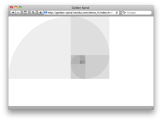
border-radius property, but using percentages does not achieve consistent results in browsers today. Luckily, if you specify a border-radius in pixels using a value that is greater than the width and height of the element, then the resulting curve will use the shorter length side as its radius. This produces exactly the effect that we want, so we’ll use an arbitrarily high value of 10,000 pixels for each border-radius:
.cycle {
  border-radius: 0px;
  border-bottom-left-radius: 10000px;
}
.cycle > div {
  border-radius: 0px;
  border-bottom-right-radius: 10000px;
}
.cycle > div > div {
  border-radius: 0px;
  border-top-right-radius: 10000px;
}
.cycle > div > div > div {
  border-radius: 0px;
  border-top-left-radius: 10000px;
}
Note that the specification for the border-radius property is still in flux, so it is advisable to use vendor-specific prefixes. I have omitted them from the example above for the sake of clarity, but if you view source on Demo Four then you’ll see that the actual styles are not quite as brief.
Filling the available space
We have created an approximation of the Golden Spiral using only HTML and CSS. Neat! It’s a shame that it occupies just a fraction of the available space. As a finishing touch, let’s make the golden spiral expand or contract to use the full space available to it.
Ideally, the outermost container should use the full available width or height that could accomodate a rectangle of golden proportions. This behaviour is available for background images using the “ background-size: contain; property, but I know of no way to make block level HTML elements behave in this fashion (if I’m missing something, please enlighten me). Where CSS fails to deliver, JavaScript can usually provide a workaround. This snippet requires jQuery:
$(document).ready(function() {
	var phi = (1 + Math.sqrt(5))/2;
$(window).resize(function() { var goldenWidth = windowWidth = $(this).width(), goldenHeight = windowHeight = $(this).height();
if (windowWidth/windowHeight > phi) { // panoramic viewport – use full height goldenWidth = windowHeight * phi; } else { // portrait viewport – use full width goldenHeight = windowWidth / phi; };
$("#container > div.cycle") .width(goldenWidth) .height(goldenHeight);
}).resize();
});
You can view the result by visiting Demo Five.
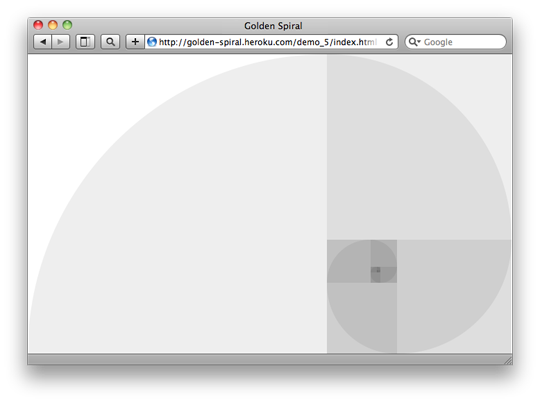
Is it just me, or can you see an elephant in there?
You can probably think of many ways to enhance this further, but for this study we’ll leave it there. It has been a good excuse to play with proportions, positioning and the immediate child selector, as well as new CSS3 features such as border-radius and RGBA colours. If you are not already designing with golden proportions, then perhaps this will inspire you to begin.
About the author
Drew Neil is an independent web developer and screencast producer. As well as loving all things web, he is totally nerdy about his text editor. He runs the Vimcasts podcast, where he publishes free instructional videos about Vim, and he is currently writing a title for the Pragmatic Programmers, Practical Vim, which will be published in 2011. He says that “Vim’s documentation reads like a dictionary; I propose to write a phrasebook.”
Drew calls Edinburgh home, but is currently working abroad. He enjoys speaking in public, and would love to talk at your local conference, user group or ignite session if you’ll have him. You can follow him on his travels on Twitter under his moniker @nelstrom. If you share in his fascination for collective nouns, then you should check out his collection at All-Sorts.org.
Brought to you by
Related articles
-
Art Direction and the New WordPress Editor
Mel Choyce explores how the new WordPress editor (also know as Gutenberg) can be used to create more carefully art directed posts. Like gifts carefully arranged beneath the Christmas tree, it’s the contents that matters but the presentation that sells.
-
Be the Villain
Eric Bailey asks us to take on the role of King Herod in our projects to consider how the products, services and processes we design could be abused to cause harm rather than to do good. No matter how good our intentions, we must remember that not every user has pure motivations and that every tool is a weapon if you hold it right.
-
Creating a Weekly Research Cadence
Wren Lanier sets aside time to explore the benefits of a regular schedule for user research. Santa’s elves quickly discovered the benefits of working to a fixed schedule, which is of course why we don’t get presents at Easter.
-
How to Do a UX Review
Joe Leech offers a rundown on his UX review process, sharing tips about analysing data and creating personas, and setting out findings in a form that benefits clients. From quick wins to workshops, there are gifts here everyone will be grateful for.
-
How to Use Audio on the Web
Ruth John lets the bells ring out for Christmas with a look at a selection of inspiring sites with creative and effective use of audio. The days of jangly MIDI tunes to distract and annoy are thankfully long behind us, with browser APIs offering new and exciting ways to generate sound. Ahead is a beautiful sonic landscape. Ding dong!
-
What I Learned about Product Design This Year
Meagan Fisher casts a thoughtful glance back over her work this year and considers what it means to design a product rather than a marketing experience. Pour yourself a cup of eggnog, grab a mince pie or two and gather around the fireside. Are you sitting comfortably? Good, then we shall begin.


