Everything You Wanted To Know About Gradients (And a Few Things You Didn’t)

Hello. I am here to discuss CSS3 gradients. Because, let’s face it, what the web really needed was more gradients.
Still, despite their widespread use (or is it overuse?), the smartly applied gradient can be a valuable contributor to a designer’s vocabulary. There’s always been a tension between the inherently two-dimensional nature of our medium, and our desire for more intensity, more depth in our designs. And a gradient can evoke so much: the splay of light across your desk, the slow decrease in volume toward the end of your favorite song, the sunset after a long day. When properly applied, graded colors bring a much needed softness to our work.
Of course, that whole ‘proper application’ thing is the tricky bit.
But given their place in our toolkit and their prominence online, it really is heartening to see we can create gradients directly with CSS. They’re part of the draft images module, and implemented in two of the major rendering engines.
Still, I’ve always found CSS gradients to be one of the more confusing aspects of CSS3. So if you’ll indulge me, let’s take a quick look at how to create CSS gradients—hopefully we can make them seem a bit more accessible, and bring a bit more art into the browser.
Gradient theory 101 (I hope that’s not really a thing)
Right. So before we dive into the code, let’s cover a few basics. Every gradient, no matter how complex, shares a few common characteristics. Here’s a straightforward one:
 I spent
 seconds hours designing this gradient. I hope you like it.
At either end of our image, we have a final color value, or color stop: on the left, our stop is white; on the right, black. And more color-rich gradients are no different:
 (Don’t ever really do this. Please. I beg you.)
It’s visually more intricate, sure. But at the heart of it, we have just seven color stops (red, orange, yellow, and so on), making for a fantastic gradient all the way.
Now, color stops alone do not a gradient make. Between each is a transition point, the fail-over point between the two stops. Now, the transition point doesn’t need to fall exactly between stops: it can be brought closer to one stop or the other, influencing the overall shape of the gradient.
A tale of two syntaxes
Armed with our new vocabulary, let’s look at a CSS gradient in the wild. Behold, the simple input button:
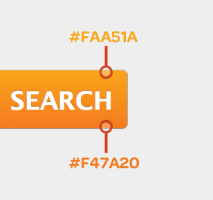
There’s a simple linear gradient applied vertically across the button, moving from a bright sunflowerish hue (#FAA51A, for you hex nuts in the audience) to a much richer orange (#F47A20). And here’s the CSS that makes it happen:
input[type=submit] {
	background-color: #F47A20;
	background-image: -moz-linear-gradient(
		#FAA51A,
		#F47A20
		);
	background-image: -webkit-gradient(linear, 0 0, 0 100%,
		color-stop(0, #FAA51A),
		color-stop(1, #F47A20)
		);
}
I’ve borrowed David DeSandro’s most excellent formatting suggestions for gradients to make this snippet a bit more legible but, still, the code above might have turned your stomach a bit. And that’s perfectly understandable—heck, it sort of turned mine. But let’s step through the CSS slowly, and see if we can’t make it a little less terrifying.
Verbose WebKit is verbose
Here’s the syntax for our little gradient on WebKit:
background-image: -webkit-gradient(linear, 0 0, 0 100%,
	color-stop(0, #FAA51A),
	color-stop(1, #F47A20)
	);
Woof. Quite a mouthful, no? Well, here’s what we’re looking at:
- WebKit has a single
-webkit-gradientproperty, which can be used to create eitherlinearorradialgradients. - The next two values are the starting and ending positions for our gradient (
0 0and0 100%, respectively). Linear gradients are simply drawn along the path between those two points, which allows us to change the direction of our gradient simply by altering its start and end points. - Afterward, we specify our color stops with the oh-so-aptly named
color-stopparameter, which takes the stop’s position on the gradient (0 being the beginning, and100%or1being the end) and the color itself.
For a simple two-color gradient like this, -webkit-gradient has a bit of shorthand notation to offer us:
background-image: -webkit-gradient(linear, 0 0, 0 100%,
	from(#FAA51A),
	to(#FAA51A)
	);
from(#FAA51A) is equivalent to writing color-stop(0, #FAA51A), and to(#FAA51A) is the same as color-stop(1, #FAA51A) or color-stop(100%, #FAA51A)—in both cases, we’re simply declaring the first and last color stops in our gradient.
Terse Gecko is terse
WebKit proposed its syntax back in 2008, heavily inspired by the way gradients are drawn in the canvas specification. However, a different, leaner syntax came to the fore, eventually appearing in a draft module specification in CSS3.
Naturally, because nothing on the web was meant to be easy, this is the one that Mozilla has implemented.
Here’s how we get gradient-y in Gecko:
background-image: -moz-linear-gradient(
	#FAA51A,
	#F47A20
	);
Wait, what? Done already? That’s right. By default, -moz-linear-gradient assumes you’re trying to create a vertical gradient, starting from the top of your element and moving to the bottom. And, if that’s the case, then you simply need to specify your color stops, delimited with a few commas.
I know: that was almost… painless. But the W3C/Mozilla syntax also affords us a fair amount of flexibility and control, by introducing features as we need them.
We can specify an origin point for our gradient:
background-image: -moz-linear-gradient(50% 100%,
	#FAA51A,
	#F47A20
	);
As well as an angle, to give it a direction:
background-image: -moz-linear-gradient(50% 100%, 45deg,
	#FAA51A,
	#F47A20
	);
And we can specify multiple stops, simply by adding to our comma-delimited list:
background-image: -moz-linear-gradient(50% 100%, 45deg,
	#FAA51A,
	#FCC,
	#F47A20
	);
By adding a percentage after a given color value, we can determine its position along the gradient path:
background-image: -moz-linear-gradient(50% 100%, 45deg,
	#FAA51A,
	#FCC 20%,
	#F47A20
	);
So that’s some of the flexibility implicit in the W3C/Mozilla-style syntax.
Now, I should note that both syntaxes have their respective fans. I will say that the W3C/Mozilla-style syntax makes much more sense to me, and lines up with how I think about creating gradients. But I can totally understand why some might prefer WebKit’s more verbose approach to the, well, looseness behind the -moz syntax. À chacun son gradient syntax.
Still, as the language gets refined by the W3C, I really hope some consensus is reached by the browser vendors. And with Opera signaling that it will support the W3C syntax, I suppose it falls on WebKit to do the same.
Reusing color stops for fun and profit
But CSS gradients aren’t all simple colors and shapes and whatnot: by getting inventive with individual color stops, you can create some really complex, compelling effects.
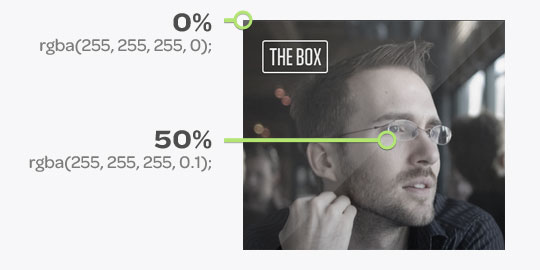
Tim Van Damme, whose brain, I believe, should be posthumously donated to science, has a particularly clever application of gradients on The Box, a site dedicated to his occasional podcast series. Now, there are a fair number of gradients applied throughout the UI, but it’s the feature image that really catches the eye.
You see, there’s nothing that says you can’t reuse color stops. And Tim’s exploited that perfectly.
He’s created a linear gradient, angled at forty-five degrees from the top left corner of the photo, starting with a fully transparent white (rgba(255, 255, 255, 0)). At the halfway mark, he’s established another color stop at an only slightly more opaque white (rgba(255, 255, 255, 0.1)), making for that incredibly gradual brightening toward the middle of the photo.
But then he has set another color stop immediately on top of it, bringing it back down to rgba(255, 255, 255, 0) again. This creates that fantastically hard edge that diagonally bisects the photo, giving the image that subtle gloss.
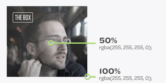
And his final color stop ends at the same fully transparent white, completing the effect. Hot? I do believe so.
Rocking the radials
We’ve been looking at linear gradients pretty exclusively. But I’d be remiss if I didn’t at least mention radial gradients as a viable option, including a modest one as a link accent on a navigation bar:

And here’s the relevant CSS:
background: -moz-radial-gradient(50% 100%, farthest-side,
	rgb(204, 255, 255) 1%,
	rgb(85, 85, 85) 15%,
	rgba(85, 85, 85, 0)
	);
background: -webkit-gradient(radial, 50% 100%, 0, 50% 100%, 15,
	from(rgb(204, 255, 255)),
	to(rgba(85, 85, 85, 0))
	);
Now, the syntax builds on what we’ve already learned about linear gradients, so much of it might be familiar to you, picking out color stops and transition points, as well as the two syntaxes’ reliance on either a separate property (-moz-radial-gradient) or parameter (-webkit-gradient(radial, …)) to shift into circular mode.
Mozilla introduces another stand-alone property (-moz-radial-gradient), and accepts a starting point (50% 100%) from which the circle radiates. There’s also a size constant defined (farthest-side), which determines the reach and shape of our gradient.
WebKit is again the more verbose of the two syntaxes, requiring both starting and ending points (50% 100% in both cases). Each also accepts a radius in pixels, allowing you to control the skew and breadth of the circle.
Again, this is a fairly modest little radial gradient. Time and article length (and, let’s be honest, your author’s completely inadequate grasp of geometry) prevent me from covering radial gradients in much more detail, because they are incredibly powerful. For those interested in learning more, I can’t recommend the references at Mozilla and Apple strongly enough.
Leave no browser behind
But no matter the kind of gradients you’re working with, there is a large swathe of browsers that simply don’t support gradients. Thankfully, it’s fairly easy to declare a sensible fallback—it just depends on the kind of fallback you’d like. Essentially, gradient-blind browsers will disregard any properties containing references to either -moz-linear-gradient, -moz-radial-gradient, or -webkit-gradient, so you simply need to keep your fallback isolated from those properties.
For example: if you’d like to fall back to a flat color, simply declare a separate background-color:
.nav {
	background-color: #000;
	background-image: -moz-linear-gradient(rgba(0, 0, 0, 0), rgba(255, 255, 255, 0.45));
	background-image: -webkit-gradient(linear, 0 0, 0 100%, from(rgba(0, 0, 0, 0)), to(rgba(255, 255, 255, 0.45)));
}
Or perhaps just create three separate background properties.
.nav {
	background: #000;
	background: #000 -moz-linear-gradient(rgba(0, 0, 0, 0), rgba(255, 255, 255, 0.45));
	background: #000 -webkit-gradient(linear, 0 0, 0 100%, from(rgba(0, 0, 0, 0)), to(rgba(255, 255, 255, 0.45)));
}
We can even build on this to fall back to a non-gradient image:
.nav {
	background: #000 <strong>url("faux-gradient-lol.png") repeat-x</strong>;
	background: #000 -moz-linear-gradient(rgba(0, 0, 0, 0), rgba(255, 255, 255, 0.45));
	background: #000 -webkit-gradient(linear, 0 0, 0 100%, from(rgba(0, 0, 0, 0)), to(rgba(255, 255, 255, 0.45)));
}
No matter the approach you feel most appropriate to your design, it’s really just a matter of keeping your fallback design quarantined from its CSS3-ified siblings.
(If you’re feeling especially masochistic, there’s even a way to get simple linear gradients working in IE via Microsoft’s proprietary filters. Of course, those come with considerable performance penalties that even Microsoft is quick to point out, so I’d recommend avoiding those.
And don’t tell Andy Clarke I told you, or he’ll probably unload his Derringer at me. Or something.)
Go forth and, um, gradientify!
It’s entirely possible your head’s spinning. Heck, mine is, but that might be the effects of the ’nog. But maybe you’re wondering why you should care about CSS gradients. After all, images are here right now, and work just fine.
Well, there are some quick benefits that spring to mind: fewer HTTP requests are needed; CSS3 gradients are easily made scalable, making them ideal for variable widths and heights; and finally, they’re easily modifiable by tweaking a few CSS properties. Because, let’s face it, less time spent yelling at Photoshop is a very, very good thing.
Of course, CSS-generated gradients are not without their drawbacks. The syntax can be confusing, and it’s still under development at the W3C. As we’ve seen, browser support is still very much in flux. And it’s possible that gradients themselves have some real performance drawbacks—so test thoroughly, and gradient carefully.
But still, as syntaxes converge, and support improves, I think generated gradients can make a compelling tool in our collective belts. The tasteful design is, of course, entirely up to you.
So have fun, and get gradientin’.
About the author
Ethan Marcotte is an independent designer and developer, and the fellow who coined the term “responsive web design”. He is the author of two books on the topic, Responsive Web Design and Responsive Design: Patterns and Principles, and has been known to give a conference talk or two. Ethan is passionate about digital design, emerging markets, and ensuring global access, and has been known to link to the odd GIF now and again.
Brought to you by
Related articles
-
A History of CSS Through Fifteen Years of 24 ways
Rachel Andrew guides us through a tour of the last fifteen years in CSS layout, as manifested in articles here on 24 ways. From the days when Internet Explorer 6 was de rigueur, right up to the modern age of evergreen browsers, the only thing you can be sure of is that the web never stands still for long.
-
A Modern Typographic Scale
Rob Weychert reaches for the top notes to sing us a song of typographic scale. A little attention to scale and to the mathematics will help you to hit a high note with your designs this Christmas and beyond.
-
Beautiful Scrolling Experiences – Without Libraries
Michelle Barker appears as one of a heavenly host, coming forth with scroll in hand to pronounce an end to janky scrolljacking! Unto us a new specification is born, in the city of TimBL, and its name shall be called Scroll Snap.
-
Cascading Web Design with Feature Queries
Chen Hui Jing pulls off the dust covers, swings open the storm shutters and lets the winter light fall on the subject of CSS feature queries. The chestnuts may not yet be roasting, and the halls may be still be undecked, but pull up a chair and settle down. It’s Christmas.
-
Clip Paths Know No Bounds
Dan Wilson throws some Christmas shapes and gives us a run down of different ways to use CSS polygon clip paths to create interesting a flexible shapes with less code that you might have thought. It may be the time of year to follow a star, but was the star plotted with five or ten points?
-
Flexible Captioned Slanted Images
Eric Meyer gift wraps the most awkwardly shaped of boxes using nothing but CSS, HTML and a little curl of ribbon. No matter how well you plan and how much paper you have at your disposal, sometimes you just need to slant the gift to the side.


