Type-Inspired Interfaces

One of the things that terrifies me most about a new project is the starting point. How is the content laid out? What colors do I pick? Once things like that are decided, it becomes significantly easier to continue design, but it’s the blank page where I spend the most time.
To that end, I often start by choosing type. I don’t need to worry about colors or layout or anything else… just the right typefaces that support the art direction. (This article won’t focus on how to choose a typeface, but there are some really great resources if you interested in that sort of thing.)
And just like that, all your work is done. “Hold it just a second,” you might say. “All I’ve done is pick type. I still have to do the rest!”
To which I would reply, “Silly rabbit. You already have!” You see, picking the right typeface gets you farther than you might think. Here are a few tips on taking cues from type to design interfaces and interface elements.
Perfecting Web 2.0
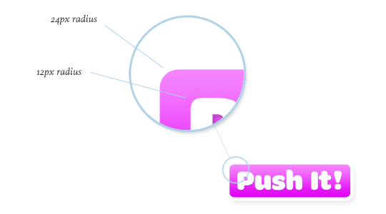
If you’re going for that beloved rounded corner look, you might class it up a bit by choosing the wonderful Omnes Pro by Joshua Darden. As the typeface already has a rounded aesthetic, making buttons that fit the style should be pretty easy.
I’ve found that using multiples helps to keep your interfaces looking balanced and proportional. Noticing that the top left edge of the letter “P” has about an 12px corner radius, let’s choose a 24px radius for our button (a multiple of 2), so that we get proper rounded corners. By taking mathematical measurements from the typeface, our button looks more thought out than just “place arbitrary text on arbitrarily-sized button.” Pretty easy, eh?
What’s in a name(plate)?
Rounded buttons are pretty popular buttons nowadays, so let’s try something a bit more stylized.
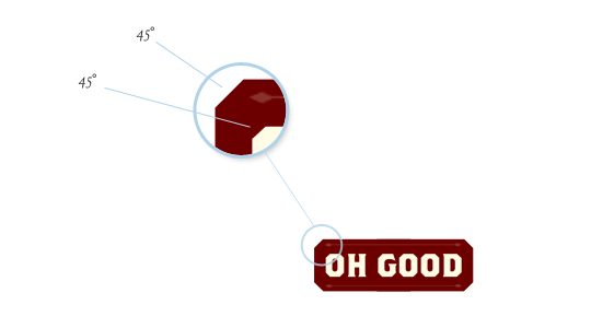
Have a gander at Brothers, a sturdy face from Emigre. The chiseled edges give us a perfect cue for a stylized button. Using the same slope, you can make plated-looking buttons that fit a different kind of style.
Headlining
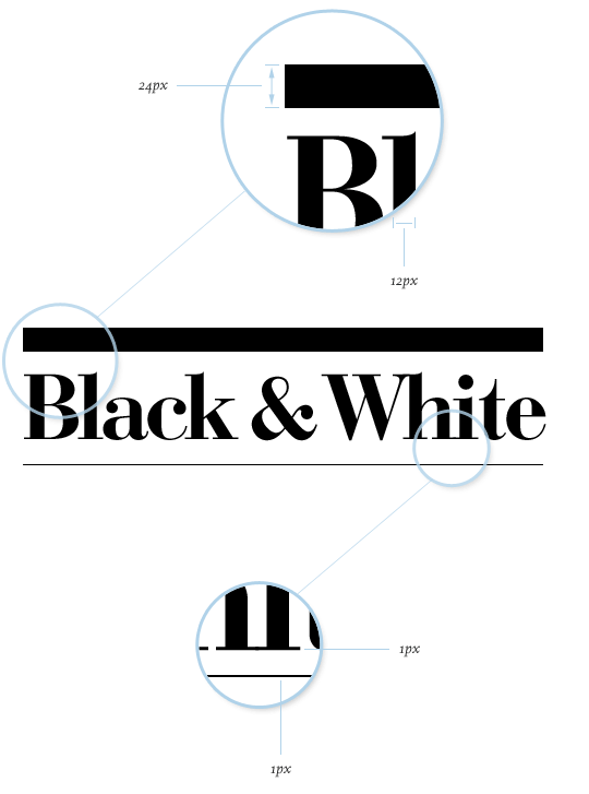
You might even take some cues from the style of the typeface itself. Didone serifs are known for their lack of bracketsーthat is, a gradual transition from the stem to the serif. Instead, they typically connect at a right angle. Another common characteristic is the high contrast in the strokes: very thick stems, very thin serifs.
So, when using a high contrast typeface, you can use it to your advantage to enhance hierarchy. Following our “multiples” guideline, a 12px measurement from the stems helps us create a top rule with a height of 24px (a multiple of 2). We can take the exact 1px measurement from the serif—a multiple of 1—to create the bottom rule. Voilà! I use this technique a lot.
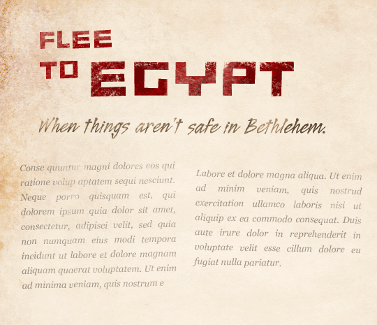
Swashbucklers
And don’t forget the importance of visual “speed bumps” to break up long passages of text. A beautiful face like Alejandro Paul’s Ministry Script has over a thousand characters that can be manipulated or even combined to create elegant interface elements. Altering the partial differential character (∂) creates a delightful ornament that can help to guide the eye through content.
Stagger & Swagger
What about layout? How can we use typography to inform how our content is displayed?
Let’s take a typeface like Assembler. We might use this for a design that needs to feel uneasy or uncomfortable. In design terms, that might translate into using irregular shapes and asymmetry. Using the proportional distances and degrees from the perpendiculars, we could easily create a multi-column layout that jives with the general tone. And for all you skeptics that don’t think a layout like this is doable on the web, stranger things have happened.
 Background texture generously offered by Bittbox.
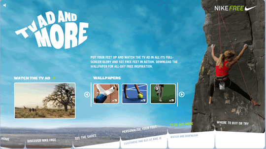
Overall Design Direction
Finally, your typography could impact the entire look of the site, from the navigation to the interaction and everything in between. Check out how the (now-defunct) Nike Free site’s typography echoes the product itself, and in turn influences the navigation.
Find Your Type
With thousands of fonts to choose from, the possibilities are ridiculously open. From angles to radii to color to weight, you’ve got endless fodder before you. Great type designers spent countless hours slaving over these detailed letterforms; take advantage of it! Don’t feel like you have to limit yourself to the same old Helvetica and wet floors… unless your design calls for it.
Happy hunting!
About the author
Dan Mall is an award-winning interactive art director and designer. He is an enthralled husband, Senior Designer at Big Spaceship, former Interactive Director at Happy Cog, technical editor for A List Apart, co-founder of Typedia, and singer/keyboard player for contemporary-Christian band Four24. Dan writes about design and other issues on Twitter and his industry-recognized site, danielmall.com.
Brought to you by
Related articles
-
An Introduction to Variable Fonts
Jason Pamental forges a path through the freshly laid snowy landscape of variable fonts. Like a brave explorer in a strange new typography topology let Jason show you the route to some fantastic font feats. Everything you thought you knew has changed.
-
Interactivity and Animation with Variable Fonts
Mandy Michael turns the corner on our variable font adventure and stumbles into a grotto of wonder and amazement. Not forgetting the need for a proper performance budget, Mandy shows how variable fonts can free your creativity from bygone technical constraints.
-
Managing Flow and Rhythm with CSS Custom Properties
Andy Bell rings out a call for a more flexible method of achieving consistent vertical rhythm across components within a page. Using a technique of CSS custom properties to establish spacing inherited through the cascade, you can make sure your choir are all singing from the same song sheet.
-
Get the Balance Right: Responsive Display Text
Richard Rutter shepherds a tea towel onto our collective heads and describes a technique for responsively scaling display text to maintain a consistent feel in both landscape and portrait screen orientations. That should put things back into proportion.
-
Run Ragged
Mark Boulton completes our calendar with some typographic techniques to improve the reading experience. Typography, like Christmas and advent calendars, relies on the accumulation of small gains for its best effects.
-
Get Expressive with Your Typography
Richard Rutter adapts an extract from his forthcoming book on web typography and encourages us to be brave with type choices. By allowing type to express a website’s intentions from even before the moment a visitor starts to read, we can help set the tone and our users’ expectations.