Going Nuts with CSS Transitions

I’m going to show you how CSS 3 transforms and WebKit transitions can add zing to the way you present images on your site.
Laying the foundations
First we are going to make our images look like mini polaroids with captions. Here’s the markup:
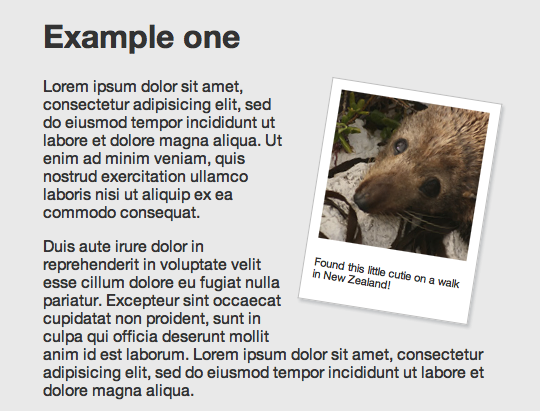
<div class="polaroid pull-right">
	<img src="../img/seal.jpg" alt="">
	<p class="caption">Found this little cutie on a walk in New Zealand!</p>
</div>
You’ll notice we’re using a somewhat presentational class of pull-right here. This means the logic is kept separate from the code that applies the polaroid effect. The polaroid class has no positioning, which allows it to be used generically anywhere that the effect is required. The pull classes set a float and add appropriate margins—they can be used for things like blockquotes as well.
.polaroid {
	width: 150px;
	padding: 10px 10px 20px 10px;
	border: 1px solid #BFBFBF;
	background-color: white;
	-webkit-box-shadow: 2px 2px 3px rgba(135, 139, 144, 0.4);
	-moz-box-shadow: 2px 2px 3px rgba(135, 139, 144, 0.4);
	box-shadow: 2px 2px 3px rgba(135, 139, 144, 0.4);
}
The actual polaroid effect itself is simply applied using padding, a border and a background colour. We also apply a nice subtle box shadow, using a property that is supported by modern WebKit browsers and Firefox 3.5+. We include the box-shadow property last to ensure that future browsers that support the eventual CSS3 specified version natively will use that implementation over the legacy browser specific version.
The box-shadow property takes four values: three lengths and a colour. The first is the horizontal offset of the shadow—positive values place the shadow on the right, while negative values place it to the left. The second is the vertical offset, positive meaning below. If both of these are set to 0, the shadow is positioned equally on all four sides. The last length value sets the blur radius—the larger the number, the blurrier the shadow (therefore the darker you need to make the colour to have an effect).
The colour value can be given in any format recognised by CSS. Here, we’re using rgba as explained by Drew behind the first door of this year’s calendar.
Rotation
For browsers that understand it (currently our old favourites WebKit and FF3.5+) we can add some visual flair by rotating the image, using the transform CSS 3 property.
-webkit-transform: rotate(9deg);
-moz-transform: rotate(9deg);
transform: rotate(9deg);
Rotations can be specified in degrees, radians (rads) or grads. WebKit also supports turns unfortunately Firefox doesn’t just yet.
For our example, we want any polaroid images on the left hand side to be rotated in the opposite direction, using a negative degree value:
.pull-left.polaroid {
	-webkit-transform: rotate(-9deg);
	-moz-transform: rotate(-9deg);
	transform: rotate(-9deg);
}
Multiple class selectors don’t work in IE6 but as luck would have it, the transform property doesn’t work in any current IE version either. The above code is a good example of progressive enrichment: browsers that don’t support box-shadow or transform will still see the image and basic polaroid effect.
Animation
WebKit is unique amongst browser rendering engines in that it allows animation to be specified in pure CSS. Although this may never actually make it in to the CSS 3 specification, it degrades nicely and more importantly is an awful lot of fun!
Let’s go nuts.
In the next demo, the image is contained within a link and mousing over that link causes the polaroid to animate from being angled to being straight.
Here’s our new markup:
<a href="http://www.flickr.com/photos/nataliedowne/2340993237/" class="polaroid">
	<img src="../img/raft.jpg" alt="">
	White water rafting in Queenstown
</a>
And here are the relevant lines of CSS:
a.polaroid {
	/* ... */
   -webkit-transform: rotate(10deg);
   -webkit-transition: -webkit-transform 0.5s ease-in;
}
a.polaroid:hover,
a.polaroid:focus,
a.polaroid:active {
	/* ... */
	-webkit-transform: rotate(0deg);
}
The @-webkit-transition@ property is the magic wand that sets up the animation. It takes three values: the property to be animated, the duration of the animation and a ‘timing function’ (which affects the animation’s acceleration, for a smoother effect).
-webkit-transition only takes affect when the specified property changes. In pure CSS, this is done using dynamic pseudo-classes. You can also change the properties using JavaScript, but that’s a story for another time.
Throwing polaroids at a table
Imagine there are lots of differently sized polaroid photos scattered on a table. That’s the effect we are aiming for with our next demo.
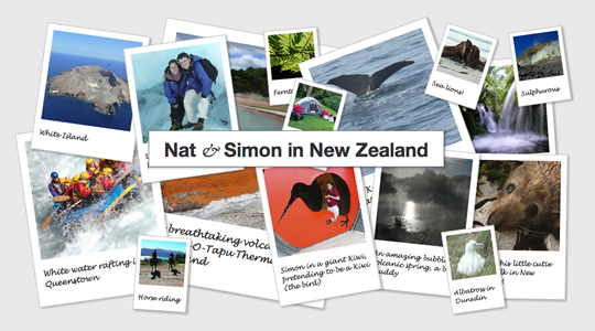
As an aside: we are using absolute positioning to arrange the images inside a flexible width container (with a minimum and maximum width specified in pixels). As some are positioned from the left and some from the right when you resize the browser they shuffle underneath each other. This is an effect used on the UX London site.
This demo uses a darker colour shadow with more transparency than before. The grey shadow in the previous example worked fine, but it was against a solid background. Since the images are now overlapping each other, the more opaque shadow looked fake.
-webkit-box-shadow: 2px 2px 4px rgba(0,0, 0, 0.3);
-moz-box-shadow: 2px 2px 4px rgba(0,0, 0, 0.3);
box-shadow: 2px 2px 4px rgba(0,0, 0, 0.3);
On hover, as well as our previous trick of animating the image rotation back to straight, we are also making the shadow darker and setting the z-index to be higher than the other images so that it appears on top.
And Finally…
Finally, for a bit more fun, we’re going to simulate the images coming towards you and lifting off the page. We’ll achieve this by making them grow larger and by offsetting the shadow & making it longer.
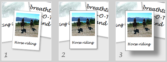
Screenshot 1 shows the default state, while 2 shows our previous hover effect. Screenshot 3 is the effect we are aiming for, illustrated by demo 4.
a.polaroid {
	/* ... */
	z-index: 2;
	-webkit-box-shadow: 2px 2px 4px rgba(0,0, 0, 0.3);
	-moz-box-shadow: 2px 2px 4px rgba(0,0, 0, 0.3);
	box-shadow: 2px 2px 4px rgba(0,0, 0, 0.3);
	-webkit-transform: rotate(10deg);
	-moz-transform: rotate(10deg);
	transform: rotate(10deg);
	-webkit-transition: all 0.5s ease-in;
}
a.polaroid:hover,
a.polaroid:focus,
a.polaroid:active {
	z-index: 999;
	border-color: #6A6A6A;
	-webkit-box-shadow: 15px 15px 20px rgba(0,0, 0, 0.4);
	-moz-box-shadow: 15px 15px 20px rgba(0,0, 0, 0.4);
	box-shadow: 15px 15px 20px rgba(0,0, 0, 0.4);
	-webkit-transform: rotate(0deg) scale(1.05);
	-moz-transform: rotate(0deg) scale(1.05);
	transform: rotate(0deg) scale(1.05);
}
You’ll notice we are now giving the transform property another transform function: scale, which takes increases the size by the specified factor. Other things you can do with transform include skewing, translating or you can go mad creating your own transforms with a matrix.
The box-shadow has both its offset and blur radius increased dramatically, and is darkened using the alpha channel of the rgba colour.
And because we want the effects to all animate smoothly, we pass a value of all to the -webkit-transition property, ensuring that any changed property on that link will be animated.
Demo 5 is the finished example, bringing everything nicely together.
CSS transitions and transforms are a great example of progressive enrichment, which means improving the experience for a portion of the audience without negatively affecting other users. They are also a lot of fun to play with!
Further reading
- -moz-transform – the mozilla developer center has a comprehensive explanation of transform that also applies to
-webkit-transformandtransform. - CSS: Animation Using CSS Transforms – this is a good, more indepth tutorial on animations.
- CSS Animation – the Safari blog explains the usage of
-webkit-transform. - Dinky pocketbooks with transform – another use for transforms, create your own printable pocketbook.
- A while back, Simon wrote a little bookmarklet to spin the entire page… warning: this will spin the entire page.
About the author
Natalie Downe is a Brit living in the Californian sunshine. Her professional experience spans both software engineering and natural history.
After getting a degree in Computer Information Systems from Bath University, she worked with the British Trust for Conservation Volunteers and the Devon Wildlife Trust, then as frontend engineer for Torchbox and Clearleft.
Then whilst travelling the world with her husband Simon Willison, together created Lanyrd which they ran for 3 years and sold to Eventbrite. Natalie transitioned to Director of Frontend Engineering at Eventbrite. In moving herself, her family and her team over to San Francisco, California, Natalie learned more than she wanted to about government buracracy.
Nowadays Natalie works for herself combining her love of nature and web development, occasionally doing public speaking on CSS or Bats (though not at the same time), volunteering for the California Bat Working group, the Marine Mammal Center and assisting the California Acadamy of Science with their tidepool monitoring.
On Sunny days Natalie can be found hiking around the bay area with her husband and her dog Cleo. On rainy days she mostly eats chocolate.
Brought to you by
Related articles
-
A History of CSS Through Fifteen Years of 24 ways
Rachel Andrew guides us through a tour of the last fifteen years in CSS layout, as manifested in articles here on 24 ways. From the days when Internet Explorer 6 was de rigueur, right up to the modern age of evergreen browsers, the only thing you can be sure of is that the web never stands still for long.
-
A Modern Typographic Scale
Rob Weychert reaches for the top notes to sing us a song of typographic scale. A little attention to scale and to the mathematics will help you to hit a high note with your designs this Christmas and beyond.
-
Beautiful Scrolling Experiences – Without Libraries
Michelle Barker appears as one of a heavenly host, coming forth with scroll in hand to pronounce an end to janky scrolljacking! Unto us a new specification is born, in the city of TimBL, and its name shall be called Scroll Snap.
-
Cascading Web Design with Feature Queries
Chen Hui Jing pulls off the dust covers, swings open the storm shutters and lets the winter light fall on the subject of CSS feature queries. The chestnuts may not yet be roasting, and the halls may be still be undecked, but pull up a chair and settle down. It’s Christmas.
-
Clip Paths Know No Bounds
Dan Wilson throws some Christmas shapes and gives us a run down of different ways to use CSS polygon clip paths to create interesting a flexible shapes with less code that you might have thought. It may be the time of year to follow a star, but was the star plotted with five or ten points?
-
Flexible Captioned Slanted Images
Eric Meyer gift wraps the most awkwardly shaped of boxes using nothing but CSS, HTML and a little curl of ribbon. No matter how well you plan and how much paper you have at your disposal, sometimes you just need to slant the gift to the side.


