Art Directing with Looking Room

Using photographic composition techniques to start to art direct on the template-driven web.
Think back to last night. There you are, settled down in front of the TV, watching your favourite soap opera, with nice hot cup of tea in hand. Did you notice – whilst engrossed in the latest love-triangle – that the cameraman has worked very hard to support your eye’s natural movement on-screen? He’s carefully framed individual shots to create balance.
Think back to last week. There you were, sat with your mates watching the big match. Did you notice that the cameraman frames the shot to go with the direction of play? A player moving right will always be framed so that he is on the far left, with plenty of ‘room’ to run into.
Both of these cameramen use a technique called Looking Room, sometimes called Lead Room. Looking Room is the space between the subject (be it a football, or a face), and the edge of the screen. Specifically, Looking Room is the negative space on the side the subject is looking or moving. The great thing is, it’s not just limited to photography, film or television; we can use it in web design too.
Basic Framing
Before we get into Looking Room, and how it applies to web, we need to have a look at some basics of photographic composition.
Many web sites use imagery, or photographs, to enhance the content. But even with professionally shot photographs, without a basic understanding of framing or composition, you can damage how the image is perceived.
A simple, easy way to make photographs more interesting is to fill the frame.
Take this rather mundane photograph of a horse:

A typical point and click affair. But, we can work with this.
By closely cropping, and filling the frame, we can instantly change the mood of the shot.

I’ve also added Looking Room on the right of the horse. This is space that the horse would be walking into. It gives the photograph movement.
Subject, Space, and Movement
Generally speaking, a portrait photograph will have a subject and space around them. Visual interest in portrait photography can come from movement; how the eye moves around the shot. To get the eye moving, the photographer modifies the space around the subject.
Look at this portrait:

The photography has framed the subject on the right, allowing for whitespace, or Looking Room, in the direction the subject is looking. The framing of the subject (1), with the space to the left (2) – the Looking Room – creates movement, shown by the arrow (3).
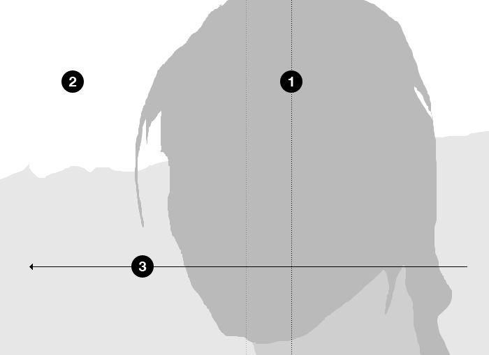
Note the subject is not framed centrally (shown by the lighter dotted line).
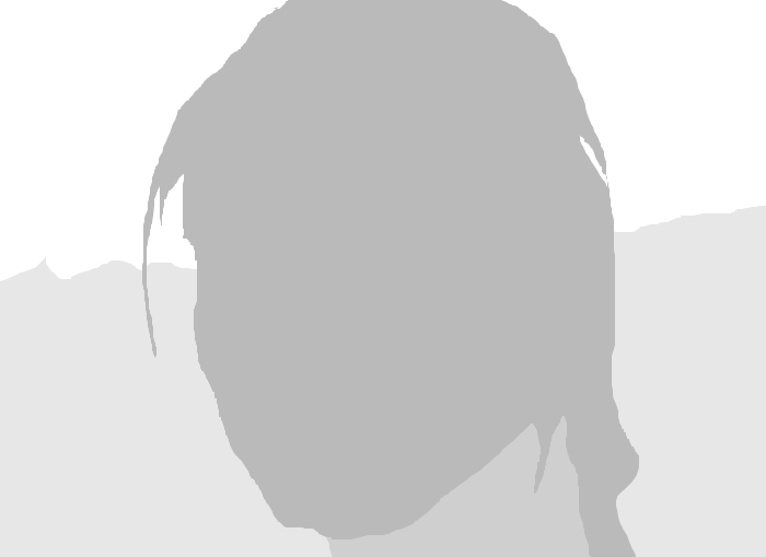
If the photographer had framed the subject with equal space either side, the resulting composition is static, like our horse.
If the photographer framed the subject way over on the left, as she is looking that way, the resulting whitespace on the right leads a very uncomfortable composition.
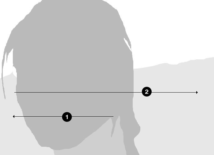
The root of this discomfort is what the framing is telling our eye to do. The subject, looking to the left, suggests to us that we should do the same. However, the Looking Room on the right is telling our eye to occupy this space. The result is a confusing back and forth.
How Looking Room applies to the web
We can apply the same theory to laying out a web page or application. Taking the three same elements – Subject, Space, and resulting Movement – we can guide a user’s eye to the elements we need to. As designers, or content editors, framing photographs correctly can have a subtle but important effect on how a page is visually scanned. Take this example:
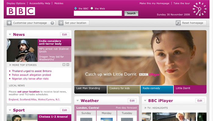
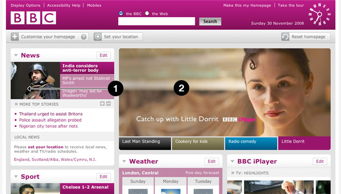
The BBC homepage uses great photography as a way of promoting content. Here, they have cropped the main photograph to guide the user’s eye into the content.
By applying the same theory, the designer or content editor has applied considerable Looking Room (2) to the photograph to create balance with the overall page design, but also to create movement of the user’s eye toward the content (1)
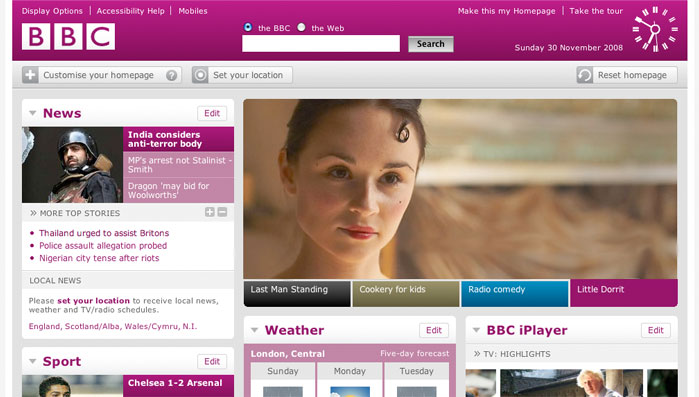
If the image was flipped horizontally. The Looking Room is now on the right. The subject of the photograph is looking off the page, drawing the user’s eye away from the content. Once again, this results in a confusing back and forth as your eye fights its way over to the left of the page.
A little bit of Art Direction
Art Direction can be described as the act or process of managing the visual presentation of content. Art Direction is difficult to do on the web, because content and presentation are, more often than not, separated. But where there are images, and when we know the templates that those images will populate, we can go a little way to bridging the gap between content and presentation.
By understanding the value of framing and Looking Room, and the fact that it extends beyond just a good looking photograph, we can start to see photography playing more of an integral role in the communication of content.
We won’t just be populating templates. We’ll be art directing.
Photo credits:
About the author
Mark Boulton is a graphic designer from near Cardiff in the UK. He used to work as a Senior Designer for the BBC, before he took leave of his senses and formed his own design consultancy, Mark Boulton Design. He studied typography, enjoys watching a good boxing match, and is partial to a really good cuppa.
Brought to you by
Related articles
-
Art Direction and the New WordPress Editor
Mel Choyce explores how the new WordPress editor (also know as Gutenberg) can be used to create more carefully art directed posts. Like gifts carefully arranged beneath the Christmas tree, it’s the contents that matters but the presentation that sells.
-
Be the Villain
Eric Bailey asks us to take on the role of King Herod in our projects to consider how the products, services and processes we design could be abused to cause harm rather than to do good. No matter how good our intentions, we must remember that not every user has pure motivations and that every tool is a weapon if you hold it right.
-
Creating a Weekly Research Cadence
Wren Lanier sets aside time to explore the benefits of a regular schedule for user research. Santa’s elves quickly discovered the benefits of working to a fixed schedule, which is of course why we don’t get presents at Easter.
-
How to Do a UX Review
Joe Leech offers a rundown on his UX review process, sharing tips about analysing data and creating personas, and setting out findings in a form that benefits clients. From quick wins to workshops, there are gifts here everyone will be grateful for.
-
How to Use Audio on the Web
Ruth John lets the bells ring out for Christmas with a look at a selection of inspiring sites with creative and effective use of audio. The days of jangly MIDI tunes to distract and annoy are thankfully long behind us, with browser APIs offering new and exciting ways to generate sound. Ahead is a beautiful sonic landscape. Ding dong!
-
What I Learned about Product Design This Year
Meagan Fisher casts a thoughtful glance back over her work this year and considers what it means to design a product rather than a marketing experience. Pour yourself a cup of eggnog, grab a mince pie or two and gather around the fireside. Are you sitting comfortably? Good, then we shall begin.