Typesetting Tables

Tables have suffered in recent years on the web. They were used for laying out web pages. Then, following the Web Standards movement, they’ve been renamed by the populous as `data tables’ to ensure that we all know what they’re for. There have been some great tutorials for the designing tables using CSS for presentation and focussing on the semantics in the displaying of data in the correct way. However, typesetting tables is a subtle craft that has hardly had a mention.
Table design can often end up being a technical exercise. What data do we need to display? Where is the data coming from and what form will it take? When was the last time your heard someone talk about lining numerals? Or designing to the reading direction?
Tables are not read like sentences
When a reader looks at, and tries to understand, tabular data, they’re doing a bunch of things at the same time.
- Generally, they’re task based; they’re looking for something.
- They are reading horizontally AND vertically
Reading a table is not like reading a paragraph in a novel, and therefore shouldn’t be typeset in the same way. Designing tables is information design, it’s functional typography—it’s not a time for eye candy.
Typesetting tables
Typesetting great looking tables is largely an exercise in restraint. Minimal interference with the legibility of the table should be in the forefront of any designers mind.
When I’m designing tables I apply some simple rules:
- Plenty of negative space
- Use the right typeface
- Go easy on the background tones, unless you’re giving reading direction visual emphasis
- Design to the reading direction
By way of explanation, here are those rules as applied to the following badly typeset table.
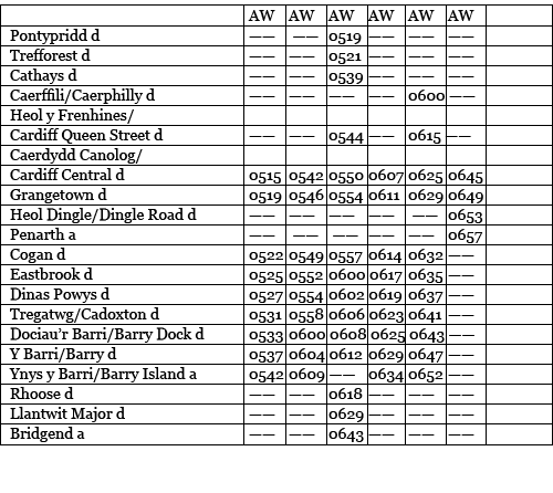
Your default table
This table is a mess. There is no consideration for the person trying to read it. Everything is too tight. The typeface is wrong. It’s flat. A grim table indeed.
Let’s see what we can do about that.
Plenty of negative space
The badly typeset table has been set with default padding. There has been little consideration for the ascenders and descenders in the type interfering with the many horizontal rules.
The first thing we do is remove most of the lines, or rules. You don’t need them – the data in the rows forms its own visual rules. Now, with most of the rules removed, the ones that remain mean something; they are indicating some kind of hierarchy to the help the reader understand what the different table elements mean – in this case the column headings.
Now we need to give the columns and rows more negative space. Note the framing of the column headings. I’m giving them more room at the bottom. This negative space is active—it’s empty for a reason. The extra air in here also gives more hierarchy to the column headings.
Use the right typeface
The default table is set in a serif typeface. This isn’t ideal for a couple of reasons. This serif typeface has a standard set of text numerals. These dip below the baseline and are designed for using figures within text, not on their own. What you need to use is a typeface with lining numerals. These align to the baseline and are more legible when used for tables.
Sans serif typefaces generally have lining numerals. They are also arguably more legible when used in tables.
Go easy on the background tones, unless you’re giving reading direction visual emphasis
We’ve all seen background tones on tables. They have their use, but my feeling is that use should be functional and not decorative.
If you have a table that is long, but only a few columns wide, then alternate row shading isn’t that useful for showing the different lines of data. It’s a common misconception that alternate row shading is to increase legibility on long tables. That’s not the case. Shaded rows are to aid horizontal reading across multiple table columns. On wide tables they are incredibly useful for helping the reader find what they want.
Background tone can also be used to give emphasis to the reading direction. If we want to emphasis a column, that can be given a background tone.
Hierarchy
As I said earlier, people may be reading a table vertically, and horizontally in order to find what they want. Sometimes, especially if the table is complex, we need to give them a helping hand.
Visually emphasising the hierarchy in tables can help the reader scan the data. Column headings are particularly important. Column headings are often what a reader will go to first, so we need to help them understand that the column headings are different to the stuff beneath them, and we also need to give them more visual importance. We can do this by making them bold, giving them ample negative space, or by including a thick rule above them. We can also give the row titles the same level of emphasis.
In addition to background tones, you can give emphasis to reading direction by typesetting those elements in bold. You shouldn’t use italics—with sans serif typefaces the difference is too subtle.
So, there you have it. A couple of simple guidelines to make your tables cleaner and more readable.
About the author
Mark Boulton is a graphic designer from near Cardiff in the UK. He used to work as a Senior Designer for the BBC, before he took leave of his senses and formed his own design consultancy, Mark Boulton Design. He studied typography, enjoys watching a good boxing match, and is partial to a really good cuppa.
Brought to you by
Related articles
-
An Introduction to Variable Fonts
Jason Pamental forges a path through the freshly laid snowy landscape of variable fonts. Like a brave explorer in a strange new typography topology let Jason show you the route to some fantastic font feats. Everything you thought you knew has changed.
-
Interactivity and Animation with Variable Fonts
Mandy Michael turns the corner on our variable font adventure and stumbles into a grotto of wonder and amazement. Not forgetting the need for a proper performance budget, Mandy shows how variable fonts can free your creativity from bygone technical constraints.
-
Managing Flow and Rhythm with CSS Custom Properties
Andy Bell rings out a call for a more flexible method of achieving consistent vertical rhythm across components within a page. Using a technique of CSS custom properties to establish spacing inherited through the cascade, you can make sure your choir are all singing from the same song sheet.
-
Get the Balance Right: Responsive Display Text
Richard Rutter shepherds a tea towel onto our collective heads and describes a technique for responsively scaling display text to maintain a consistent feel in both landscape and portrait screen orientations. That should put things back into proportion.
-
Run Ragged
Mark Boulton completes our calendar with some typographic techniques to improve the reading experience. Typography, like Christmas and advent calendars, relies on the accumulation of small gains for its best effects.
-
Get Expressive with Your Typography
Richard Rutter adapts an extract from his forthcoming book on web typography and encourages us to be brave with type choices. By allowing type to express a website’s intentions from even before the moment a visitor starts to read, we can help set the tone and our users’ expectations.