Tracking Christmas Cheer with Google Charts

A note from the editors: Since this article was written Google has retired the Charts API.
Let’s get something out in the open: I love statistics. As an informatician I can’t get enough graphs, charts, and numbers. So you can imagine when Google released their Charts API I thought Christmas had come early. I immediately began to draw up graphs for the holiday season using the new API; and using my new found chart-making skills I’ll show you what you can and can’t do with Google Charts.
Mummy, it’s my first chart
The Google Charts API allows you to send data to Google; in return they give you back a nicely-rendered graph. All the hard work is done on Google’s servers — you need only reference an image in your HTML. You pass along the data — the numbers for the charts, axis labels, and so on — in the query string of the image’s URL. If you want to add charts to your blog or web site, there’s probably no quicker way to get started.
Here’s a simple example: if we add the following line to an HTML page:
<img src="http://chart.apis.google.com/chart?cht=lc&chs=200x125&chd=s:ZreelPuevfgznf2008" />Then we’ll see the line graph in Figure 1 appear in our page. That graph is hosted on Google’s own server1: http://chart.apis.google.com/.
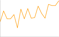 Figure 1: A simple example of a line graph created with Google Charts.
If you look at the URL used in the example you’ll notice we’re passing some parameters along in the query string (the bit after the question mark). The query string looks like this:
cht=lc&chs=200x125&chd=s:ZreelPuevfgznf2008It’s contains everything Google Charts needs to draw the graph. There are three parameters in the query string:
cht; this specifies the type of chart Google Charts will generate (in this case,lcis a line chart).chs, the value of which is200x125; this defines the chart’s size (200 pixels wide by 125 pixels high).chd, the value of which iss:ZreelPuevfgznf2008; this is the actual chart data, which we’ll discuss in more detail later.
These three parameters are the minimum you need to send to Google Charts in order to create a chart. There are lots more parameters you can send too (giving you more choice over how a chart is displayed), but you have to include at least these three before a chart can be created. Using these three parameters you can create pie charts, scatter plots, Venn diagrams, bar charts (and more) up to 1,000 pixels wide or 1,000 pixels high (but no more than 300,000 pixels in total).
Christmas pie
After I discovered the option to create a pie chart I instantly thought of graphing all the types of food and beverages that I’ll consume at this year’s Christmas feast. I can represent each item as a percentage of all the food on a pie chart (just thinking about that makes me hungry).
By changing the value of the cht parameter in the image’s query string I can change the chart type from a line chart to a pie chart. Google Charts offers two different types of pie chart: a fancy three-dimensional version and a two-dimensional overhead version. I want to stick with the latter, so I need to change cht=lc to cht=p (the p telling Google Charts to create a pie chart; if you want the three-dimensional version, use cht=p3). As a pie chart is circular I also need to adjust the size of the chart to make it square. Finally, it would be nice to add a title to the graph. I can do this by adding the optional parameter, chtt, to the end of the image URL. I end up with the chart you see in Figure 2.
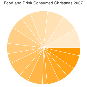 Figure 2: Pie chart with a title.
To add this chart to your own page, you include the following (notice that you can’t include spaces in URLs, so you need to encode them as plus-signs.):
<img src="http://chart.apis.google.com/chart?chtt=Food+and+Drink+Consumed+Christmas+2007&cht=p&chs=300x300&chd=s:ZreelPuevfgznf2008" />Ok, that’s great, but there are still two things I want to do before I can call this pie chart complete. First I want to label each slice of the pie. And second I want to include the proper data (at the moment the slices are meaningless). If 2007 is anything like 2006, the break down will be roughly as follows:
| Egg nog | 10% |
| Christmas Ham | 20% |
| Milk (not including egg nog) | 8% |
| Cookies | 25% |
| Roasted Chestnuts | 5% |
| Chocolate | 3% |
| Various Other Beverages | 15% |
| Various Other Foods | 9% |
| Snacks | 5% |
I have nine categories of food and drink to be tracked, so I need nine slice labels. To add these to the chart, I use the chl parameter. All nine labels are sent in one value; I use the vertical-pipe character, |, to separate them. So I need to append the following to the query string:
chl=Egg+nog|Christmas+Ham|Milk+(not+including+egg+nog)|Cookies|Roast+Chestnuts|Chocolate|Various+Other+Beverages|Various+Other+Foods|SnacksNext I need to add the corresponding percentage values to the chart labels. Encoding the chart data is the trickiest part of the Google Charts API — but by no means complicated. There are three different ways to encode your data on a chart. As I’m only dealing with small numbers, I’m going to use what Google calls simple encoding.
Simple encoding offers a sixty-two value spectrum in which to represent data. Remember the mandatory option, chd, from the first example? The value for this is split into two parts: the type of encoding and the graph data itself. These two parts are separated with a colon. To use simple encoding, the first character of the chd option must be a lower case s. Follow this with a colon and everything after it is considered data for the graph.
In simple encoding, you have sixty-two values to represent your data. These values are lowercase and uppercase letters from the Latin alphabet (fifty-two characters in total) and the digits 0 to 9. Each letter of the alphabet represents a single number: A equals 0, B equals 1, and so on up to Z, which equals 25; a equals 26, b equals 27, and so on up to z, which equals 51. The ten digits represent the numbers 52 to 61: 0 equals 52, 1 equals 53, and 9 equals 61.
In the previous two examples we used the string ZreelPuevfgznf2008 as our chart data; the Z is equal to 25, the r is equal to 42, the e is equal to 30, and so on. I want to encode the percentage values 10, 20, 8, 25, 5, 3, 15, 9 and 5, so in simple encoding I would use the string KUIZFDPJF.
If you think figuring this out for each chart may make your head explode, don’t worry: help is out there.
Do you remember I said I needed to change the image dimensions to be square, to accommodate the pie chart? Well now I’m including labels I need even more room. And as I’m in a Christmassy mood I’m going to add some festive colours too.
The optional chco parameter is used to change the chart color. You set this using the same hexadecimal (“hex”) notation found in CSS. So let’s make our pie chart green by adding chco=00AF33 (don’t start it with a hash character as in CSS) to the image URL. If we only specify one hex colour for the pie chart Google Charts will use shades of that colour for each of the slices. To choose your own colours, pass a comma separated list of colours. The “Milk” and “Cookies” slices were consumed together, so we can make those two slices more of a redish colour. I’ll use shades of green for the other slices. My chco parameter now looks like this:
chco=00AF33,4BB74C,EE2C2C,CC3232,33FF33,66FF66,9AFF9A,C1FFC1,CCFFCC.After all this, I’m left with the following URL:
http://chart.apis.google.com/chart?chco=00AF33,4BB74C,EE2C2C,CC3232,33FF33,66FF66,9AFF9A,C1FFC1,CCFFCC&chl=Egg+nog|Christmas+Ham|Milk+(not+including+egg+nog)|Cookies|Roast+Chestnuts|Chocolate|Various+Other+Beverages|Various+Other+Foods|Snacks&chtt=Food+and+Drink+Consumed+Christmas+2007&cht=p&chs=600x300&chd=s:KUIZFDPJFWhat does that give us? I’m glad you asked. I have the rather beautiful 600-pixel wide pie chart you see in Figure 3.
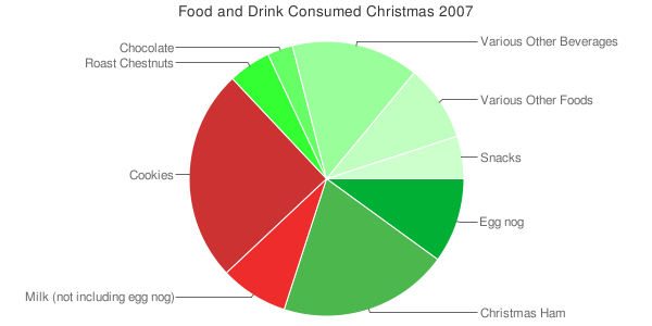 Figure 3: A Christmassy pie chart with labels.
But I don’t like pie charts
The pie chart was invented by the Scottish polymath William Playfair in 1801. But not everyone is as excited by pie charts as wee Billy, so if you’re an anti-pie-chartist, what can you do?
You can easily reuse the same data but display it as a bar graph in a snap. The first thing we need to do is change the value of the cht parameter from p to bhg. This creates a horizontal bar graph (you can request a vertical bar graph using bvg). The data and labels all remain the same, but we need to decide where the labels will appear. I’ll talk more about how to do all this in the next section.
In Figure 4 you’ll see the newly-converted bar graph. The URL for the graph is:
http://chart.apis.google.com/chart?cht=bhg&chs=600x300&chd=s:KUIZFDPJF&chxt=x,y&chtt=Food+and+Drink+Consumed+Christmas+2007&chxl=1:|Egg+nog|Christmas+Ham|Milk+(not+including+egg+nog)|Cookies|Roast+Chestnuts|Chocolate|Various+Other+Beverages|Various+Other+Foods|Snacks&chco=00AF33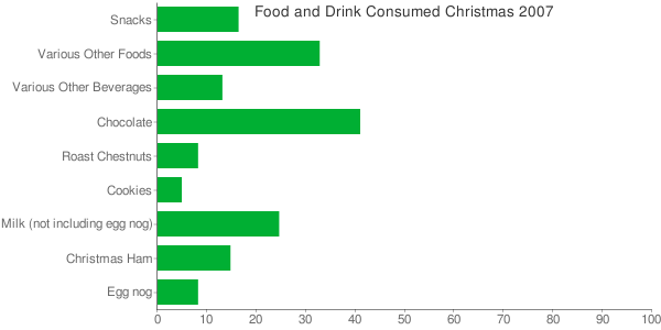 Figure 4: The pie chart from Figure 3 represented as a bar chart.
Two lines, one graph
Pie charts and bar charts are interesting, but what if I want to compare last year’s Christmas cheer with this year’s? That sounds like I’ll need two lines on one graph.
The code is much the same as the previous examples; the most obvious difference is I need to set up the chart as a line graph. Creating some dummy values for the required parameters, I end up with:
<img src="http://chart.apis.google.com/chart?chs=800x300&cht=lxy&chd=t:0,100|0,100" />The chs=800x300 sets the dimensions of the new chart, while cht=lxy describes the type of chart we are using (in this case a line chart with x and y co-ordinates). For the chart data I’m going to demostrate a different encoding, text encoding. To use this I start the value of the chd parameter with “t:” instead of “s:”, and follow it with a list of x coordinates, a vertical pipe, |, and a list of y coordinates. Given the URL above, Google Charts will render the chart shown in Figure 5.
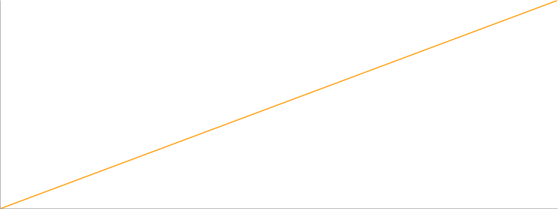 Figure 5: A simple line graph with x and y co-ordinates.
To make this graph a little more pleasing to the eye, I can add much the same as I did to the pie chart. I’ll add a chart title. Maybe something like “Projected Christmas Cheer for 2007”. Just as before I would add a chtt parameter to the image URL:
&chtt=Projected+Christmas+Cheer+for+2007Next, let’s add some labels on the y axis to represent a scale from 0 to 100. On the x axis let’s label for the most important days of December. To do this I need to use the chart axis type parameter, chxt. This allows us to specify the axes and associate some labels with them. As I’m only interested in the y-axis (to the left of the chart) and the x-axis (below the chart), we add chxt=x,y to our image URL.
Now I need my label data. This is slightly more tricky because I want the data evenly spaced without labelling every item. The parameter for labels is chxl, the chart axis label. You match a label to an axis by using a number. So 0:Label1 is the zero index of chxt — in this case the x-axis. 1:Label2 is the first index of chxt — the y-axis. The order of these parameters or labels doesn’t matter as long as you associate them to their chxt correctly.
The next thing to know about chxl is that you can add an empty label. Labels are separated by vertical pipe; if you don’t put any text in a label, you just leave the two vertical pipes empty (“||”) and Google Charts will allocate space but no label.
For our vertical y axis, we want to label only 50% and 100% on the graph and plot them in their respective places. Since the y-axis is the second item, 1: (remember to start counting at zero), we add ten spaces to our image URL, chxl=1:||||||50|||||100 This will output the 50 halfway and the 100 at the top; all the other spaces will be empty.
We can do the same thing to get specific dates along the x-axis as well. Let’s add the 1st of December, St. Nick’s Day (the 6th), Christmas Day, Boxing Day (a holiday common in the UK and the Commonwealth, on the 26th), and the final day of the month, the 31st. Since this is the x-axis I’ll use 0: as a reference in the chxt parameter tell Google Charts which axis to label. In full, the chxl parameter now looks like:
chxl=1:||||||50|||||100|0:|Dec+1st|||||6th||||10th|||||15th|||||20th|||||25th|26th|||||Dec+31stThat’s pretty.
Before we begin to graph our data, I’ll do one last thing: add some grid lines to the chart so to better connect the data to the labels. The parameter for this is chg, short for chart grid lines. The parameter takes four comma-separated arguments. The first is the x-axis spacing for the grid. I have thirty-one days, so I need thirty vertical lines. The chart is 100% wide, so 3.33 (100 divided by 30) is the required spacing.
As for the y-axis: the axis goes up to 100% but we probably only need to have a horizontal line every 10%, so the required spacing is 10 (100 divided by 10). That is the second argument.
The last two arguments control the dash-style of the grid-lines. The first number is the length of the line dash and the second is the space between the dashes. So 6,3 would mean a six-unit dash with a three-unit space. I like a ratio of 1,3 but you can change this as you wish. Now that I have the four arguments, the chg parameter looks like:
chg=3.333,10,1,3If I add that to the chart URL I end up with:
http://chart.apis.google.com/chart?chs=800x300&cht=lxy&chd=t:0,100|0,100&chtt=Projected+Christmas+Cheer+for+2007&chxt=x,y&chxl=0:|Dec+1st|||||6th|||||||||||||||||||25th|26th|||||Dec+31st|1:||||||50|||||100&chg=3.3333,10,1,3Which results in the chart shown in Figure 6.
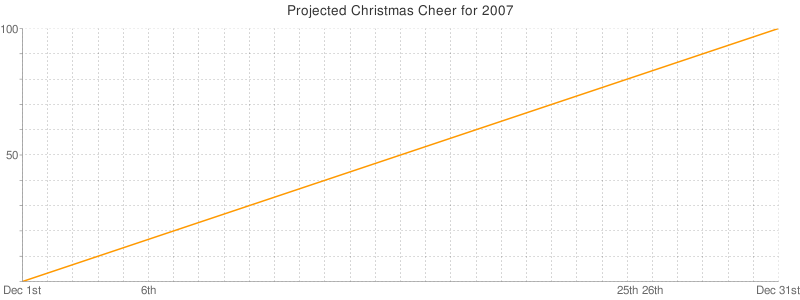 Figure 6: Chart ready to receive the Christmas cheer values.
Real data
Now the chart is ready I can add historical data from 2006 and current data from 2007.
Having a look at last year’s cheer levels we find some highs and lows through-out the month:
| Dec 1st | Advent starts; life is good | 30% |
|---|---|---|
| Dec 6th | St. Nick’s Day, awake to find good things in my shoes | 45% |
| Dec 8th | Went Christmas carolling, nearly froze | 20% |
| Dec 10th | Christmas party at work, very nice dinner | 50% |
| Dec 18th | Panic Christmas shopping, hate rude people | 15% |
| Dec 23rd | Off Work, home eating holiday food | 80% |
| Dec 25th | Opened presents, good year, but got socks again from Grandma | 60% |
| Dec 26th | Boxing Day; we’re off and no one knows why | 70% |
| Dec 28th | Third day of left overs | 40% |
| Dec 29th | Procured some fireworks for new years | 55% |
| Dec 31st | New Year’s Eve | 80% |
Since I’m plotting data for 2006 and 2007 on the same graph I’ll need two different colours — one for each year’s line — and a key to denote what each colour represents. The key is controlled by the chdl (chart data legend) parameter. Again, each part of the parameter is separated by a vertical pipe, so for two labels I’ll use chdl=2006|2007. I also want to colour-code them, so I’ll need to add the chco as I did for the pie chart. I want a red line and a green line, so I’ll use chco=458B00,CD2626 and add this to the image URL.
Let’s begin to plot the 2006 data on the Chart, replacing our dummy data of chd=t:0,100|0,100 with the correct information. The chd works by first listing all the x coordinates (each separated by a comma), then a vertical pipe, and then all the y coordinates (also comma-separated). The chart is 100% wide, so I need to convert the days into a percentage of the month.
The 1st of December is 0 and the 31st is 100. Everything else is somewhere in between. Our formula is:
(d – 1) × 100 ÷ (31 – 1)
Where d is the day of the month. The formula states that each day will be printed every 3.333 units; so the 6th of December will be printed at 16.665 units. I can repeat the process for the other dates listed to get the following x coordinates: 0,16.7,23.3,33.3,60,76.7,83.3,86.7,93.3,96.7. The y axis coordinates are easy because our scale is 100%, just like our rating, so we can simply copy them across as 30,45,20,50,15,80,60,70,40,55,80. This gives us a final chd value of:
chd=t:0,16.7,23.3,33.3,60,76.7,83.3,86.7,93.3,96.7,100|30,45,20,50,15,80,60,70,40,55,80Onto 2007: I can put the data for the month so far to see how we are trending.
| Dec 1st | Christmas shopping finished already | 50% |
|---|---|---|
| Dec 4th | Computer hard disk drive crashed (not Christmas related accident, but put me in a bad mood) | 10% |
| Dec 6th | Missed St. Nick’s Day completely due to travelling | 30% |
| Dec 9th | Dinner with friends before they travel | 55% |
| Dec 11th | 24ways article goes live | 60% |
Using the same system we did for 2006, I can take the five data points and plot them on the chart. The new x axis values will be 0,10,16.7,26.7 and the new y axis 50,10,30,65. We incorporate those into the image URL by appending these values onto the chd parameter we already have, which then becomes:
chd=t:0,16.7,23.3,33.3,60,76.7,83.3,86.7,93.3,96.7,100|30,45,20,50,15,80,60,70,40,55,80|0,10,16.7,26.7,33.3|50,10,30,55,60Passing this to Google Charts results in Figure 7.
http://chart.apis.google.com/chart?chs=800x300&cht=lxy&chd=t:0,100|0,100&chtt=Projected+Christmas+Cheer+for+2007&chxt=x,y&chxl=0:|Dec+1st|||||6th|||||||||||||||||||25th|26th|||||Dec+31st|1:||||||50|||||100&chg=3.3333,10,1,3&chd=t:0,16.7,23.3,33.3,60,76.7,83.3,86.7,93.3,96.7,100|30,45,20,50,15,80,60,70,40,55,80|0,10,16.7,26.7,33.3|50,10,30,55,60&chco=458B00,CD2626&chdl=2006|2007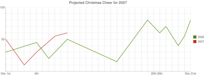 Figure 7: Projected Christmas cheer for 2006 and 2007.
Did someone mention Edward Tufte?
Google Charts are a robust set of chart types that you can create easily and freely using their API. As you can see, you can graph just about anything you want using the line graph, bar charts, scatter plots, venn diagrams and pie charts. One type of chart conspicuously missing from the API is sparklines. Sparklines were proposed by Edward Tufte as “small, high resolution graphics embedded in a context of words, numbers, images”. They can be extremely useful, but can you create them in Google Charts?
The answer is: “Yes, but it’s an undocumented feature”. (The usual disclaimer about undocumented features applies.)
If we take our original line graph example, and change the value of the cht parameter from lc (line chart) to lfi (financial line chart) the axis-lines are removed. This allows you to make a chart — a sparkline — small enough to fit into a sentence. Google uses the lfi type all throughout the their financial site, but it’s not yet part of the official API.
| MerryChristmas | http://chart.apis.google.com/chart?cht=lfi&chs=100x15&chd=s:MerryChristmas |
|
|---|---|---|
| 24ways | http://chart.apis.google.com/chart?cht=lfi&chs=100x15&chd=s:24ways&chco=999999 |
|
| HappyHolidays | http://chart.apis.google.com/chart?cht=lfi&chs=100x15&chd=s:HappyHolidays&chco=ff0000 |
|
| HappyNewYear | http://chart.apis.google.com/chart?cht=lfi&chs=100x15&chd=s:HappyNewYear&chco=0000ff |
Summary
The new Google Charts API is a powerful method for creating charts and graphs of all types. If you apply a little bit of technical skill you can create pie charts, bar graphs, and even sparklines as and when you need them. Now you’ve finished ready the article I hope you waste no more time: go forth and chart!
Further reading
- Google Charts API
- More on Google Charts
- How to handle negative numbers
- 12 Days of Christmas Pie Chart
1 In order to remain within the 50,000 requests a day limit the Google Charts API imposes, chart images on this page have been cached and are being served from our own servers. But the URLs work – try them!
About the author
Brian Suda is a master informatician working to make the web a better place little by little everyday. Since discovering the Internet in the mid-90s, Brian Suda has spent a good portion of each day connected to it. His own little patch of Internet is http://suda.co.uk, where many of his past projects and crazy ideas can be found.
Photo: Jeremy Keith
Brought to you by
Related articles
-
Building a Dictaphone Using Media Recorder and getUserMedia
Chris Mills brushes up his shorthand and shows how the MediaStream Recording API in modern browsers can be used to capture audio directly from the user’s device. Inching ever closer to the capabilities of native software, it truly is an exciting time to be a web developer.
-
Develop Your Naturalist Superpowers with Observable Notebooks and iNaturalist
Natalie Downe gathers the forest creatures in from the cold and shows them how some clever combining of an inquisitive mind and a JavaScript API can produce some amazing results.
-
Fast Autocomplete Search for Your Website
Simon Willison searches for the true meaning of Christmas, but settles on making a search engine for our articles on 24 ways. In doing he so demonstrates how a little bit of JavaScript, some open source tools and a sprinkling of database magic can make your festive dreams come true.
-
Documentation-Driven Design for APIs
Frances Berriman puts the sled firmly behind the reindeer with her approach to documenting feature-rich APIs. Creating good documentation needn’t be a chore and it reaps benefits – you wouldn’t expect presents at Christmas without writing your list to Santa first, would you?
-
The Web Is Your CMS
Christian Heilmann uses the Yahoo! Query Language to assert that we already have a content management system in the form of the web. YQL unifies interfaces and combines requests to make working with APIs much easier.
-
Geotag Everywhere with Fire Eagle
Ben Ward walks us through the process of building a small client-side application using the Fire Eagle API. Yahoo’s Fire Eagle is a service for disseminating details of your location physical location to other services on the web. Ben shows us how such a thing can be made useful.