Increase Your Font Stacks With Font Matrix

Web pages built in plain old HTML and CSS are displayed using only the fonts installed on users’ computers (@font-face implementations excepted). To enable this, CSS provides the font-family property for specifying fonts in order of preference (often known as a font stack). For example:
h1 {font-family: 'Egyptienne F', Cambria, Georgia, serif}
So in the above rule, headings will be displayed in Egyptienne F. If Egyptienne F is not available then Cambria will be used, failing that Georgia or the final fallback default serif font. This everyday bit of CSS will be common knowledge among all 24 ways readers.
It is also a commonly held belief that the only fonts we can rely on being installed on users’ computers are the core web fonts of Arial, Times New Roman, Verdana, Georgia and friends. But is that really true?
If you look in the fonts folder of your computer, or even your Mum’s computer, then you are likely to find a whole load of fonts besides the core ones. This is because many software packages automatically install extra typefaces. For example, Office 2003 installs over 100 additional fonts. Admittedly not all of these fonts are particularly refined, and not all are suitable for the Web. However they still do increase your options.
The Matrix
I have put together a matrix of (western) fonts showing which are installed with Mac and Windows operating systems, which are installed with various versions of Microsoft Office, and which are installed with Adobe Creative Suite.
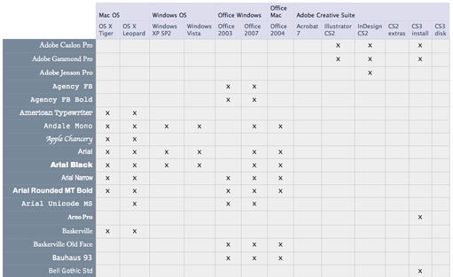
The matrix is available for download as an Excel file and as a CSV. There are no readily available statistics regarding the penetration of Office or Creative Suite, but you can probably take an educated guess based on your knowledge of your readers.
The idea of the matrix is that use can use it to help construct your font stack. First of all pick the font you’d really like for your text – this doesn’t have to be in the matrix. Then pick the generic family (serif, sans-serif, cursive, fantasy or monospace) and a font from each of the operating systems. Then pick any suitable fonts from the Office and Creative Suite lists.
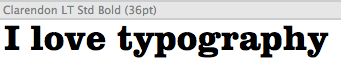
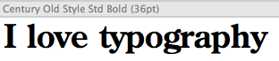
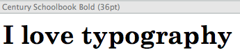
For example, you may decide your headings should be in the increasingly ubiquitous Clarendon. This is a serif type face. At OS-level the most similar is arguably Georgia. Adobe CS2 comes with Century Old Style which has a similar feel. Century Schoolbook is similar too, and is installed with all versions of Office. Based on this your font stack becomes:
font-family: 'Clarendon Std', 'Century Old Style Std', 'Century Schoolbook', Georgia, serif
Note the ‘Std’ suffix indicating a ‘standard’ OpenType file, which will normally be your best bet for more esoteric fonts.
I’m not suggesting the process of choosing suitable fonts is an easy one. Firstly there are nearly two hundred fonts in the matrix, so learning what each font looks like is tricky and potentially time consuming (if you haven’t got all the fonts installed on a machine to hand you’ll be doing a lot of Googling for previews). And it’s not just as simple as choosing fonts that look similar or have related typographic backgrounds, they need to have similar metrics as well, This is especially true in terms of x-height which gives an indication of how big or small a font looks.
Over to You
The main point of all this is that there are potentially more fonts to consider than is generally accepted, so branch out a little (carefully and tastefully) and bring a little variety to sites out there. If you come up with any novel font stacks based on this approach, please do blog them (tagged as per the footer) and at some point they could all be combined in one place for everyone to consider.
Appendix
What about Linux?
The only operating systems in the matrix are those from Microsoft and Apple. For completeness, Linux operating systems should be included too, although these are many and varied and very much in a minority, so I omitted them for time being. For the record, some Linux distributions come packaged with Microsoft’s core fonts. Others use the Vera family, and others use the Liberation family which comprises fonts metrically identical to Times New Roman and Arial.
Sources
The sources of font information for the matrix are as follows:
- Windows XP SP2
- Windows Vista
- Office 2003
- Office 2007
- Mac OSX Tiger
- Mac OSX Leopard (scroll down two thirds)
- Office 2004 (Mac) by inspecting my Microsoft Office 2004/Office/Fonts folder
- Office 2008 (Mac) is expected to be as Office 2004 with the addition of the Vista ClearType fonts
- Creative Suite 2 (see pdf link in first comment)
- Creative Suite 3
About the author
Richard Rutter is a user experience consultant and director of Clearleft. In 2009 he cofounded the webfont service, Fontdeck. He runs an ongoing project called The Elements of Typographic Style Applied to the Web, where he extols the virtues of good web typography. Richard occasionally blogs at Clagnut, where he writes about design, accessibility and web standards issues, as well as his passion for music and mountain biking.
Brought to you by
Related articles
-
An Introduction to Variable Fonts
Jason Pamental forges a path through the freshly laid snowy landscape of variable fonts. Like a brave explorer in a strange new typography topology let Jason show you the route to some fantastic font feats. Everything you thought you knew has changed.
-
Interactivity and Animation with Variable Fonts
Mandy Michael turns the corner on our variable font adventure and stumbles into a grotto of wonder and amazement. Not forgetting the need for a proper performance budget, Mandy shows how variable fonts can free your creativity from bygone technical constraints.
-
Managing Flow and Rhythm with CSS Custom Properties
Andy Bell rings out a call for a more flexible method of achieving consistent vertical rhythm across components within a page. Using a technique of CSS custom properties to establish spacing inherited through the cascade, you can make sure your choir are all singing from the same song sheet.
-
Get the Balance Right: Responsive Display Text
Richard Rutter shepherds a tea towel onto our collective heads and describes a technique for responsively scaling display text to maintain a consistent feel in both landscape and portrait screen orientations. That should put things back into proportion.
-
Run Ragged
Mark Boulton completes our calendar with some typographic techniques to improve the reading experience. Typography, like Christmas and advent calendars, relies on the accumulation of small gains for its best effects.
-
Get Expressive with Your Typography
Richard Rutter adapts an extract from his forthcoming book on web typography and encourages us to be brave with type choices. By allowing type to express a website’s intentions from even before the moment a visitor starts to read, we can help set the tone and our users’ expectations.