Get In Shape

Pop quiz: what’s wrong with the following navigation?
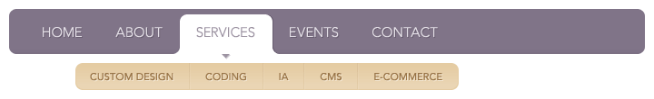
Maybe nothing. But then again, maybe there’s something bugging you about the way it comes together, something you can’t quite put your finger on. It seems well-designed, but it also seems a little… off.
The design decisions that led to this eventual form were no doubt well-considered:
- Client: The top level needs to have a “current page” status indicator of some sort.
- Designer: How about a white tab?
- Client: Great! The second level needs to show up underneath the first level though…
- Designer: Okay, but that white tab I just added makes it hard to visually connect the bottom nav to the top.
- Client: Too late, we’ve seen the white tab and we love it. Try and make it work.
- Designer: Right. So I placed the second level in its own box.
- Client: Hmm. They seem too separated. I can’t tell that the yellow nav is the second level of the first.
- Designer: How about an indicator arrow?
- Client: Brilliant!
The problem is that the end result feels awkward and forced. During the design process, little decisions were made that ultimately affect the overall shape of the navigation. What started out as a neatly contained rounded rectangle ended up as an ambiguous double shape that looks funny, though it’s often hard to pinpoint precisely why.
The Shape of Things
Well the why in this case is because seemingly unrelated elements in a design still end up visually interacting. Adding a new item to a page impacts everything surrounding it. In this navigation example, we’re looking at two individual objects that are close enough to each other that they form a relationship; if we reduce them to strictly their outlines, it’s a little easier to see that this particular combination registers oddly.
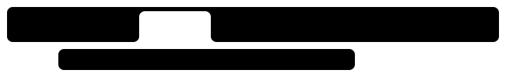
The two shapes float with nothing really grounding them. If they were connected, perhaps it would be a different story. The white tab divides the top shape in half, leaving a gap in the middle of it. There’s very little balance in this pairing because the overall shape of the navigation wasn’t considered during the design process.
Here’s another example: Gmail. Great email client, but did you ever closely look at what’s going on in that left hand navigation? The continuous blue bar around the message area spills out into the navigation. If we remove all text, we’re left with this odd configuration:
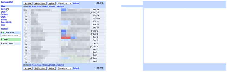
Though the reasoning for anchoring the navigation highlight against the message area might be sound, the result is an irregular shape that doesn’t correspond with anything in reality. You may never consciously notice it, but once you do it’s hard to miss. One other example courtesy of last.fm:

The two header areas are the same shade of pink so they appear to be closely connected. When reduced to their outlines it’s easy to see that this combination is off-balance: the edges don’t align, the sharp corners of the top shape aren’t consistent with the rounded corners of the bottom, and the part jutting out on the right of the bottom one seems fairly random. The result is a duo of oddly mis-matched shapes.
Design Strategies
Our minds tend to pick out familiar patterns. A clever designer can exploit this by creating references in his or her work to shapes and combinations with which viewers are already familiar. There are a few simple ideas that can be employed to help you achieve this: consistency, balance, and completion.
Consistency
A fairly simple way to unify the various disparate shapes on a page is by designing them with a certain amount of internal consistency. You don’t need to apply an identical size, colour, border, or corner treatment to every single shape; devolving a design into boring repetition isn’t what we’re after here. But it certainly doesn’t hurt to apply a set of common rules to most shapes within your work.
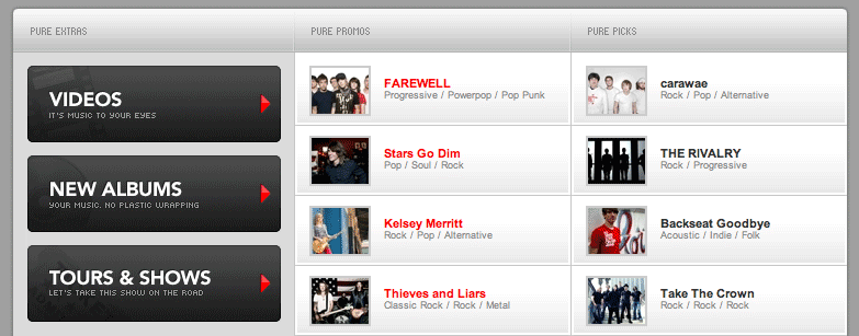
Consider purevolume and its multiple rounded-corner panels. From the bottom of the site’s main navigation to the grey “Extras” panels halfway down the page (shown above), multiple shapes use a common border radius for unity. Different colours, different sizes, different content, but the consistent outlines create a strong sense of similarity. Not that every shape on the site follows this rule; they break the pattern right at the top with a darker sharp-cornered header, and again with the thumbnails below. But the design remains unified, nonetheless.
Balance
Arguably the biggest problem with the last.fm example earlier is one of balance. The area poking out of the bottom shape created a fairly obvious imbalance for no apparent reason. The right hand side is visually emphasized due to the greater area of pink coverage, but with the white gap left beside it, the emphasis seems unwarranted. It’s possible to create tension in your design by mismatching shapes and throwing off the balance, but when that happens unintentionally it can look like a mistake.
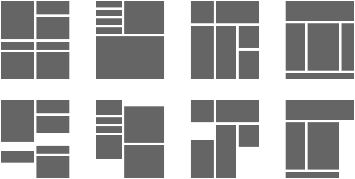
Above are a few examples of design elements in balanced and unbalanced configurations. The examples in the top row are undeniably more pleasing to the eye than those in the bottom row. If these were fleshed out into full designs, those derived from the templates in the top row would naturally result in stronger work.
Take a look at the header on 9Rules for a study in well-considered balance. On the left you’ll see a couple of paragraphs of text, on the right you have floating navigational items, and both flank the site’s logo. This unusual layout combines multiple design elements that look nothing alike, and places them together in a way that anchors each so that no one weighs down the header.
Completion
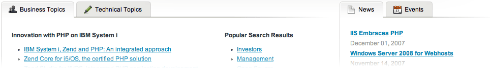
And finally we come to the idea of completion. Shapes don’t necessarily need hard outlines to be read visually as shapes, which can be exploited for various purposes. Notice how Zend’s mid-page “Business Topics” and “News” items (below) fade out to the right and bottom, but the placement of two of these side-by-side creates an impression of two panels rather than three disparate floating columns. By allowing the viewer’s eye to complete the shapes, they’ve lightened up the design of the page and removed inessential lines. In a busy design this technique could prove quite handy.
Along the same lines, the individual shapes within your design may also be combined visually to form outlines of larger shapes. The differently-coloured header and main content/sidebar shapes on Veerle’s blog come together to form a single central panel, further emphasized by the slight drop shadow to the right.
Implementation
Studying how shape can be used effectively in design is simply a starting point. As with all things design-related, there are no hard and fast rules here; ultimately you may choose to bring these principles into your work more often, or break them for effect. But understanding how shapes interact within a page, and how that effect is ultimately perceived by viewers, is a key design principle you can use to impress your friends.
About the author
Dave Shea is the Founder of Bright Creative, and co-organizer of Web Directions North. He blogs sometimes at Mezzoblue and Flickrs a bit more often than that. Oh, and there’s other stuff too.
Brought to you by
Related articles
-
Art Direction and the New WordPress Editor
Mel Choyce explores how the new WordPress editor (also know as Gutenberg) can be used to create more carefully art directed posts. Like gifts carefully arranged beneath the Christmas tree, it’s the contents that matters but the presentation that sells.
-
Be the Villain
Eric Bailey asks us to take on the role of King Herod in our projects to consider how the products, services and processes we design could be abused to cause harm rather than to do good. No matter how good our intentions, we must remember that not every user has pure motivations and that every tool is a weapon if you hold it right.
-
Creating a Weekly Research Cadence
Wren Lanier sets aside time to explore the benefits of a regular schedule for user research. Santa’s elves quickly discovered the benefits of working to a fixed schedule, which is of course why we don’t get presents at Easter.
-
How to Do a UX Review
Joe Leech offers a rundown on his UX review process, sharing tips about analysing data and creating personas, and setting out findings in a form that benefits clients. From quick wins to workshops, there are gifts here everyone will be grateful for.
-
How to Use Audio on the Web
Ruth John lets the bells ring out for Christmas with a look at a selection of inspiring sites with creative and effective use of audio. The days of jangly MIDI tunes to distract and annoy are thankfully long behind us, with browser APIs offering new and exciting ways to generate sound. Ahead is a beautiful sonic landscape. Ding dong!
-
What I Learned about Product Design This Year
Meagan Fisher casts a thoughtful glance back over her work this year and considers what it means to design a product rather than a marketing experience. Pour yourself a cup of eggnog, grab a mince pie or two and gather around the fireside. Are you sitting comfortably? Good, then we shall begin.