Photographic Palettes

How many times have you seen a colour combination that just worked, a match so perfect that it just seems obvious?
Now, how many times do you come up with those in your own work? A perfect palette looks easy when it’s done right, but it’s often maddeningly difficult and time-consuming to accomplish.
Choosing effective colour schemes will always be more art than science, but there are things you can do that will make coming up with that oh-so-smooth palette just a little a bit easier. A simple trick that can lead to incredibly gratifying results lies in finding a strong photograph and sampling out particularly harmonious colours.
Photo Selection
Not all photos are created equal. You certainly want to start with imagery that fits the eventual tone you’re attempting to create. A well-lit photo of flowers might lead to a poor colour scheme for a funeral parlour’s web site, for example. It’s worth thinking about what you’re trying to say in advance, and finding a photo that lends itself to your message.
As a general rule of thumb, photos that have a lot of neutral or de-saturated tones with one or two strong colours make for the best palette; bright and multi-coloured photos are harder to derive pleasing results from. Let’s start with a relatively neutral image.
Sampling
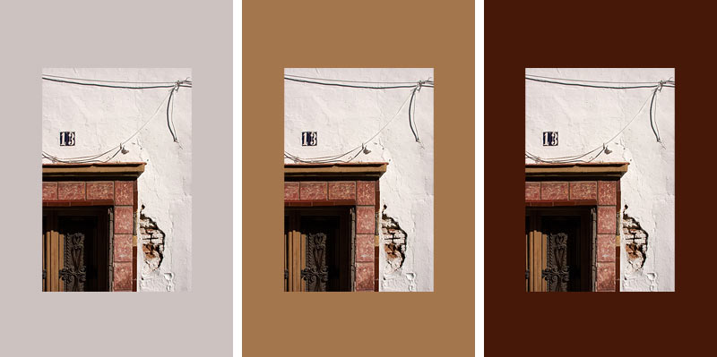
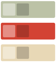
In the above example, I’ve surrounded the photo with three different background colours directly sampled from the photo itself. Moving from left to right, you can see how each of the sampled colours is from an area of increasingly smaller coverage within the photo, and yet there’s still a strong harmony between the photo and the background image. I don’t really need to pick the big obvious colours from the photo to create that match, I can easily concentrate on more interesting colours that might work better for what I intend.
Using a similar palette, let’s apply those colour choices to a more interesting layout:

In this mini-layout, I’ve re-used the same tan colour from the previous middle image as a background, and sampled out a nicely matching colour for the top and bottom overlays, as well as the two different text colours. Because these colours all fall within a narrow range, the overall balance is harmonious.
What if I want to try something a little more daring? I have a photo of stacked chairs of all different colours, and I’d like to use a few more of those. No problem, provided I watch my colour contrast:

Though it uses varying shades of red, green, and yellow, this palette actually works because the values are even, and the colours muted. Placing red on top of green is usually a hideous combination of death, but if the green is drab enough and the red contrasts well enough, the result can actually be quite pleasing. I’ve chosen red as my loudest colour in this palette, and left green and yellow to play the quiet supporting roles.
Obviously, there are no hard and fast rules here. You might not want to sample absolutely every colour in your scheme from a photo. There are times where you’ll need a variation that’s just a little bit lighter, or a blue that’s not in the photo. You might decide to start from a photo base and tweak, or add in colours of your own. That’s okay too.
Tonal Variations
I’ll leave you with a final trick I’ve been using lately, a way to bring a bit more of a formula into the equation and save some steps.
Starting with the same base palette I sampled from the chairs, in the above image I’ve added a pair of overlaying squares that produce tonal variations of each primary. The lighter variation is simply a solid white square set to 40% opacity, the darker one is a black square at 20%. That gives me a highlight and shadow for each colour, which would prove handy if I had to adapt this colour scheme to a larger layout.
I could add a few more squares of varying opacities, or adjust the layer blending modes for different effects, but as this looks like a great place to end, I’ll leave that up to your experimental whims. Happy colouring!
About the author
Dave Shea is the Founder of Bright Creative, and co-organizer of Web Directions North. He blogs sometimes at Mezzoblue and Flickrs a bit more often than that. Oh, and there’s other stuff too.
Brought to you by
Related articles
-
Art Direction and the New WordPress Editor
Mel Choyce explores how the new WordPress editor (also know as Gutenberg) can be used to create more carefully art directed posts. Like gifts carefully arranged beneath the Christmas tree, it’s the contents that matters but the presentation that sells.
-
Be the Villain
Eric Bailey asks us to take on the role of King Herod in our projects to consider how the products, services and processes we design could be abused to cause harm rather than to do good. No matter how good our intentions, we must remember that not every user has pure motivations and that every tool is a weapon if you hold it right.
-
Creating a Weekly Research Cadence
Wren Lanier sets aside time to explore the benefits of a regular schedule for user research. Santa’s elves quickly discovered the benefits of working to a fixed schedule, which is of course why we don’t get presents at Easter.
-
How to Do a UX Review
Joe Leech offers a rundown on his UX review process, sharing tips about analysing data and creating personas, and setting out findings in a form that benefits clients. From quick wins to workshops, there are gifts here everyone will be grateful for.
-
How to Use Audio on the Web
Ruth John lets the bells ring out for Christmas with a look at a selection of inspiring sites with creative and effective use of audio. The days of jangly MIDI tunes to distract and annoy are thankfully long behind us, with browser APIs offering new and exciting ways to generate sound. Ahead is a beautiful sonic landscape. Ding dong!
-
What I Learned about Product Design This Year
Meagan Fisher casts a thoughtful glance back over her work this year and considers what it means to design a product rather than a marketing experience. Pour yourself a cup of eggnog, grab a mince pie or two and gather around the fireside. Are you sitting comfortably? Good, then we shall begin.