Gravity-Defying Page Corners

While working on Stikkit, a “page curl” came to be.
Not being as crafty as Veerle, you see.
I fired up Photoshop to see what could be.
“Another copy is running on the network“ … oopsie.
With license issues sorted out and a concept in mind
I set out to create something flexible and refined.
One background image and code that is sure to be lean.
A simple solution for lazy people like me.
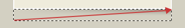
The curl I’ll be showing isn’t a curl at all.
It’s simply a gradient that’s 18 pixels tall.
With a fade to the left that’s diagonally aligned
and a small fade on the right that keeps the illusion defined.

Create a selection with the marquee tool (keeping in mind a reasonable minimum width) and drag a gradient (black to transparent) from top to bottom.
Now drag a gradient (the background color of the page to transparent) from the bottom left corner to the top right corner.
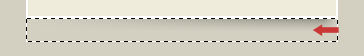
Finally, drag another gradient from the right edge towards the center, about 20 pixels or so.
But the top is flat and can be positioned precisely
just under the bottom right edge very nicely.
And there it will sit, never ever to be busted
by varying sizes of text when adjusted.
<div id="page">
	<div id="page-contents">
		<h2>Gravity-Defying!</h2>
		<p>Lorem ipsum dolor ...</p>
	</div>
</div>
Let’s dive into code and in the markup you’ll see
“is that an extra div?” … please don’t kill me?
The #page div sets the width and bottom padding
whose height is equal to the shadow we’re adding.
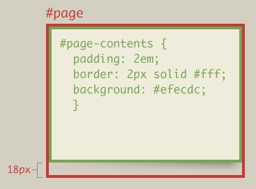
The #page-contents div will set padding in ems
to scale with the text size the user intends.
The background color will be added here too
but not overlapping the shadow where #page’s padding makes room.
A simple technique that you may find amusing
is to substitute a PNG for the GIF I was using.
For that would be crafty and future-proof, too.
The page curl could sit on any background hue.
I hope you’ve enjoyed this easy little trick.
It’s hardly earth-shattering, and arguably slick.
But it could come in handy, you just never know.
Happy Holidays! And pleasant dreams of web three point oh.
About the author
Dan Cederholm is a web designer and author based in Salem, Massachusetts. He’s the founder of SimpleBits, a tiny web design studio. He’s writes and speaks (in non-poetic form) about interface design during the day, and plays the ukulele and drinks wine at night.
Photo: Scott Beale / Laughing Squid
Brought to you by
Related articles
-
Art Direction and the New WordPress Editor
Mel Choyce explores how the new WordPress editor (also know as Gutenberg) can be used to create more carefully art directed posts. Like gifts carefully arranged beneath the Christmas tree, it’s the contents that matters but the presentation that sells.
-
Be the Villain
Eric Bailey asks us to take on the role of King Herod in our projects to consider how the products, services and processes we design could be abused to cause harm rather than to do good. No matter how good our intentions, we must remember that not every user has pure motivations and that every tool is a weapon if you hold it right.
-
Creating a Weekly Research Cadence
Wren Lanier sets aside time to explore the benefits of a regular schedule for user research. Santa’s elves quickly discovered the benefits of working to a fixed schedule, which is of course why we don’t get presents at Easter.
-
How to Do a UX Review
Joe Leech offers a rundown on his UX review process, sharing tips about analysing data and creating personas, and setting out findings in a form that benefits clients. From quick wins to workshops, there are gifts here everyone will be grateful for.
-
How to Use Audio on the Web
Ruth John lets the bells ring out for Christmas with a look at a selection of inspiring sites with creative and effective use of audio. The days of jangly MIDI tunes to distract and annoy are thankfully long behind us, with browser APIs offering new and exciting ways to generate sound. Ahead is a beautiful sonic landscape. Ding dong!
-
What I Learned about Product Design This Year
Meagan Fisher casts a thoughtful glance back over her work this year and considers what it means to design a product rather than a marketing experience. Pour yourself a cup of eggnog, grab a mince pie or two and gather around the fireside. Are you sitting comfortably? Good, then we shall begin.