Centered Tabs with CSS

Doug Bowman’s Sliding Doors is pretty much the de facto way to build tabbed navigation with CSS, and rightfully so – it is, as they say, rockin’ like Dokken. But since it relies heavily on floats for the positioning of its tabs, we’re constrained to either left- or right-hand navigation. But what if we need a bit more flexibility? What if we need to place our navigation in the center?
Styling the li as a floated block does give us a great deal of control over margin, padding, and other presentational styles. However, we should learn to love the inline box – with it, we can create a flexible, centered alternative to floated navigation lists.
Humble Beginnings
Do an extra shot of ‘nog, because you know what’s coming next. That’s right, a simple unordered list:
<div id="navigation">
     <ul>
          <li><a href="#"><span>Home</span></a></li>
          <li><a href="#"><span>About</span></a></li>
          <li><a href="#"><span>Our Work</span></a></li>
          <li><a href="#"><span>Products</span></a></li>
          <li class="last"><a href="#"><span>Contact Us</span></a></li>
     </ul>
</div>
If we were wedded to using floats to style our list, we could easily fix the width of our ul, and trick it out with some margin: 0 auto; love to center it accordingly. But this wouldn’t net us much flexibility: if we ever changed the number of navigation items, or if the user increased her browser’s font size, our design could easily break.
Instead of worrying about floats, let’s take the most basic approach possible: let’s turn our list items into inline elements, and simply use text-align to center them within the ul:
#navigation ul, #navigation ul li {
     list-style: none;
     margin: 0;
     padding: 0;
}

#navigation ul {
     text-align: center;
}

#navigation ul li {
     display: inline;
     margin-right: .75em;
}

#navigation ul li.last {
     margin-right: 0;
}
Our first step is sexy, no? Well, okay, not really – but it gives us a good starting point. We’ve tamed our list by removing its default styles, set the list items to display: inline, and centered the lot. Adding a background color to the links shows us exactly how the different elements are positioned.
Now the fun stuff.
Inline Elements, Padding, and You
So how do we give our links some dimensions? Well, as the CSS specification tells us, the height property isn’t an option for inline elements such as our anchors. However, what if we add some padding to them?
#navigation li a {
     padding: 5px 1em;
}
I just love leading questions. Things are looking good, but something’s amiss: as you can see, the padded anchors seem to be escaping their containing list.
Thankfully, it’s easy to get things back in line. Our anchors have 5 pixels of padding on their top and bottom edges, right? Well, by applying the same vertical padding to the list, our list will finally “contain” its child elements once again.
’Tis the Season for Tabbing
Now, we’re finally able to follow the “Sliding Doors” model, and tack on some graphics:
#navigation ul li a {
     background: url("tab-right.gif") no-repeat 100% 0;
     color: #06C;
     padding: 5px 0;
     text-decoration: none;
}

#navigation ul li a span {
     background: url("tab-left.gif") no-repeat;
     padding: 5px 1em;
}

#navigation ul li a:hover span {
     color: #69C;
     text-decoration: underline;
}
Finally, our navigation’s looking appropriately sexy. By placing an equal amount of padding on the top and bottom of the ul, our tabs are properly “contained”, and we can subsequently style the links within them.
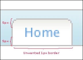
But what if we want them to bleed over the bottom-most border? Easy: we can simply decrease the bottom padding on the list by one pixel, like so.
A Special Note for Special Browsers
The Mac IE5 users in the audience are likely hopping up and down by now: as they’ve discovered, our centered navigation behaves rather annoyingly in their browser. As Philippe Wittenbergh has reported, Mac IE5 is known to create “phantom links” in a block-level element when text-align is set to any value but the default value of left. Thankfully, Philippe has documented a workaround that gets that [censored] venerable browser to behave. Simply place the following code into your CSS, and the links will be restored to their appropriate width:
/**//*/
#navigation ul li a {
     display: inline-block;
     white-space: nowrap;
     width: 1px;
}
/**/
IE for Windows, however, displays an extra kind of crazy. The padding I’ve placed on my anchors is offsetting the spans that contain the left curve of my tabs; thankfully, these shenanigans are easily straightened out:
/**/
* html #navigation ul li a {
     padding: 0;
}
/**/
And with that, we’re finally finished.
All set.
And that’s it. With your centered navigation in hand, you can finally enjoy those holiday toddies and uncomfortable conversations with your skeevy Uncle Eustace.
About the author
Ethan Marcotte is an independent designer and developer, and the fellow who coined the term “responsive web design”. He is the author of two books on the topic, Responsive Web Design and Responsive Design: Patterns and Principles, and has been known to give a conference talk or two. Ethan is passionate about digital design, emerging markets, and ensuring global access, and has been known to link to the odd GIF now and again.
Brought to you by
Related articles
-
A History of CSS Through Fifteen Years of 24 ways
Rachel Andrew guides us through a tour of the last fifteen years in CSS layout, as manifested in articles here on 24 ways. From the days when Internet Explorer 6 was de rigueur, right up to the modern age of evergreen browsers, the only thing you can be sure of is that the web never stands still for long.
-
A Modern Typographic Scale
Rob Weychert reaches for the top notes to sing us a song of typographic scale. A little attention to scale and to the mathematics will help you to hit a high note with your designs this Christmas and beyond.
-
Beautiful Scrolling Experiences – Without Libraries
Michelle Barker appears as one of a heavenly host, coming forth with scroll in hand to pronounce an end to janky scrolljacking! Unto us a new specification is born, in the city of TimBL, and its name shall be called Scroll Snap.
-
Cascading Web Design with Feature Queries
Chen Hui Jing pulls off the dust covers, swings open the storm shutters and lets the winter light fall on the subject of CSS feature queries. The chestnuts may not yet be roasting, and the halls may be still be undecked, but pull up a chair and settle down. It’s Christmas.
-
Clip Paths Know No Bounds
Dan Wilson throws some Christmas shapes and gives us a run down of different ways to use CSS polygon clip paths to create interesting a flexible shapes with less code that you might have thought. It may be the time of year to follow a star, but was the star plotted with five or ten points?
-
Flexible Captioned Slanted Images
Eric Meyer gift wraps the most awkwardly shaped of boxes using nothing but CSS, HTML and a little curl of ribbon. No matter how well you plan and how much paper you have at your disposal, sometimes you just need to slant the gift to the side.


