Broader Border Corners

A note from the editors: Since this article was written the CSS border-radius property has become widely supported in browsers. It should be preferred to this image technique.
A quick and easy recipe for turning those single-pixel borders that the kids love so much into into something a little less right-angled.
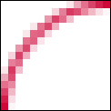
Here’s the principle: We have a box with a one-pixel wide border around it. Inside that box is another box that has a little rounded-corner background image sitting snugly in one of its corners. The inner-box is then nudged out a bit so that it’s actually sitting on top of the outer box. If it’s all done properly, that little background image can mask the hard right angle of the default border of the outer-box, giving the impression that it actually has a rounded corner.
Take An Image, Finely Chopped
Add A Sprinkle of Markup
<div id="content">
    <p>Lorem ipsum etc. etc. etc.</p>
</div>
Throw In A Dollop of CSS
#content {
     border: 1px solid #c03;
}

#content p {
     background: url(corner.gif) top left no-repeat;
     position: relative;
     left: -1px;
     top: -1px;
     padding: 1em;
     margin: 0;
}
Bubblin’ Hot
- The content div has a one-pixel wide red border around it.
- The paragraph is given a single instance of the background image, created to look like a one-pixel wide arc.
- The paragraph is shunted outside of the box – back one pixel and up one pixel – so that it is sitting over the div’s border. The white area of the image covers up that part of the border’s corner, and the arc meets up with the top and left border.
- Because, in this example, we’re applying a background image to a paragraph, its top margin needs to be zeroed so that it starts at the top of its container.
Et voilà. Bon appétit.
Extra Toppings
- If you want to apply a curve to each one of the corners and you run out of meaningful markup to hook the background images on to, throw some spans or divs in the mix (there’s nothing wrong with this if that’s the effect you truly want – they don’t hurt anybody) or use some nifty DOM Scripting to put the scaffolding in for you.
- Note that if you’ve got more than one of these relative corners, you will need to compensate for the starting position of each box which is nested in an already nudged parent.
- You’re not limited to one pixel wide, rounded corners – the same principles apply to thicker borders, or corners with different shapes.
About the author
Patrick Griffiths has been doing the professional web developer thing since 1999, and HTML and CSS has pretty much always been his specialty. He has worked for the likes of Vodafone, Wiley, and on various UK Government projects, and has contributed a number of articles and projects to well respected web design resources.
Brought to you by
Related articles
-
A History of CSS Through Fifteen Years of 24 ways
Rachel Andrew guides us through a tour of the last fifteen years in CSS layout, as manifested in articles here on 24 ways. From the days when Internet Explorer 6 was de rigueur, right up to the modern age of evergreen browsers, the only thing you can be sure of is that the web never stands still for long.
-
A Modern Typographic Scale
Rob Weychert reaches for the top notes to sing us a song of typographic scale. A little attention to scale and to the mathematics will help you to hit a high note with your designs this Christmas and beyond.
-
Beautiful Scrolling Experiences – Without Libraries
Michelle Barker appears as one of a heavenly host, coming forth with scroll in hand to pronounce an end to janky scrolljacking! Unto us a new specification is born, in the city of TimBL, and its name shall be called Scroll Snap.
-
Cascading Web Design with Feature Queries
Chen Hui Jing pulls off the dust covers, swings open the storm shutters and lets the winter light fall on the subject of CSS feature queries. The chestnuts may not yet be roasting, and the halls may be still be undecked, but pull up a chair and settle down. It’s Christmas.
-
Clip Paths Know No Bounds
Dan Wilson throws some Christmas shapes and gives us a run down of different ways to use CSS polygon clip paths to create interesting a flexible shapes with less code that you might have thought. It may be the time of year to follow a star, but was the star plotted with five or ten points?
-
Flexible Captioned Slanted Images
Eric Meyer gift wraps the most awkwardly shaped of boxes using nothing but CSS, HTML and a little curl of ribbon. No matter how well you plan and how much paper you have at your disposal, sometimes you just need to slant the gift to the side.


