CSS3 Patterns, Explained

Many of you have probably seen my CSS3 patterns gallery. It became very popular throughout the year and it showed many web developers how powerful CSS3 gradients really are. But how many really understand how these patterns are created? The biggest benefit of CSS-generated backgrounds is that they can be modified directly within the style sheet. This benefit is void if we are just copying and pasting CSS code we don’t understand. We may as well use a data URI instead.
Important note
In all the examples that follow, I’ll be using gradients without a vendor prefix, for readability and brevity. However, you should keep in mind that in reality you need to use all the vendor prefixes (-moz-, -ms-, -o-, -webkit-) as no browser currently implements them without a prefix. Alternatively, you could use -prefix-free and have the current vendor prefix prepended at runtime, only when needed.
The syntax described here is the one that browsers currently implement. The specification has since changed, but no browser implements the changes yet. If you are interested in what is coming, I suggest you take a look at the dev version of the spec.
If you are not yet familiar with CSS gradients, you can read these excellent tutorials by John Allsopp and return here later, as in the rest of the article I assume you already know the CSS gradient basics:
The main idea
I’m sure most of you can imagine the background this code generates:
background: linear-gradient(left, white 20%, #8b0 80%);It’s a simple gradient from one color to another that looks like this:

As you probably know, in this case the first 20% of the container’s width is solid white and the last 20% is solid green. The other 60% is a smooth gradient between these colors. Let’s try moving these color stops closer to each other:
background: linear-gradient(left, white 30%, #8b0 70%);
background: linear-gradient(left, white 40%, #8b0 60%);
background: linear-gradient(left, white 50%, #8b0 50%);
Notice how the gradient keeps shrinking and the solid color areas expanding, until there is no gradient any more in the last example. We can even adjust the position of these two color stops to control where each color abruptly changes into another:
background: linear-gradient(left, white 30%, #8b0 30%);
background: linear-gradient(left, white 90%, #8b0 90%);
What you need to take away from these examples is that when two color stops are at the same position, there is no gradient, only solid colors. Even without going any further, this trick is useful for a number of different use cases like faux columns or the effect I wanted to achieve in my homepage or the -prefix-free page where the background is only shown on one side and hidden on the other:

Combining with background-size
We can do wonders, however, if we combine this with the CSS3 background-size property:
background: linear-gradient(left, white 50%, #8b0 50%);
background-size: 100px 100px;
And there it is. We just created the simplest of patterns: (vertical) stripes. We can remove the first parameter (left) or replace it with top and we’ll get horizontal stripes. However, let’s face it: Horizontal and vertical stripes are kinda boring. Most stripey backgrounds we see on the web are diagonal. So, let’s try doing that.
Our first attempt would be to change the angle of the gradient to something like 45deg. However, this results in an ugly pattern like this:

Before reading on, think for a second: why didn’t this produce the desired result? Can you figure it out?
The reason is that the gradient angle rotates the gradient inside each tile, not the tiled background as a whole. However, didn’t we have the same problem the first time we tried to create diagonal stripes with an image? And then we learned that every stripe has to be included twice, like so:
So, let’s try to create that effect with CSS gradients. It’s essentially what we tried before, but with more color stops:
background: linear-gradient(45deg, white 25%,
    #8b0 25%, #8b0 50%,
    white 50%, white 75%,
    #8b0 75%);
background-size:100px 100px;
And there we have our stripes! An easy way to remember the order of the percentages and colors it is that you always have two of the same in succession, except the first and last color.
Note: Firefox for Mac also needs an additional 100% color stop at the end of any pattern with more than two stops, like so: ..., white 75%, #8b0 75%, #8b0). The bug was reported in February 2011 and you can vote for it and track its progress at Bugzilla.
Unfortunately, this is essentially a hack and we will realize that if we try to change the gradient angle to 60deg:

Not that maintainable after all, eh? Luckily, CSS3 offers us another way of declaring such backgrounds, which not only helps this case but also results in much more concise code:
background: repeating-linear-gradient(60deg, white, white 35px, #8b0 35px, #8b0 70px);
In this case, however, the size has to be declared in the color stop positions and not through background-size, since the gradient is supposed to cover the entire container. You might notice that the declared size is different from the one specified the previous way. This is because the size of the stripes is measured differently: in the first example we specify the dimensions of the tile itself; in the second, the width of the stripes (35px), which is measured diagonally.
Multiple backgrounds
Using only one gradient you can create stripes and that’s about it. There are a few more patterns you can create with just one gradient (linear or radial) but they are more or less boring and ugly. Almost every pattern in my gallery contains a number of different backgrounds. For example, let’s create a polka dot pattern:
background: radial-gradient(circle, white 10%, transparent 10%),
radial-gradient(circle, white 10%, black 10%) 50px 50px;
background-size:100px 100px;
Notice that the two gradients are almost the same image, but positioned differently to create the polka dot effect. The only difference between them is that the first (topmost) gradient has transparent instead of black. If it didn’t have transparent regions, it would effectively be the same as having a single gradient, as the topmost gradient would obscure everything beneath it.
There is an issue with this background. Can you spot it?
This background will be fine for browsers that support CSS gradients but, for browsers that don’t, it will be transparent as the whole declaration is ignored. We have two ways to provide a fallback, each for different use cases. We have to either declare another background before the gradient, like so:
background: black;
background: radial-gradient(circle, white 10%, transparent 10%),
radial-gradient(circle, white 10%, black 10%) 50px 50px;
background-size:100px 100px;
or declare each background property separately:
background-color: black;
background-image: radial-gradient(circle, white 10%, transparent 10%),
radial-gradient(circle, white 10%, transparent 10%);
background-size:100px 100px;
background-position: 0 0, 50px 50px;
The vigilant among you will have noticed another change we made to our code in the last example: we altered the second gradient to have transparent regions as well. This way background-color serves a dual purpose: it sets both the fallback color and the background color of the polka dot pattern, so that we can change it with just one edit. Always strive to make code that can be modified with the least number of edits. You might think that it will never be changed in that way but, almost always, given enough time, you’ll be proved wrong.
We can apply the exact same technique with linear gradients, in order to create checkerboard patterns out of right triangles:
background-color: white;
background-image: linear-gradient(45deg, black 25%, transparent 25%, transparent 75%, black 75%),
linear-gradient(45deg, black 25%, transparent 25%, transparent 75%, black 75%);
background-size:100px 100px;
background-position: 0 0, 50px 50px;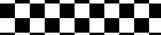
Using the right units
Don’t use pixels for the sizes without any thought. In some cases, ems make much more sense. For example, when you want to make a lined paper background, you want the lines to actually follow the text. If you use pixels, you have to change the size every time you change font-size. If you set the background-size in ems, it will naturally follow the text and you will only have to update it if you change line-height.
Is it possible?
The shapes that can be achieved with only one gradient are:
- stripes
- right triangles
- circles and ellipses
- semicircles and other shapes formed from slicing ellipses horizontally or vertically
You can combine several of them to create squares and rectangles (two right triangles put together), rhombi and other parallelograms (four right triangles), curves formed from parts of ellipses, and other shapes.
Just because you can doesn’t mean you should
Technically, anything can be crafted with these techniques. However, not every pattern is suitable for it. The main advantages of this technique are:
- no extra HTTP requests
- short code
- human-readable code (unlike data URIs) that can be changed without even leaving the CSS file.
Complex patterns that require a large number of gradients are probably better left to SVG or bitmap images, since they negate almost every advantage of this technique:
- they are not shorter
- they are not really comprehensible – changing them requires much more effort than using an image editor
They still save an HTTP request, but so does a data URI.
I have included some very complex patterns in my gallery, because even though I think they shouldn’t be used in production (except under very exceptional conditions), understanding how they work and coding them helps somebody understand the technology in much more depth.
Another rule of thumb is that if your pattern needs shapes to obscure parts of other shapes, like in the star pattern or the yin yang pattern, then you probably shouldn’t use it. In these patterns, changing the background color requires you to also change the color of these shapes, making edits very tedious.
If a certain pattern is not practicable with a reasonable amount of CSS, that doesn’t mean you should resort to bitmap images. SVG is a very good alternative and is supported by all modern browsers.
Browser support
CSS gradients are supported by Firefox 3.6+, Chrome 10+, Safari 5.1+ and Opera 11.60+ (linear gradients since Opera 11.10). Support is also coming in Internet Explorer when IE10 is released. You can get gradients in older WebKit versions (including most mobile browsers) by using the proprietary -webkit-gradient(), if you really need them.
Epilogue
I hope you find these techniques useful for your own designs. If you come up with a pattern that’s very different from the ones already included, especially if it demonstrates a cool new technique, feel free to send a pull request to the github repo of the patterns gallery. Also, I’m always fascinated to see my techniques put in practice, so if you made something cool and used CSS patterns, I’d love to know about it!
Happy holidays!
About the author
Lea Verou is the lead web developer and designer of Fresset Ltd, which she co-founded in 2008. Fresset owns and manages some of the largest Greek community websites. Lea has a long-standing passion for open web standards, especially CSS and JavaScript. She loves researching new ways to use them and shares her findings through her blog, lea.verou.me. She speaks at a number of the largest web development conferences and writes for leading industry publications. Lea also co-organized and occasionally lectures the web development course at the Athens University of Economics and Business.
Brought to you by
Related articles
-
A History of CSS Through Fifteen Years of 24 ways
Rachel Andrew guides us through a tour of the last fifteen years in CSS layout, as manifested in articles here on 24 ways. From the days when Internet Explorer 6 was de rigueur, right up to the modern age of evergreen browsers, the only thing you can be sure of is that the web never stands still for long.
-
A Modern Typographic Scale
Rob Weychert reaches for the top notes to sing us a song of typographic scale. A little attention to scale and to the mathematics will help you to hit a high note with your designs this Christmas and beyond.
-
Beautiful Scrolling Experiences – Without Libraries
Michelle Barker appears as one of a heavenly host, coming forth with scroll in hand to pronounce an end to janky scrolljacking! Unto us a new specification is born, in the city of TimBL, and its name shall be called Scroll Snap.
-
Cascading Web Design with Feature Queries
Chen Hui Jing pulls off the dust covers, swings open the storm shutters and lets the winter light fall on the subject of CSS feature queries. The chestnuts may not yet be roasting, and the halls may be still be undecked, but pull up a chair and settle down. It’s Christmas.
-
Clip Paths Know No Bounds
Dan Wilson throws some Christmas shapes and gives us a run down of different ways to use CSS polygon clip paths to create interesting a flexible shapes with less code that you might have thought. It may be the time of year to follow a star, but was the star plotted with five or ten points?
-
Flexible Captioned Slanted Images
Eric Meyer gift wraps the most awkwardly shaped of boxes using nothing but CSS, HTML and a little curl of ribbon. No matter how well you plan and how much paper you have at your disposal, sometimes you just need to slant the gift to the side.


