The Articulate Web Designer of Tomorrow

You could say that we design to communicate, and that we seek emotive responses. It sounds straightforward, and it can be, but leaving it to chance isn’t wise. Many wander into web design without formal training, and whilst that certainly isn’t essential, we owe it to ourselves to draw on wider influences, learn from the past, and think smarter.
What knowledge can we ourselves explore in order to become better designers? In addition, how can we take this knowledge, investigate it through our unique discipline, and in turn speak more eloquently about what we do on the web? Below, I outline a number of things that I personally believe all designers should be using and exploring collectively.
Taking stock
Where we’re at is good. Finding clarity through web standards, we’ve ended up quite modernist in our approach, pursuing function, elegance and reduction. However, we’re not great at articulating our own design processes and principles to outsiders. Equally, we rely heavily on our instincts when deciding if something is or isn’t good. That’s fine, but we can better understand why things are the way they are by looking a little deeper, thereby helping us articulate what goes on in our design brains to our peers, our clients and to normal humans.
As designers we use ideas, concepts, text and images. We apply our ideas and experience, imposing order and structure to content, hoping to ease the communication of an idea to the largest possible audience or to a specific audience. We consciously manipulate most of what is available to us, but not all. There is something else we can use. I often think that brilliant work demands a keen understanding of the magical visual language that informs design.
Embracing an established visual language
This is a language whose alphabet is shapes, structures, colours, lines and rhythms. When effective, it is somewhat invisible, subliminally enforcing messages and evoking meaning, using methods solidly rooted in a grammar perceptible in virtually all extraordinary creative work. The syntax for art, architecture, film, and furniture, industrial and graphic design (think Bauhaus and the Swiss style perhaps), this language urges us to become fluent if we aim for a more powerful dialogue with our audience.
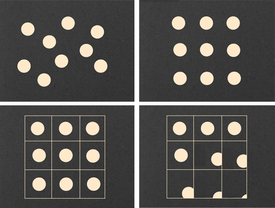 Figure 1: Structures (clockwise from top-left): Informal; Formal; Active; Visible.
The greatest creative minds our world has produced could understand some or all of this language. Line and point, form and shape. Abstract objects. Formal and informal structures. Visual distribution. Balance, composition and the multitudinous approaches to symmetry. Patterns and texture. Movement and paths. Repetition, rhythm and frequency. Colour theory. Whitespace and the pause. The list goes on.
The genius we perceive in our creative heroes is often a composite of experience, trial and error, conviction, intuition – even accident – but rarely does great work arise without an initial understanding of the nuts and bolts that help communicate an idea or emotion.
Our world of interactivity
As web designers, our connection with this language is most evident in graphic design. With more technological ease and power comes the responsibility to understand, wisely use, and be able to justify many of our decisions. We have moved beyond the scope of print into a world of interactivity, but we shouldn’t let go of any established principles without good reason.
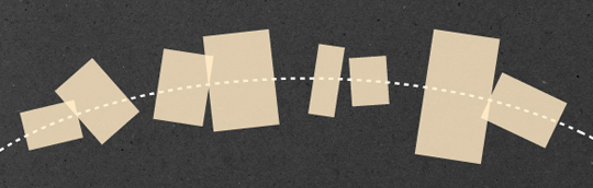 Figure 2: Understanding movement of objects in any direction along a defined path.
For example, immersion in this visual language can improve our implementation of CSS3 and JavaScript behaviour. With CSS3, we’ve seen a resurgence in CSS experimentation, some of which has been wonderful, but much of it has appeared clumsy. In the race to make something spin, twist, flip or fly from one corner to another, the designer sometimes fails to think about the true movement they seek to emulate. What forces are supposedly affecting this movement? What is the expected path of this transition and is it being respected?
Stopping to think about what is really supposed to be happening on the page compels us to use complex animations, diagrams and rotations more carefully. It helps us to better understand paths and movement.
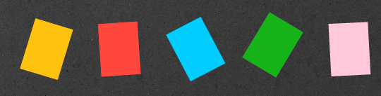 Figure 3: Repetition can occur through variations in colour, shape, direction, and so on.
It can only be of greater benefit to be mindful of symmetries, depth, affordance, juxtaposition, balance, economy and reduction. A deeper understanding of basic structures can help us to say more with sketches, wireframes, layouts and composition. We’ve all experimented with grids and rhythm but, to truly benefit from these long-established principles, we are duty-bound to understand their possibilities more than we will by simply leveraging a free framework or borrowing some CSS.
Design is not a science, but…
Threading through all of this is what we have learned from science, and what it teaches us of the human brain. This visual language matters because technology changes but, for the most part, people don’t. For centuries, we humans have received and interpreted information in much the same way. Understanding more of how we perceive meaning can help designers make smarter decisions, and call on visual language to underpin these decisions. It is our responsibility as designers to be aware of mental models, mapping, semiotics, sensory experience and human emotion.
Design itself is not a science, but the appropriate use of visual language and scientific understanding exposes the line between effective and awkward, between communicative and mute. By strengthening our mental and analytical approach to what is often done arbitrarily or “because it feels right”, we simply become better designers.
A visual language for the web
So, I’ve outlined numerous starting points and areas worthy of deeper investigation, and hopefully you’re eager to do some research. However, I’ve mostly discussed established ideas and principles that we as web designers can learn from. It’s my belief that our community has a shared responsibility to expand this visual language as it applies to the ebb and flow of the web. Indulge me as I conclude with a related tangent.
In defining a visual language specifically for the web, we must continue to mature. The old powerfully influences the new, but we must intelligently expand the visual language of masterful work and articulate what is uniquely ours.
For example, phrases like Ethan Marcotte’s Responsive Web Design aren’t merely elegant, they describe a new way of thinking and working, of communicating about designs and interaction patterns. These phrases broaden our vocabulary and are immediately adopted by designers worldwide, in both conversation and execution.
Our legacy
Our new definitions should flex and not be tied to specific devices or methods which fade away or morph with time. Our legacy is perhaps more about robust and flexible patterns and systems than it is about specific devices or programming languages.
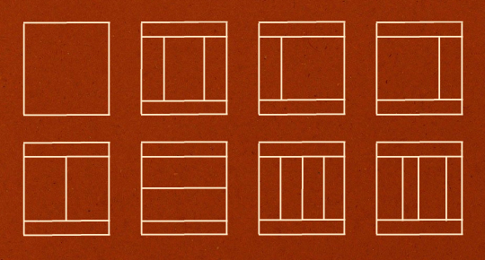 Figure 4: As web designers, we should think about systems, not pages.
The established principles we adopt and whatever new ways of thinking we define should slip neatly into a wider philosophy about our approach to web design. We’re called, as a community, to define what is distinctive about the visual language of the web, create this vocabulary, this dialect that resonates with us and moves us forward as we tackle each day’s work. Let’s give it some thought.
Further reading
This is my immediate “go-to” list of books that I bullishly believe all web designers should own, but there is so much more out there to read. Sadly, many great texts relating to this stuff are often out of print. Feel free to share your recommendations.
About the author
Simon Collison is a designer, author and speaker with a decade of experience at the sharp end. He co-founded Erskine Design back in 2006, but left in early 2010 to pursue new and exciting challenges, including writing an ambitious new book, and organising the New Adventures in Web Design event. Simon has lived in London and Reykjavik, but now lives back in his hometown of Nottingham, where he is owned by a cat.
Photo: Lachlan Hardy
Brought to you by
Related articles
-
Art Direction and the New WordPress Editor
Mel Choyce explores how the new WordPress editor (also know as Gutenberg) can be used to create more carefully art directed posts. Like gifts carefully arranged beneath the Christmas tree, it’s the contents that matters but the presentation that sells.
-
Be the Villain
Eric Bailey asks us to take on the role of King Herod in our projects to consider how the products, services and processes we design could be abused to cause harm rather than to do good. No matter how good our intentions, we must remember that not every user has pure motivations and that every tool is a weapon if you hold it right.
-
Creating a Weekly Research Cadence
Wren Lanier sets aside time to explore the benefits of a regular schedule for user research. Santa’s elves quickly discovered the benefits of working to a fixed schedule, which is of course why we don’t get presents at Easter.
-
How to Do a UX Review
Joe Leech offers a rundown on his UX review process, sharing tips about analysing data and creating personas, and setting out findings in a form that benefits clients. From quick wins to workshops, there are gifts here everyone will be grateful for.
-
How to Use Audio on the Web
Ruth John lets the bells ring out for Christmas with a look at a selection of inspiring sites with creative and effective use of audio. The days of jangly MIDI tunes to distract and annoy are thankfully long behind us, with browser APIs offering new and exciting ways to generate sound. Ahead is a beautiful sonic landscape. Ding dong!
-
What I Learned about Product Design This Year
Meagan Fisher casts a thoughtful glance back over her work this year and considers what it means to design a product rather than a marketing experience. Pour yourself a cup of eggnog, grab a mince pie or two and gather around the fireside. Are you sitting comfortably? Good, then we shall begin.