An Introduction to CSS 3-D Transforms

Ladies and gentlemen, it is the second decade of the third millennium and we are still kicking around the same 2-D interface we got three decades ago. Sure, Apple debuted a few apps for OSX 10.7 that have a couple more 3-D flourishes, and Microsoft has had that Flip 3D for a while. But c’mon – 2011 is right around the corner. That’s Twenty Eleven, folks. Where is our 3-D virtual reality? By now, we should be zipping around the Metaverse on super-sonic motorbikes.
Granted, the capability of rendering complex 3-D environments has been present for years. On the web, there are already several solutions: Flash; three.js in <canvas>; and, eventually, WebGL. Finally, we meagre front-end developers have our own three-dimensional jewel: CSS 3-D transforms!
Rationale
Like a beautiful jewel, 3-D transforms can be dazzling, a true spectacle to behold. But before we start tacking 3-D diamonds and rubies to our compositions like Liberace‘s tailor, we owe it to our users to ask how they can benefit from this awesome feature.
An entire application should not take advantage of 3-D transforms. CSS was built to style documents, not generate explorable environments. I fail to find a benefit to completing a web form that can be accessed by swivelling my viewport to the Sign-Up Room (although there have been proposals to make the web just that). Nevertheless, there are plenty of opportunities to use 3-D transforms in between interactions with the interface, via transitions.
Take, for instance, the Weather App on the iPhone. The application uses two views: a details view; and an options view. Switching between these two views is done with a 3-D flip transition. This informs the user that the interface has two – and only two – views, as they can exist only on either side of the same plane.
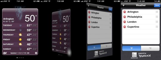 Flipping from details view to options view via a 3-D transition
Also, consider slide shows. When you’re looking at the last slide, what cues tip you off that advancing will restart the cycle at the first slide? A better paradigm might be achieved with a 3-D transform, placing the slides side-by-side in a circle (carousel) in three-dimensional space; in that arrangement, the last slide obviously comes before the first.
3-D transforms are more than just eye candy. We can also use them to solve dilemmas and make our applications more intuitive.
Current support
The CSS 3D Transforms module has been out in the wild for over a year now. Currently, only Safari supports the specification – which includes Safari on Mac OS X and Mobile Safari on iOS.
The support roadmap for other browsers varies. The Mozilla team has taken some initial steps towards implementing the module. Mike Taylor tells me that the Opera team is keeping a close eye on CSS transforms, and is waiting until the specification is fleshed out. And our best friend Internet Explorer still needs to catch up to 2-D transforms before we can talk about the 3-D variety.
To make matters more perplexing, Safari’s WebKit cousin Chrome currently accepts 3-D transform declarations, but renders them in 2-D space. Chrome team member Paul Irish, says that 3-D transforms are on the horizon, perhaps in one of the next 8.0 releases.
This all adds up to a bit of a challenge for those of us excited by 3-D transforms. I’ll give it to you straight: missing the dimension of depth can make degradation a bit ungraceful. Unless the transform is relatively simple and holds up in non-3D-supporting browsers, you’ll most likely have to design another solution. But what’s another hurdle in a steeplechase? We web folk have had our mettle tested for years. We’re prepared to devise multiple solutions.
Here’s the part of the article where I mention Modernizr, and you brush over it because you’ve read this part of an article hundreds of times before. But seriously, it’s the best way to test for CSS 3-D transform support. Use it.
Even with these difficulties mounting up, trying out 3-D transforms today is the right move. The CSS 3-D transforms module was developed by the same team at Apple that produced the CSS 2D Transforms and Animation modules. Both specifications have since been adopted by Mozilla and Opera. Transforming in three-dimensions now will guarantee you’ll be ahead of the game when the other browsers catch up.
The choice is yours. You can make excuses and pooh-pooh 3-D transforms because they’re too hard and only snobby Apple fans will see them today. Or, with a tip of the fedora to Mr Andy Clarke, you can get hard-boiled and start designing with the best features out there right this instant.
So, I bid you, in the words of the eternal Optimus Prime…
Transform and roll out.
Let’s get coding.
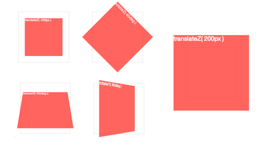
Perspective
To activate 3-D space, an element needs perspective. This can be applied in two ways: using the transform property, with the perspective as a functional notation:
-webkit-transform: perspective(600);or using the perspective property:
-webkit-perspective: 600;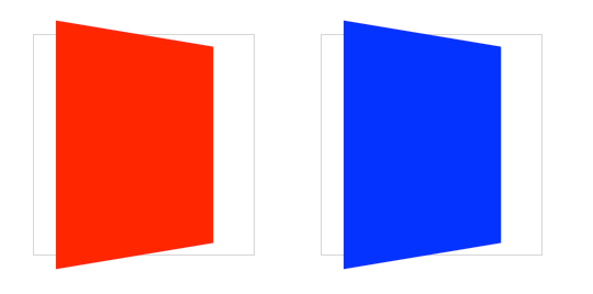 The red element on the left uses
 transform: perspective() functional notation; the blue element on the right uses the perspective property
These two formats both trigger a 3-D space, but there is a difference. The first, functional notation is convenient for directly applying a 3-D transform on a single element (in the previous example, I use it in conjunction with a rotateY transform). But when used on multiple elements, the transformed elements don’t line up as expected. If you use the same transform across elements with different positions, each element will have its own vanishing point. To remedy this, use the perspective property on a parent element, so each child shares the same 3-D space.
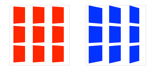 Each red box on the left has its own vanishing point within the parent container; the blue boxes on the right share the vanishing point of the parent container
The value of perspective determines the intensity of the 3-D effect. Think of it as a distance from the viewer to the object. The greater the value, the further the distance, so the less intense the visual effect. perspective: 2000; yields a subtle 3-D effect, as if we were viewing an object from far away. perspective: 100; produces a tremendous 3-D effect, like a tiny insect viewing a massive object.
By default, the vanishing point for a 3-D space is positioned at its centre. You can change the position of the vanishing point with perspective-origin property.
-webkit-perspective-origin: 25% 75%;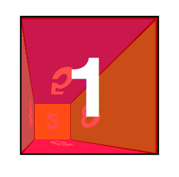
3-D transform functions
As a web designer, you’re probably well acquainted with working in two dimensions, X and Y, positioning items horizontally and vertically. With a 3-D space initialised with perspective, we can now transform elements in all three glorious spatial dimensions, including the third Z dimension, depth.
3-D transforms use the same transform property used for 2-D transforms. If you’re familiar with 2-D transforms, you’ll find the basic 3D transform functions fairly similar.
rotateX(angle)rotateY(angle)rotateZ(angle)translateZ(tz)scaleZ(sz)
Whereas translateX() positions an element along the horizontal X-axis, translateZ() positions it along the Z-axis, which runs front to back in 3-D space. Positive values position the element closer to the viewer, negative values further away.
The rotate functions rotate the element around the corresponding axis. This is somewhat counter-intuitive at first, as you might imagine that rotateX will spin an object left to right. Instead, using rotateX(45deg) rotates an element around the horizontal X-axis, so the top of the element angles back and away, and the bottom gets closer to the viewer.
 3-D
3-D rotate() and translate() functions around each axis
There are also several shorthand transform functions that require values for all three dimensions:
translate3d(tx,ty,tz)scale3d(sx,sy,sz)rotate3d(rx,ry,rz,angle)
Pro-tip: These foo3d() transform functions also have the benefit of triggering hardware acceleration in Safari. Dean Jackson, CSS 3-D transform spec author and main WebKit dude, writes (to Thomas Fuchs):
In essence, any transform that has a 3D operation as one of its functions will trigger hardware compositing, even when the actual transform is 2D, or not doing anything at all (such as
translate3d(0,0,0)). Note this is just current behaviour, and could change in the future (which is why we don’t document or encourage it). But it is very helpful in some situations and can significantly improve redraw performance.
For the sake of simplicity, my demos will use the basic transform functions, but if you’re writing production-ready CSS for iOS or Safari-only, make sure to use the foo3d() functions to get the best rendering performance.
Card flip
We now have all the tools to start making 3-D objects. Let’s get started with something simple: flipping a card.
Here’s the basic markup we’ll need:
<section class="container">
  <div id="card">
    <figure class="front">1</figure>
    <figure class="back">2</figure>
  </div>
</section>
The .container will house the 3-D space. The #card acts as a wrapper for the 3-D object. Each face of the card has a separate element: .front; and .back. Even for such a simple object, I recommend using this same pattern for any 3-D transform. Keeping the 3-D space element and the object element(s) separate establishes a pattern that is simple to understand and easier to style.
We’re ready for some 3-D stylin’. First, apply the necessary perspective to the parent 3-D space, along with any size or positioning styles.
.container {
  width: 200px;
  height: 260px;
  position: relative;
  -webkit-perspective: 800;
}
Now the #card element can be transformed in its parent’s 3-D space. We’re combining absolute and relative positioning so the 3-D object is removed from the flow of the document. We’ll also add width: 100%; and height: 100%;. This ensures the object’s transform-origin will occur in the centre of .container. More on transform-origin later.
Let’s add a CSS3 transition so users can see the transform take effect.
#card {
  width: 100%;
  height: 100%;
  position: absolute;
  -webkit-transform-style: preserve-3d;
  -webkit-transition: -webkit-transform 1s;
}
The .container’s perspective only applies to direct descendant children, in this case #card. In order for subsequent children to inherit a parent’s perspective, and live in the same 3-D space, the parent can pass along its perspective with transform-style: preserve-3d. Without 3-D transform-style, the faces of the card would be flattened with its parents and the back face’s rotation would be nullified.
To position the faces in 3-D space, we’ll need to reset their positions in 2-D with position: absolute. In order to hide the reverse sides of the faces when they are faced away from the viewer, we use backface-visibility: hidden.
#card figure {
  display: block;
  position: absolute;
  width: 100%;
  height: 100%;
  -webkit-backface-visibility: hidden;
}
To flip the .back face, we add a basic 3-D transform of rotateY(180deg).
#card .front {
  background: red;
}
#card .back {
  background: blue;
  -webkit-transform: rotateY(180deg);
}
With the faces in place, the #card requires a corresponding style for when it is flipped.
#card.flipped {
  -webkit-transform: rotateY(180deg);
}
Now we have a working 3-D object. To flip the card, we can toggle the flipped class. When .flipped, the #card will rotate 180 degrees, thus exposing the .back face.
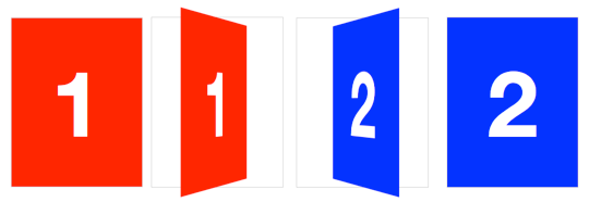 Flipping a card in three dimensions
Slide-flip
Take another look at the Weather App 3-D transition. You’ll notice that it’s not quite the same effect as our previous demo. If you follow the right edge of the card, you’ll find that its corners stay within the container. Instead of pivoting from the horizontal centre, it pivots on that right edge. But the transition is not just a rotation – the edge moves horizontally from right to left. We can reproduce this transition just by modifying a couple of lines of CSS from our original card flip demo.
The pivot point for the rotation occurs at the right side of the card. By default, the transform-origin of an element is at its horizontal and vertical centre (50% 50% or center center). Let’s change it to the right side:
#card { -webkit-transform-origin: right center; }That flip now needs some horizontal movement with translateX. We’ll set the rotation to -180deg so it flips right side out.
#card.flipped {
  -webkit-transform: translateX(-100%) rotateY(-180deg);
}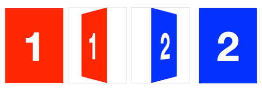 Creating a slide-flip from the right edge of the card
Cube
Creating 3-D card objects is a good way to get started with 3-D transforms. But once you’ve mastered them, you’ll be hungry to push it further and create some true 3-D objects: prisms. We’ll start out by making a cube.
The markup for the cube is similar to the card. This time, however, we need six child elements for all six faces of the cube:
<section class="container">
  <div id="cube">
    <figure class="front">1</figure>
    <figure class="back">2</figure>
    <figure class="right">3</figure>
    <figure class="left">4</figure>
    <figure class="top">5</figure>
    <figure class="bottom">6</figure>
  </div>
</section>
Basic position and size styles set the six faces on top of one another in the container.
.container {
  width: 200px;
  height: 200px;
  position: relative;
  -webkit-perspective: 1000;
}
#cube {
  width: 100%;
  height: 100%;
  position: absolute;
  -webkit-transform-style: preserve-3d;
}
#cube figure {
  width: 196px;
  height: 196px;
  display: block;
  position: absolute;
  border: 2px solid black;
}
With the card, we only had to rotate its back face. The cube, however, requires that five of the six faces to be rotated. Faces 1 and 2 will be the front and back. Faces 3 and 4 will be the sides. Faces 5 and 6 will be the top and bottom.
#cube .front { -webkit-transform: rotateY(0deg); }
#cube .back { -webkit-transform: rotateX(180deg); }
#cube .right { -webkit-transform: rotateY(90deg); }
#cube .left { -webkit-transform: rotateY(-90deg); }
#cube .top { -webkit-transform: rotateX(90deg); }
#cube .bottom { -webkit-transform: rotateX(-90deg); }
We could remove the first #cube .front style declaration, as this transform has no effect, but let’s leave it in to keep our code consistent.
Now each face is rotated, and only the front face is visible. The four side faces are all perpendicular to the viewer, so they appear invisible. To push them out to their appropriate sides, they need to be translated out from the centre of their positions. Each side of the cube is 200 pixels wide. From the cube’s centre they’ll need to be translated out half that distance, 100px.
#cube .front { -webkit-transform: rotateY(0deg) translateZ(100px); }
#cube .back { -webkit-transform: rotateX(180deg) translateZ(100px); }
#cube .right { -webkit-transform: rotateY(90deg) translateZ(100px); }
#cube .left { -webkit-transform: rotateY(-90deg) translateZ(100px); }
#cube .top { -webkit-transform: rotateX(90deg) translateZ(100px); }
#cube .bottom { -webkit-transform: rotateX(-90deg) translateZ(100px); }
Note here that the translateZ function comes after the rotate. The order of transform functions is important. Take a moment and soak this up. Each face is first rotated towards its position, then translated outward in a separate vector.
We have a working cube, but we’re not done yet.
Returning to the Z-axis origin
For the sake of our users, our 3-D transforms should not distort the interface when the active panel is at its resting position. But once we start pushing elements off their Z-axis origin, distortion is inevitable.
In order to keep 3-D transforms snappy, Safari composites the element, then applies the transform. Consequently, anti-aliasing on text will remain whatever it was before the transform was applied. When transformed forward in 3-D space, significant pixelation can occur.
Looking back at the Perspective 3 demo, note that no matter how small the perspective value is, or wherever the transform-origin may be, the panel number 1 always returns to its original position, as if all those funky 3-D transforms didn’t even matter.
To resolve the distortion and restore pixel perfection to our #cube, we can push the 3-D object back, so that the front face will be positioned back to the Z-axis origin.
#cube { -webkit-transform: translateZ(-100px); } Restoring the front face to the original position on the Z-axis
Rotating the cube
To expose any face of the cube, we’ll need a style that rotates the cube to expose any face. The transform values are the opposite of those for the corresponding face. We toggle the necessary class on the #box to apply the appropriate transform.
#cube.show-front { -webkit-transform: translateZ(-100px) rotateY(0deg); }
#cube.show-back { -webkit-transform: translateZ(-100px) rotateX(-180deg); }
#cube.show-right { -webkit-transform: translateZ(-100px) rotateY(-90deg); }
#cube.show-left { -webkit-transform: translateZ(-100px) rotateY(90deg); }
#cube.show-top { -webkit-transform: translateZ(-100px) rotateX(-90deg); }
#cube.show-bottom { -webkit-transform: translateZ(-100px) rotateX(90deg); }
Notice how the order of the transform functions has reversed. First, we push the object back with translateZ, then we rotate it.
Finishing up, we can add a transition to animate the rotation between states.
#cube { -webkit-transition: -webkit-transform 1s; }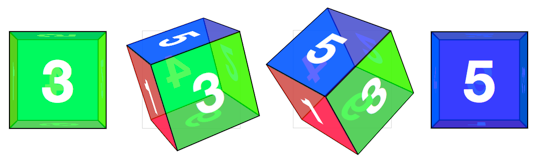 Rotating the cube with a CSS
 transition
Rectangular prism
Cubes are easy enough to generate, as we only have to worry about one measurement. But how would we handle a non-regular rectangular prism? Let’s try to make one that’s 300 pixels wide, 200 pixels high, and 100 pixels deep.
The markup remains the same as the #cube, but we’ll switch the cube id for #box. The container styles remain mostly the same:
.container {
  width: 300px;
  height: 200px;
  position: relative;
  -webkit-perspective: 1000;
}
#box {
  width: 100%;
  height: 100%;
  position: absolute;
  -webkit-transform-style: preserve-3d;
}
Now to position the faces. Each set of faces will need their own sizes. The smaller faces (left, right, top and bottom) need to be positioned in the centre of the container, where they can be easily rotated and then shifted outward. The thinner left and right faces get positioned left: 100px ((300 − 100) ÷ 2), The stouter top and bottom faces get positioned top: 50px ((200 − 100) ÷ 2).
#box figure {
  display: block;
  position: absolute;
  border: 2px solid black;
}
#box .front,
#box .back {
  width: 296px;
  height: 196px;
}
#box .right,
#box .left {
  width: 96px;
  height: 196px;
  left: 100px;
}
#box .top,
#box .bottom {
  width: 296px;
  height: 96px;
  top: 50px;
}
The rotate values can all remain the same as the cube example, but for this rectangular prism, the translate values do differ. The front and back faces are each shifted out 50 pixels since the #box is 100 pixels deep. The translate value for the left and right faces is 150 pixels for their 300 pixels width. Top and bottom panels take 100 pixels for their 200 pixels height:
#box .front { -webkit-transform: rotateY(0deg) translateZ(50px); }
#box .back { -webkit-transform: rotateX(180deg) translateZ(50px); }
#box .right { -webkit-transform: rotateY(90deg) translateZ(150px); }
#box .left { -webkit-transform: rotateY(-90deg) translateZ(150px); }
#box .top { -webkit-transform: rotateX(90deg) translateZ(100px); }
#box .bottom { -webkit-transform: rotateX(-90deg) translateZ(100px); }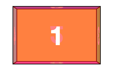
Just like the cube example, to expose a face, the #box needs to have a style to reverse that face’s transform. Both the translateZ and rotate values are the opposites of the corresponding face.
#box.show-front { -webkit-transform: translateZ(-50px) rotateY(0deg); }
#box.show-back { -webkit-transform: translateZ(-50px) rotateX(-180deg); }
#box.show-right { -webkit-transform: translateZ(-150px) rotateY(-90deg); }
#box.show-left { -webkit-transform: translateZ(-150px) rotateY(90deg); }
#box.show-top { -webkit-transform: translateZ(-100px) rotateX(-90deg); }
#box.show-bottom { -webkit-transform: translateZ(-100px) rotateX(90deg); } Rotating the rectangular box with a CSS
 transition
Carousel
Front-end developers have a myriad of choices when it comes to content carousels. Now that we have 3-D capabilities in our browsers, why not take a shot at creating an actual 3-D carousel?
The markup for this demo takes the same form as the box, cube and card. Let’s make it interesting and have a carousel with nine panels.
<div class="container">
  <div id="carousel">
    <figure>1</figure>
    <figure>2</figure>
    <figure>3</figure>
    <figure>4</figure>
    <figure>5</figure>
    <figure>6</figure>
    <figure>7</figure>
    <figure>8</figure>
    <figure>9</figure>
  </div>
</div>
Now, apply basic layout styles. Let’s give each panel of the #carousel 20 pixel gaps between one another, done here with left: 10px; and top: 10px;. The effective width of each panel is 210 pixels.
.container {
  width: 210px;
  height: 140px;
  position: relative;
  -webkit-perspective: 1000;
}
#carousel {
  width: 100%;
  height: 100%;
  position: absolute;
  -webkit-transform-style: preserve-3d;
}
#carousel figure {
  display: block;
  position: absolute;
  width: 186px;
  height: 116px;
  left: 10px;
  top: 10px;
  border: 2px solid black;
}
Next up: rotating the faces. This #carousel has nine panels. If each panel gets an equal distribution on the carousel, each panel would be rotated forty degrees from its neighbour (360 ÷ 9).
#carousel figure:nth-child(1) { -webkit-transform: rotateY(0deg); }
#carousel figure:nth-child(2) { -webkit-transform: rotateY(40deg); }
#carousel figure:nth-child(3) { -webkit-transform: rotateY(80deg); }
#carousel figure:nth-child(4) { -webkit-transform: rotateY(120deg); }
#carousel figure:nth-child(5) { -webkit-transform: rotateY(160deg); }
#carousel figure:nth-child(6) { -webkit-transform: rotateY(200deg); }
#carousel figure:nth-child(7) { -webkit-transform: rotateY(240deg); }
#carousel figure:nth-child(8) { -webkit-transform: rotateY(280deg); }
#carousel figure:nth-child(9) { -webkit-transform: rotateY(320deg); }
Now, the outward shift. Back when we were creating the cube and box, the translate value was simple to calculate, as it was equal to one half the width, height or depth of the object. With this carousel, there is no size we can automatically use as a reference. We’ll have to calculate the distance of the shift by other means.
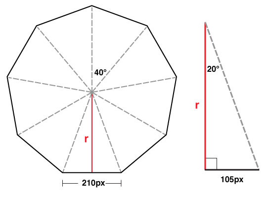
Drawing a diagram of the carousel, we can see that we know only two things: the width of each panel is 210 pixels; and the each panel is rotated forty degrees from the next. If we split one of these segments down its centre, we get a right-angled triangle, perfect for some trigonometry.
We can determine the length of r in this diagram with a basic tangent equation:
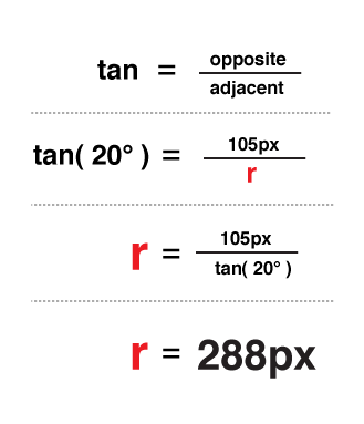
There you have it: the panels need to be translated 288 pixels in 3-D space.
#carousel figure:nth-child(1) { -webkit-transform: rotateY(0deg) translateZ(288px); }
#carousel figure:nth-child(2) { -webkit-transform: rotateY(40deg) translateZ(288px); }
#carousel figure:nth-child(3) { -webkit-transform: rotateY(80deg) translateZ(288px); }
#carousel figure:nth-child(4) { -webkit-transform: rotateY(120deg) translateZ(288px); }
#carousel figure:nth-child(5) { -webkit-transform: rotateY(160deg) translateZ(288px); }
#carousel figure:nth-child(6) { -webkit-transform: rotateY(200deg) translateZ(288px); }
#carousel figure:nth-child(7) { -webkit-transform: rotateY(240deg) translateZ(288px); }
#carousel figure:nth-child(8) { -webkit-transform: rotateY(280deg) translateZ(288px); }
#carousel figure:nth-child(9) { -webkit-transform: rotateY(320deg) translateZ(288px); }
If we decide to change the width of the panel or the number of panels, we only need to plug in those two variables into our equation to get the appropriate translateZ value. In JavaScript terms, that equation would be:
var tz = Math.round( ( panelSize / 2 ) /
  Math.tan( ( ( Math.PI * 2 ) / numberOfPanels ) / 2 ) );
// or simplified to
var tz = Math.round( ( panelSize / 2 ) /
  Math.tan( Math.PI / numberOfPanels ) );
Just like our previous 3-D objects, to show any one panel we need only apply the reverse transform on the carousel. Here’s the style to show the fifth panel:
-webkit-transform: translateZ(-288px) rotateY(-160deg);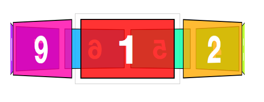
By now, you probably have two thoughts:
- Rewriting transform styles for each panel looks tedious.
- Why bother doing high school maths? Aren’t robots supposed to be doing all this work for us?
And you’re absolutely right. The repetitive nature of 3-D objects lends itself to scripting. We can offload all the monotonous transform styles to our dynamic script, which, if done correctly, will be more flexible than the hard-coded version.
Conclusion
3-D transforms change the way we think about the blank canvas of web design. Better yet, they change the canvas itself, trading in the flat surface for voluminous depth.
My hope is that you took at least one peak at a demo and were intrigued. We web designers, who have rejoiced for border-radius, box-shadow and background gradients, now have an incredible tool at our disposal in 3-D transforms. They deserve just the same enthusiasm, research and experimentation we have seen on other CSS3 features. Now is the perfect time to take the plunge and start thinking about how to use three dimensions to elevate our craft. I’m breathless waiting for what’s to come.
See you on the flip side.
About the author
If the Web were a coloring book, David DeSandro would be the kid manically scribbling outside the lines of every page, whittling away his front-end development crayons to wee nubs. Lucky for him, he’s paid to do the thing he loves, creating engaging, innovative interfaces at nclud. Come nightfall, he dons a cape, develops resources, journals his discoveries, and fights crime around Washington DC.
Brought to you by
Related articles
-
A History of CSS Through Fifteen Years of 24 ways
Rachel Andrew guides us through a tour of the last fifteen years in CSS layout, as manifested in articles here on 24 ways. From the days when Internet Explorer 6 was de rigueur, right up to the modern age of evergreen browsers, the only thing you can be sure of is that the web never stands still for long.
-
A Modern Typographic Scale
Rob Weychert reaches for the top notes to sing us a song of typographic scale. A little attention to scale and to the mathematics will help you to hit a high note with your designs this Christmas and beyond.
-
Beautiful Scrolling Experiences – Without Libraries
Michelle Barker appears as one of a heavenly host, coming forth with scroll in hand to pronounce an end to janky scrolljacking! Unto us a new specification is born, in the city of TimBL, and its name shall be called Scroll Snap.
-
Cascading Web Design with Feature Queries
Chen Hui Jing pulls off the dust covers, swings open the storm shutters and lets the winter light fall on the subject of CSS feature queries. The chestnuts may not yet be roasting, and the halls may be still be undecked, but pull up a chair and settle down. It’s Christmas.
-
Clip Paths Know No Bounds
Dan Wilson throws some Christmas shapes and gives us a run down of different ways to use CSS polygon clip paths to create interesting a flexible shapes with less code that you might have thought. It may be the time of year to follow a star, but was the star plotted with five or ten points?
-
Flexible Captioned Slanted Images
Eric Meyer gift wraps the most awkwardly shaped of boxes using nothing but CSS, HTML and a little curl of ribbon. No matter how well you plan and how much paper you have at your disposal, sometimes you just need to slant the gift to the side.


