Calculating Color Contrast

Some websites and services allow you to customize your profile by uploading pictures, changing the background color or other aspects of the design. As a customer, this personalization turns a web app into your little nest where you store your data. As a designer, letting your customers have free rein over the layout and design is a scary prospect. So what happens to all the stock text and images that are designed to work on nice white backgrounds? Even the Mac only lets you choose between two colors for the OS, blue or graphite! Opening up the ability to customize your site’s color scheme can be a recipe for disaster unless you are flexible and understand how to find maximum color contrasts.
In this article I will walk you through two simple equations to determine if you should be using white or black text depending on the color of the background. The equations are both easy to implement and produce similar results. It isn’t a matter of which is better, but more the fact that you are using one at all! That way, even with the craziest of Geocities color schemes that your customers choose, at least your text will still be readable.
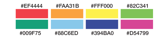
Let’s have a look at a range of various possible colors. Maybe these are pre-made color schemes, corporate colors, or plucked from an image.
Now that we have these potential background colors and their hex values, we need to find out whether the corresponding text should be in white or black, based on which has a higher contrast, therefore affording the best readability. This can be done at runtime with JavaScript or in the back-end before the HTML is served up.
There are two functions I want to compare. The first, I call ’50%’. It takes the hex value and compares it to the value halfway between pure black and pure white. If the hex value is less than half, meaning it is on the darker side of the spectrum, it returns white as the text color. If the result is greater than half, it’s on the lighter side of the spectrum and returns black as the text value.
In PHP:
function getContrast50($hexcolor){
    return (hexdec($hexcolor) > 0xffffff/2) ? 'black':'white';
}
In JavaScript:
function getContrast50(hexcolor){
    return (parseInt(hexcolor, 16) > 0xffffff/2) ? 'black':'white';
}
It doesn’t get much simpler than that! The function converts the six-character hex color into an integer and compares that to one half the integer value of pure white. The function is easy to remember, but is naive when it comes to understanding how we perceive parts of the spectrum. Different wavelengths have greater or lesser impact on the contrast.
The second equation is called ‘YIQ’ because it converts the RGB color space into YIQ, which takes into account the different impacts of its constituent parts. Again, the equation returns white or black and it’s also very easy to implement.
In PHP:
function getContrastYIQ($hexcolor){
	$r = hexdec(substr($hexcolor,0,2));
	$g = hexdec(substr($hexcolor,2,2));
	$b = hexdec(substr($hexcolor,4,2));
	$yiq = (($r*299)+($g*587)+($b*114))/1000;
	return ($yiq >= 128) ? 'black' : 'white';
}
In JavaScript:
function getContrastYIQ(hexcolor){
	var r = parseInt(hexcolor.substr(0,2),16);
	var g = parseInt(hexcolor.substr(2,2),16);
	var b = parseInt(hexcolor.substr(4,2),16);
	var yiq = ((r*299)+(g*587)+(b*114))/1000;
	return (yiq >= 128) ? 'black' : 'white';
}
You’ll notice first that we have broken down the hex value into separate RGB values. This is important because each of these channels is scaled in accordance to its visual impact. Once everything is scaled and normalized, it will be in a range between zero and 255. Much like the previous ’50%’ function, we now need to check if the input is above or below halfway. Depending on where that value is, we’ll return the corresponding highest contrasting color.
That’s it: two simple contrast equations which work really well to determine the best readability.
If you are interested in learning more, the W3C has a few documents about color contrast and how to determine if there is enough contrast between any two colors. This is important for accessibility to make sure there is enough contrast between your text and link colors and the background.
There is also a great article by Kevin Hale on Particletree about his experience with choosing light or dark themes. To round it out, Jonathan Snook created a color contrast picker which allows you to play with RGB sliders to get values for YIQ, contrast and others. That way you can quickly fiddle with the knobs to find the right balance.
Comparing results
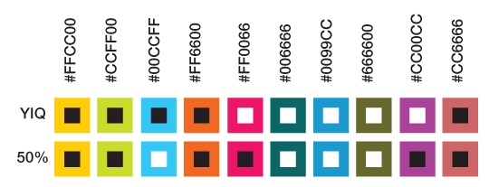
Let’s revisit our color schemes and see which text color is recommended for maximum contrast based on these two equations.
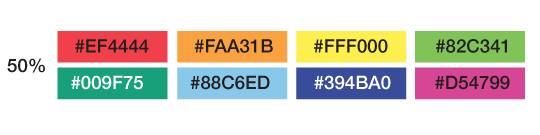
If we use the simple ’50%’ contrast function, we can see that it recommends black against all the colors except the dark green and purple on the second row. In general, the equation feels the colors are light and that black is a better choice for the text.
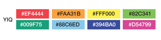
The more complex ‘YIQ’ function, with its weighted colors, has slightly different suggestions. White text is still recommended for the very dark colors, but there are some surprises. The red and pink values show white text rather than black. This equation takes into account the weight of the red value and determines that the hue is dark enough for white text to show the most contrast.
As you can see, the two contrast algorithms agree most of the time. There are some instances where they conflict, but overall you can use the equation that you prefer. I don’t think it is a major issue if some edge-case colors get one contrast over another, they are still very readable.
Now let’s look at some common colors and then see how the two functions compare. You can quickly see that they do pretty well across the whole spectrum.
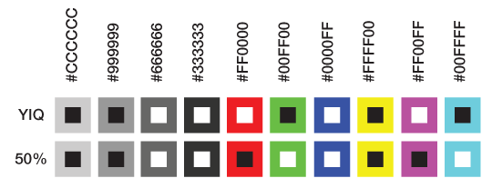
In the first few shades of grey, the white and black contrasts make sense, but as we test other colors in the spectrum, we do get some unexpected deviation. Pure red #FF0000 has a flip-flop. This is due to how the ‘YIQ’ function weights the RGB parts. While you might have a personal preference for one style over another, both are justifiable.
In this second round of colors, we go deeper into the spectrum, off the beaten track. Again, most of the time the contrasting algorithms are in sync, but every once in a while they disagree. You can select which you prefer, neither of which is unreadable.
Conclusion
Contrast in color is important, especially if you cede all control and take a hands-off approach to the design. It is important to select smart defaults by making the contrast between colors as high as possible. This makes it easier for your customers to read, increases accessibility and is generally just easier on the eyes.
Sure, there are plenty of other equations out there to determine contrast; what is most important is that you pick one and implement it into your system.
So, go ahead and experiment with color in your design. You now know how easy it is to guarantee that your text will be the most readable in any circumstance.
About the author
Brian Suda is a master informatician working to make the web a better place little by little everyday. Since discovering the Internet in the mid-90s, Brian Suda has spent a good portion of each day connected to it. His own little patch of Internet is http://suda.co.uk, where many of his past projects and crazy ideas can be found.
Photo: Jeremy Keith
Brought to you by
Related articles
-
Art Direction and the New WordPress Editor
Mel Choyce explores how the new WordPress editor (also know as Gutenberg) can be used to create more carefully art directed posts. Like gifts carefully arranged beneath the Christmas tree, it’s the contents that matters but the presentation that sells.
-
Be the Villain
Eric Bailey asks us to take on the role of King Herod in our projects to consider how the products, services and processes we design could be abused to cause harm rather than to do good. No matter how good our intentions, we must remember that not every user has pure motivations and that every tool is a weapon if you hold it right.
-
Creating a Weekly Research Cadence
Wren Lanier sets aside time to explore the benefits of a regular schedule for user research. Santa’s elves quickly discovered the benefits of working to a fixed schedule, which is of course why we don’t get presents at Easter.
-
How to Do a UX Review
Joe Leech offers a rundown on his UX review process, sharing tips about analysing data and creating personas, and setting out findings in a form that benefits clients. From quick wins to workshops, there are gifts here everyone will be grateful for.
-
How to Use Audio on the Web
Ruth John lets the bells ring out for Christmas with a look at a selection of inspiring sites with creative and effective use of audio. The days of jangly MIDI tunes to distract and annoy are thankfully long behind us, with browser APIs offering new and exciting ways to generate sound. Ahead is a beautiful sonic landscape. Ding dong!
-
What I Learned about Product Design This Year
Meagan Fisher casts a thoughtful glance back over her work this year and considers what it means to design a product rather than a marketing experience. Pour yourself a cup of eggnog, grab a mince pie or two and gather around the fireside. Are you sitting comfortably? Good, then we shall begin.