Jump to content

Year

Day

24 ways to impress your friends

For a long time on the web, we’ve been typographically spoilt. Yes, you heard me correctly. Think about it: our computers come with web fonts already installed; fonts that have been designed specifically to work well online and at small size; and fonts that we can be sure other people have too.

Yes, we’ve been spoilt. We don’t need to think about using Verdana, Arial, Georgia or Cambria.

Yet, for a long time now, designers have felt we needed more. We want to choose whatever typeface we feel necessary for our designs. We did bad things along the way in pursuit of this goal such as images for text. Smart people dreamt up tools to help us such as sIFR, or Cufón. Only fairly recently, @font-face is supported in most browsers. The floodgates are opening. It really is the dawn of a new typographic era on the web. And we must tread carefully.

The New Typesetters

Many years ago, before the advent of desktop publishing, if you wanted words set in a particular typeface, you had to go to a Typesetter. A Typesetter, or Compositor, as they were sometimes called, was a person whose job it was to take the written word (in the form of a document or manuscript) and ‘set’ the type in the desired typeface. The designer would chose what typeface they wanted – and all the ligatures, underlines, italics and whatnot – and then scribble all over the manuscript so the typesetter could set the correct type.

Then along came Desktop Publishing and every Tom, Dick and Harry could choose type on their computer and an entire link in the typographic chain was removed within just a few years. Well, that’s progress I guess. That was until six months ago when Typesetting was reborn on the web in the guise of a font service: Typekit.

Typekit – and services like Typekit such as Typotheque, Kernest and the upcoming Fontdeck – are typesetting services for the web. You supply them with your content, in the form of a webpage, and they provide you with some JavaScript to render that webpage in the typeface you’ve specified simply by adding the font name in your CSS file.

Thanks to services like these, font foundries are now talking to create licensing structures to allow us to embed fonts into our web pages legally – which has always been a sticking point in the past. So, finally, us designers can get what we want: whatever typeface we want on the web.

Yes, but… there are hurdles. One of which is the subject of this article.

The differences between Web Fonts and other fonts

Web fonts are different to normal fonts. They differ in a whole bunch of ways, from loose letter spacing to larger x-heights. But perhaps the most notable practical difference is file size. Let’s take a look at one of Typekit’s latest additions from the FontFont library, Meta.

Meta Roman weighs in at 42 KB. This is a fairly typical file size for a single weight of a good font. Now, let’s have a look at Verdana. Verdana is 186 KB. For one weight. The four weight family for Verdana weighs in at 686 KB. Four weights for half a megabyte!? Why so huge?

Well, Verdana has a lot of information packed into its 186 KB. It has the largest hinting data table of any typeface (the information carried by a font that tells it how to align itself to the pixels on your screen). As it has been shipped with Microsoft products since 1996, it has had time to grow to support many, many languages. Along with its cousin, Georgia (283 KB), Verdana was a new breed of typeface. And it’s grown fat.

If really serious web typography takes off – and by that I mean typefaces specifically designed for the screen – then we’re going to see more fonts increase in file size as the font files include more data. So, if you’re embedding a font weighing in at 100 KB, what happens?

The Flash of Unstyled Text

We all remember the Flash of Unstyled Content bug on Internet Explorer, right? That annoying bug that caused a momentary flash of unstyled HTML page. Well, the same thing can happen with embedding fonts using @font-face. An effect called The Flash of Unstyled Text (FOUT), first coined by Paul Irish. Personally, I prefer to call it the Flash of UnTypeset Text (still FOUT), as the text is styled, just not with what you want.

If you embed a typeface in your CSS, then the browser will download that typeface. Typically, browsers differ in the way they handle this procedure.

Firefox and Opera will render the text using the next font in your font stack until the first (embedded) font is loaded. It will then switch to the embedded font.

Webkit takes the approach that you asked for that font so it will wait until it’s completely loaded before showing it you.

In Opera and Firefox, you get a FOUT. In Webkit, you don’t. You wait.

Hang on there. Didn’t I say that good web fonts weigh in considerably more than ‘normal’ fonts? And whilst the browser is downloading the font, the user gets what to look at? Some pictures, background colours and whatever else isn’t HTML? I believe Webkit’s handling of font embedding – as deliberate as it is – is damaging to the practice of font embedding. Why? Well, we can design to a switch in typeface (as jarring as that is for the user), but we can’t design to blank space.

Let’s have a closer look at how we can design to FOUT.

More considered font stacks

We all know that font stacks in CSS are there for when a user doesn’t have a font; the browser will jump to the next one in the stack. Adding embedded fonts into the font stack means that because of FOUT (in gecko and Opera), the user can see a switch, and depending on their connection that switch could happen well into any reading that the user may be doing.

The practicalities of this are that a user could be reading and be towards the end of a line when the paragraph they are reading changes shape. The word they were digesting suddenly changes to three lines down. It’s the online equivalent of someone turning the page for you when you least expect it. So, how can we think about our font stacks slightly differently so we can minimise the switch?

Two years ago, Richard Rutter wrote on this very site about increasing our font stacks. By increasing the font stacks (by using his handy matrix) we can begin to experiment with different typefaces. However, when we embed a typeface, we must look very carefully at the typefaces in the font stack and the relationship between them. Because, previously, the user would not see a switch from one typeface to another, they’d just get either one or the other. Not both. With FOUT, the user sees two typefaces.

By carefully looking at the characteristics of the typefaces you choose, you can minimise the typographic ‘distance’ between the type down the stack. In doing so, you minimise the jarring effect of the switch.

Let’s take a look at an example of how to go about this.

Micro Typography to build better font stacks

Let’s say I want to use a recent edition to Typekit – Meta Serif Book – as my embedded font. My font stack would start like this:

font-family: 'Meta Serif Bold'; 

Where do you go from here? Well, first, familiarise yourself with Richard’s Font Matrix so you get an idea of what fonts are available for different people. Then start by looking closely at the characters of the embedded font and then compare them to different fonts from the matrix.

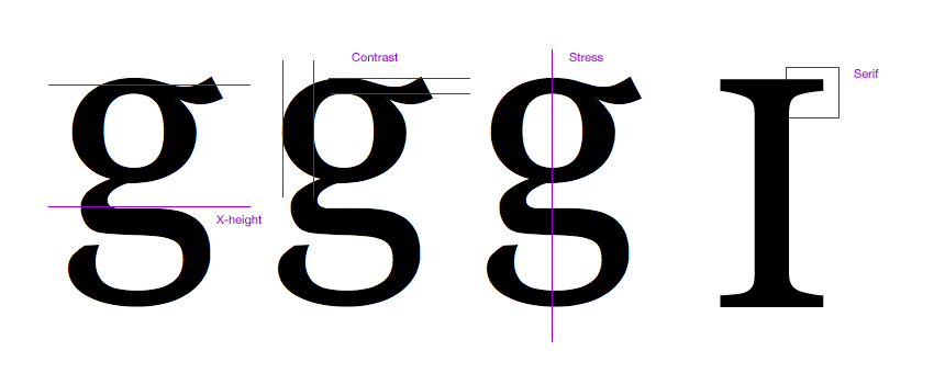
When I do this, I’m looking to match type characteristics such as x-height, contrast (the thickness and thinness of strokes), the stress (the angle of contrast) and the shape of the serifs (if the typeface has any).

Characteristics

Using just these simple comparative metrics means you can get to a ‘best fit’ reasonably quickly. And remember, you’re not after an ideal match. You’re after a match that means the switch is less painful for the reader, but also a typeface that carries similar characteristics so your design doesn’t change too much.

Building upon my choice of embedded font, I can quickly build up a stack by comparing letters.

Comparison

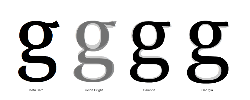
This then creates my ‘best fit’ stack.

Stack

This translates to the CSS as:

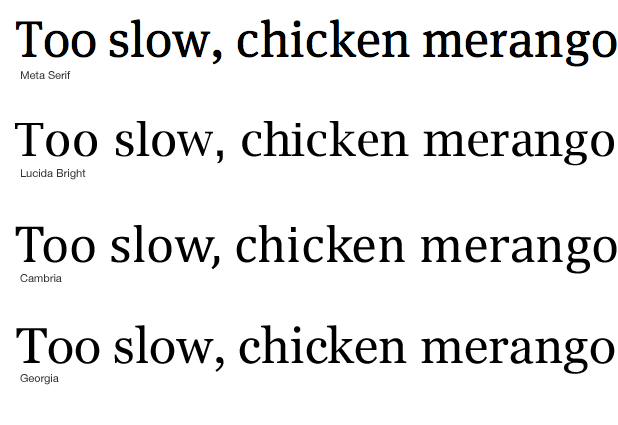
font-family: 'Meta Serif Bold', 'Lucida Bright', Cambria, Georgia, serif 

Following this process, and ending up with considered font stacks, means that we can design to the Flash of UnTypeset Content and ensure that our readers don’t get a diminished experience.

Like what you read?

Comments

Comments are ordered by helpfulness, as indicated by you. Help us pick out the gems and discourage asshattery by voting on notable comments.

Got something to add? You can leave a comment below.

  • prisca http://graphiceyedea.co.uk

    Mark… I knew we’d get another great and inspiring article from you! I do love it when you talk type :)
    Was about to call it a night – then this popped up – couldn’t resist and just had to read it now ;) Thanks for this beautifully written post – and for always going into the fine details :)

    Vote Helpful or Unhelpful

  • Bjarni http://www.bj2design.com

    The more extensive availability of fonts for use on the web will widen the gap or good and bad typography

    Vote Helpful or Unhelpful

  • Sam Rayner http://samrayner.com

    Nice article Mark. Not long ago I created a tool called AltFontPrev that helps you preview alternative typefaces for your font stack. It’s a JavaScript bookmarklet so can be used on any website, live or local.

    I hadn’t considered it at the time but
    hopefully it’ll assist people in FOUT-proofing their pages!

    Vote Helpful or Unhelpful

  • garrick Van Buren http://kernest.com

    Mark – great article. A small correction: Kernest.com is a CSS-only font delivery service, no javascript is involved.

    Vote Helpful or Unhelpful

  • JoshuaNTaylor http://www.joshuataylordesign.com

    Great article and one more thing to think about when we are designing for the web. I think things like this are going to continue spreading the gap between designers who know their stuff and those who don’t.

    Vote Helpful or Unhelpful

  • bevan Stephens http://bevanstephens.com

    Web typography and Red Dwarf, I’m in heaven! thanks.

    Vote Helpful or Unhelpful

  • Derek Anderson http://www.mediaupstream.com

    Thanks for the great article Mark,

    The FOUT is a problem when you base your design around the text sizing, spacing and placement. For instance even if your substitute fonts match up pretty closely in style from one letter like in your example ‘g’, you need to take into consideration the spacing between all the letters, unless the font is monospaced, of course.

    You can manually remove letters that you know you won’t ever be using, from the font files themselves such as Jonathan Snook and others have done to try to combat the file size and FOUT.

    this is a good read on some of the ins and outs of @font-face: http://snook.ca/archives/html_and_css/becoming-a-font-embedding-master

    I’d like to see the operating systems, Windows Mac and Linux all getting quality fonts as default. It’d maybe be worth creating a donate to the ‘web fonts for all’ fund, and get the world to chip in (like wikipedia does wink). The idea would be to raise enough funds to pay the font developers to allow them to include their fonts into all operating systems.

    anyway i’m getting off on a tangent,

    Vote Helpful or Unhelpful

  • Jarin Udom http://jarin.posterous.com

    TypeKit says they are adding the ability to remove unused weights and character sets to reduce file size. I’m not sure how the font downloading works exactly, it would be good for “flash” times, but it might be bad for the ability of browsers to cache fonts to prevent flashes on other sites that use the same font.

    Vote Helpful or Unhelpful

  • Ben http://twitter.com/bachelorchow

    Great article Mark!

    It would be nice if Typekit could include this as part of their service – providing a recommended best font stack for any given font (if they don’t do this already?)

    Vote Helpful or Unhelpful

  • Kyle Gach http://kylegach.com

    What a wonderfully practical and timely article. Thank you!

    Vote Helpful or Unhelpful

  • Heather Flyte http://www.hbflyte.com

    Off-topic –

    I was delighted to see the phrase “Too slow, chicken merango”.

    I say that all the time and people just stare.

    You have fine taste, sir.

    Vote Helpful or Unhelpful

  • Stewart McCoy http://stewartmccoy.info

    I’m curious about the graphic at the end of the article comparing the letter ‘g’ between the different typefaces chosen for your font stack.

    First, should the Meta Serif imposed over the Lucida Bright be more opaque with an opacity similar to the letters imposed over the other two typefaces?

    Second, I respect your typographic knowledge and I do not consider myself by any means a typographic expert, not even an amateur, but as far as I can tell by your example, when comparing the letter ‘g’, Meta Serif appears to most closely match Cambria and not Lucida Bright. So, in the font stack, I would move Cambria into the second position after Meta Serif.

    All the same, a well-considered article. I’m a new reader at 24ways and I consider the publication on par with ALA. Excellently written and designed.

    Vote Helpful or Unhelpful

  • Martin Leblanc http://www.iconfinder.net

    Great post.
    I wouldn’t consider webdesigners typographical spoilt before the @font-face attribute was available :-) Many of these font are ugly and renders badly in small versions.
    I’m looking forward to a prettier web with more distinct typography.

    Vote Helpful or Unhelpful

  • Mark Stickley Http://www.norestfortheweekend.com

    Very interesting article! I’m sure there are a lot of people out there who are talented and lucky enough to do both the design work and the markup, but there are also plenty who do one or the other. How would you suggest the coder approaches an unreceptive designer or a designer whose knowledge of css is limited about this, and vice versa? I imagine it would be more difficult if the design and coding were being done by two separate companies.

    Vote Helpful or Unhelpful

  • Mark Wallis http://www.markwallis.ie

    Excellent post Mark. Really inspiring – you touched briefly on this topic during the recent talk you gave at build. It is great to get an in depth article on the subject. Thank you.

    Vote Helpful or Unhelpful

  • Drew McLellan http://allinthehead.com/

    @Mark Stickley – I think the choice of font stack should always be down to the designer, so it’s a case of educating the designer if they’re not aware of the issues. Sending a link to this article would be an easy option!

    Vote Helpful or Unhelpful

  • Matt Carey http://www.studiolift.com

    Great article Mark.

    A possible small correction?

    If you are choosing Meta Serif Book, shouldn’t the font-family be ‘Meta Serif Book’ and not ‘Meta Serif Bold’?

    Vote Helpful or Unhelpful

  • Chris Emerson http://www.cemerson.co.uk

    Nice article, but I’m confused as to why Lucida Bright was chosen as the ‘best fit’ to the desired font, when Cambria and Georgia appear to match far better?

    Vote Helpful or Unhelpful

  • Mark Boulton http://www.markboulton.co.uk

    @all – thanks!

    @GARRICK VAN BUREN: Apologies.

    @BEVAN STEPHENS: Glad someone got the rather obscure reference :)

    @DEREK ANDERSON: I don’t think FOUT is a problem with placing emphasis on text sizing, placement etc. I think it’s a problem for every user looking at a website and then that website changing whilst they’re reading it. Especially if it alters lines. Thanks for Jon’s link.

    @BEN: Indeed it would. Providing better tools so people can make better font stacks is something every font embedding service should strive for.

    @HEATHER FLYTE: Ah ha! Someone else got the reference too! I say it as well and am often met with strange looks.

    @STEWART MCCOY: The reason I chose Lucida Bright as the second typeface down the stack is it has an overall more condensed look similar to Meta. Whilst Cambria and Georgia may share similar letterform shapes, the overall similarities with Lucida Bright were too many to ignore. But maybe they should be switched around.

    @MARTIN LEBLANC: Verdana et al were designed specifically for screen use. Many typefaces available for embedding were designed to be printed first, viewed on screen second.

    Vote Helpful or Unhelpful

  • Chris McCorkle http://elitesouth.com

    Mark: Great post. Great, great post. That is all.

    Vote Helpful or Unhelpful

  • Rich Underwood http://www.saosilvero.com

    Paul Irish seems to have hit the nail on the head when he coined the term FOUT, whether he realised it or not. In Dutch, fout means mistake and is rather apt in this case.

    Vote Helpful or Unhelpful

  • Scott Kellum http://webfnt.com

    I am working on yet another web font service http://webfnt.com where users purchase just the styles they need.

    Also the reason why system fonts like Veranda are so large is they include most of the unicode character tables. Downloadable web fonts strip as many characters as possible to reduce file size. WOFF is wonderful because it compresses fonts even more.

    I think we are getting a little ahead of our selves though. Web typography has a long way to go. Webkit (safari and chrome) still does not support kerning and ligatures. Firefox has the basic ligature support down but doesn’t support advanced opentype alternates. When I see web fonts I would like them to render properly…

    Vote Helpful or Unhelpful

  • Paul Irish http://paulirish.com

    Great article Mark.

    Another tool we have to help solve this is CSS3’s font-size-adjust (only supported in FF3+)

    With that you can specify the x-height of fonts instead of the cap-height, which will typically be a bit more consistent looking.

    More info on font-size-adjust and a test page

    Vote Helpful or Unhelpful

  • Jason Santa Maria http://jasonsantamaria.com/

    Great article, Mark. Some of the biggest challenges I’ve experienced involve just what you mention, not only typefaces that differ in height with regard to fallbacks, but typefaces that differ in width like condensed faces. When using these, I generally set the type size a big larger than normal, which means the fallbacks are way too big.

    In addition, I think this is going to be an issue that we are dealing with for quite a bit of time. Until download speeds get drastically faster, or file sizes get drastically small (WOFF being a good contender to help this), we will really need to lean heavily on installed fallbacks for extended character sets or language translations.

    Vote Helpful or Unhelpful

  • Dan Sensecall http://www.sensecall.co.uk

    Really nice post – simple and to the point, but something that will definitely be helpful – I wouldn’t have given a thought to this before. Thanks

    Vote Helpful or Unhelpful

  • John Faulds http://www.tyssendesign.com.au

    I’ve been using @font-face for a little while now in projects but only ever for headings and large featured type, never for body copy. Doing so you reduce the impact of any FOUT while still letting you use different fonts.

    Vote Helpful or Unhelpful

  • Richard Rutter http://clagnut.com/

    Like Paul Irish commented, I too have been playing around with font-size-adjust as a way of reducing the impact of FOUT. It only works in Firefox in the moment, but it’s a very effective way of getting x-heights to match perfectly. Obviously there are other metrics and characteristics involved in type matching, but x-height is probably the one with the biggest impact.

    Vote Helpful or Unhelpful

  • Scott Cranfill http://scottish.tumblr.com/

    Oh man, font-size-adjust is amazing! Thanks Paul and Richard for calling my attention to it. I implore other browser-makers to implement it!

    Vote Helpful or Unhelpful

  • Ethan http://www.reportla.com/

    Great article Mark.

    The future of web typography is definitely exciting. As is always the case when designers get more control, the spread between bad and good design will grow; there’ll be a lot of egregious typography, but I think it’ll be a net improvement.

    Also, a small note on the code on your blog: the span tag which holds the drop cap at the start of each post shouldn’t have a title attribute. Title attributes are meant to add additional info, and in the case of that span tag, they’re just repeating the content.

    Thanks

    Vote Helpful or Unhelpful

  • Fenson http://fensonism.blogspot.com

    Great article. I really liked the typeface characteristics comparison step part before building up a font stack.

    Vote Helpful or Unhelpful

  • DesignLovr http://www.designlovr.com

    Amazing Article!
    It is a great approach you take there, but I see a problem with extravagant or unusual fonts that don’t necessarily have a web-safe font equivalent that fits in size and style.

    I’ll definitely apply your tip wherever I can though.

    Vote Helpful or Unhelpful

  • Devils advocate

    For the majority of users, is it really worth the FOUT and other issues when they dont even care/won’t notice a different font?

    Designers will notice

    99% (everybody else) wont

    I am all for better design and better looking sites

    BUT when there is a price to pay for the majority of users and it makes the site worse to use (slightly i will admit) for a benefit they will not notice, appreciate or care about I am not sure it is worth it.

    Designers are very keen on designing for designers, I should know, I am one.

    If you site is aimed at designers then great. Otherwise its very short-sighted.

    Vote Helpful or Unhelpful

  • Elizabeth K. Barone http://ekbdesigns.com

    Personally, I play it safe; I stick with fonts that I <em>know</em> my users will already have on their computer, and use images for fonts that are less common. I don’t want to use the font embed until it’s more compatible. I believe that you cannot, should not, design for designers or for yourself; the majority of your users should be put first.

    I think that the solution presented in this article is a great one, though. Combining this article with the 19th’s article on optimizing font for embedding, I’m much, much more comfortable with trying out the new font embed, and looking forward to shedding my “play it safe” security blankie. Thank you so much for this. I think I’m falling in love with 24 Ways. :D

    Vote Helpful or Unhelpful

Impress us

Be friendly / use Textile

About the author

Mark Boulton

Mark Boulton is a graphic designer from near Cardiff in the UK. He used to work as a Senior Designer for the BBC, before he took leave of his senses and formed his own design consultancy, Mark Boulton Design. He studied typography, enjoys watching a good boxing match, and is partial to a really good cuppa.

More information

Brought to you by:

Perch - a really little cms

The easiest way to publish fast, flexible HTML5 websites your clients will love.