The end of 2009 is fast approaching. Yet another year has passed in a split second. Our Web Designing careers are one year older and it’s time to reflect on the highs and lows of 2009. What was your greatest achievement and what could you have done better? Perhaps, even more importantly, what are your goals for 2010?
Something that I noticed in 2009 is that being a web designer 24/7; it’s easy to get consumed by the web. It’s easy to get caught up in the blog posts, CSS galleries, web trends and Twitter! Living in this bubble can lead to one’s work becoming stale, boring and basically like everyone else’s work on the web. No designer wants this.
So, I say on 1st January 2010 let’s make it our New Year’s resolution to create something different, something special or even ground-breaking! Make it your goal to break the mold of current web design trends and light the way for your fellow web designer comrades!
Of course I wouldn’t let you embark on the New Year empty handed. To help you on your way I’ve compiled a few thoughts and ideas to get your brains ticking!
Don’t design for the web, just design
A key factor in creating something original and fresh for the web is to stop thinking in terms of web design. The first thing we need to do is forget the notion of headers, footers, side bars etc. A website doesn’t necessarily need any of these, so even before we’ve started we’ve already limited our design possibilities by thinking in these very conventional and generally accepted web terms. The browser window is a 2D canvas like any other and we can do with it what we like.
With this in mind we can approach web design from a fresh perspective. We can take inspiration for web design from editorial design, packaging design, comics, poster design, album artwork, motion design, street signage and anything else you can think of. Web design is way more than the just the web and by taking this more wide angled view of what web design is and can be you’ll find there are a thousand more exiting design possibilities.
Note: Try leaving the wire framing till after you’ve gone to town with some initial design concepts. You might find it helps keep your head out of that ‘web space’ a little bit longer, thus enabling you to think more freely about your design. Really go crazy with these as you can always pull it back into line later. The key is to think big initially and then work backwards. There’s no point restricting your creativity early on because your technical knowledge can foresee problems down the line. You can always sort these problems out later on… let your creative juices flow!
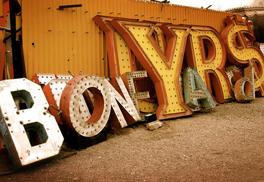
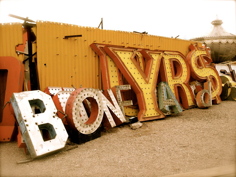
Inspiration can come from anywhere! (Photo: modomatic)
Try something new!
Progress in web design or in any design discipline is a sort of evolution. Design trends and solutions merge and mutate to create new design trends and hopefully better solutions. This is fine but the real leaps are made when someone has the guts to do something different.
Don’t be afraid to challenge the status quo. To create truly original work you have to be prepared to get it wrong and that’s hard to do. When you’re faced with this challenge just remind yourself that in web design there is rarely a ‘best way to do something’, or why would we ever do it any other way?
If you do this and get it right the pay off can be immense. Not only will you work stand out from the crowd by a mile, you will have become a trend setter as opposed to a trend follower.
Tell a story with your design
Great web design is way more than just the aesthetics, functionality or usability. Great web design goes beyond the pixels on the screen. For your website to make a real impact on it’s users it has to connect with them emotionally. So, whether your website is promoting your own company or selling cheese it needs to move people. You need to weave a story into your design. It’s this story that your users will connect with.
To do this the main ingredients of your design need to be strongly connected. In my head those main ingredients are Copy, Graphic Design, Typography, imagery and colour.
Copy
Strong meaningful copy is the backbone to most great web design work. Pay special attention to strap lines and headlines as these are often the sparks that start the fire. All the other elements can be inspired by this backbone of strong copy.
Graphic Design
Use the copy to influence how you treat the page with your graphic design. Let the design echo the words.
Typography
What really excites me about typography isn’t the general text presentation on a page, most half decent web designer have a grasp of this already. What excites me is the potential there is to base a whole design on words and letters. Using the strong copy you already have, one has the opportunity the customise, distort, build and arrange words and letters to create beautiful and powerful compositions that can be the basis for an entire site design.
Get creative with Typography (Photo: Pam Sattler)
Imagery and Colour
With clever use of imagery (photographs or illustrations) and colour you further have the chance to deepen the story you are weaving into your design. The key is to use meaningful imagery, don’t to insert generic imagery for the sake of filling space… it’s just a wasted opportunity.
Remember, the main elements of your design combined are greater than the sum of their parts. Whatever design decisions you make on a page, make them for a good reason. It’s not good enough to try and seduce your users with slick and shiny web pages. For your site to leave a lasting impression on the user you need to make that emotional connection.
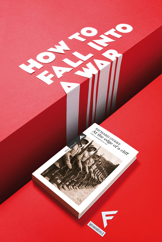
Telling the Story (Advertising Agency: Tita, Milano, Italy, Art Director: Emanuele Basso)
Go one step further
So you’ve almost finished your latest website design. You’ve fulfilled the brief, you’re happy with the result and you’re pretty sure your client will be too. It’s at this point we should ask ourselves “Can I push this further”? What touches could you add to the site that’ll take it beyond what was required and into something exceptional? The truth is, to produce exceptional work we need to do more than is required of us. We need to answer the brief and then some!
Go back through your site and make a note of what enhancements could be made to make the site not just good but outstanding. It might be revisiting a couple of pages that were neglected in the design process, it might be adding some CSS 3 gloss for the users that can benefit from it or it might just be adding some clever little easter eggs to show that you care. These touches will soon add up and make a massive difference to the finished product.
So, go one step further… take it further than you anyone else will. Then your work will stand out for sure.
Parting message
I love being a designer for many of reasons but the main one being that with every new project we embark on we have the chance to express ourselves. We have the chance to create something special, something that people will talk about. It’s this chance that drives us onwards day after day, year after year. So in 2010 shout louder than you ever have before, take chances, try something new and above all design your socks off!


Comments
Got something to add? You can just leave a comment.
10/12/2009
Agree wholeheartedly. As the web evolves the concept of browser-as-canvas is becoming more and more a reality. I also firmly believe that trends, galleries, etc should be watched from a distance and a clear divide established between the inspiration you may find and the work you produce.
10/12/2009
I agree with the need to raise the bar on creative design and to stop sticking to convention. However, a better analogy would be more like browser-as-canvases.
One of the biggest hurdles for us as designers who want to break out from the pack and be freely creative is that we have to be willing to sacrifice compatibility which translates to community. How many times have you had to go back to the drawing board with a design because of cross-browser compatibility issues? I’m really excited about the potential of HTML 5 and CSS 3, but support varies and is still limited.
10/12/2009
And such is the challenge of a web designer – juggling cutting edge design & ideas with the notion that people have to actually use the site.
While a unique, out-of-the-box design is something we all strive for, we have to look out for the user visiting the site. That’s not to say the header, nav & content have to be laid out the same; far from that actually. I believe that more and more users are becoming open to the fact that website don’t always follow such a rigid layout pattern.
Until every user does, however, we have to take into consideration the user’s ability to use the site. Part of the fun in designing sites is just that – finding that balance between cutting edge & familiar.
Great, inspiring post Mike!!!!
10/12/2009
Hi Mike, Great advice and motivation. Good points about living in the world we create, it’s easy to not think critically or creatively when we can just copy what we see from the design galleries. There is something to be said about standing out from the crowd.
However, what happens when we all stand out, that uniqueness will eventually become the norm, and to break it we may find ourselves going in circles.
I believe it was Paul Rand who made this quote famous : “Don’t try to be original. Just try to be good.”, quoting Ludwig Mies van der Rohe.
Let’s not push boundaries and be original for originality sake. After all “…design is not good design if it is irrelevant.” – Paul Rand (again)
10/12/2009
Great article! But what would be really helpful would be a showcase of 25 websites that break trends, so we could get inspiration from it.
Oh wait…
10/12/2009
I’m for it. This movement that is.
Also, thank you for speaking up on the header/sidebar/footer topic. Having just finally gotten rid of them on my own personal blog, I can honestly say I’m happier without them. Yes they’re necessary for some projects, but we seem to have gotten to a point where we as designers are reliant on them to make our designs whole. Ew.
Let’s end on a happy note though: 2009 was great. 2010 will be greater. Especially because of movements like this :) Even as small and specific as they are.
10/12/2009
Nice article, Mike!
Some very good points made – for me, it is encouraging me to go back to graphic design roots.
Think concepts, not conventions.
10/12/2009
I can agree to a certain degree, innovation and pushing the envelope is healthy and good and fun and all. ..
HOWEVER, conventions are conventions for a reason. There is a REASON why books aren’t five foot wide and a reason why it has the spine to the left. On a website, i will try to scroll down, and i will look for a logo which takes me home in the upper left corner somewhere.
There are projects, such as art projects, campaign sites, portfolios etc that is suitable for innovative design.
But when i need information on a company or maybe a government organ, i want that information to be accessible, what i do NOT want is an “experience”. (And I do not want to scroll sideways. scrolling sideways sucks…)
The race to be as innovative as possible is what created splash-sites and other atrocities that people call “expiriences”, but that really just comes between the user and the information.
Fortunately the web isn’t a canvas. It has so much more potential in terms of user-input than a piece of paper. So, sure, push the boundaries and think outside the box, but remember to give the user a shortcut to the relevant content. When i look for opening-hours or adresses or other kinds of text content, i don’t want bells and wistles, I want information, and i want it presented in a readable, acessible way.
And on a second note, design isn’t everything, if you offer some kind of awsome functionality, a logo and a textfield on white background can go a long way…
10/12/2009
@Nils – I agree that creativity shouldn’t be at the expense of usability, however, usability is as much of the design process.
It’s fine to break a convention, provided that whatever you’ve done instead is clear to the user. Do links need to be blue and underlined? No. Do links need to be clear and distinct from regular text to invite interaction? Yes. How that’s achieved is up for grabs.
10/12/2009
This article is a good reminder for designers of all disciplines to get away from what they’re working on and just have a look at the world for a minute.
I don’t think Mike is saying “re-invent the web in 2010”, but what he is saying is “stop looking for inspiration for your next project from your last project”, because that is what makes designers stale.
Go and look at your phone, your kettle, a street sign, advertising hoardings, shop doorways, sports cars, trees, flowers, a pint of beer; soak up the end product, envision the design process, understand the constraints – have a guess on how you would improve it.
Get some inspiration from that.
PS – @Sacha, great comment. ;p
10/12/2009
Thanks for all your comments guys :)
@CHRIS MCKAY
Hi Chris,
I think I mentioned the browser canvas analogy in my article :)
@DAMON BAUER
Hi Damon,
I’m taking it for granted that as web designers we’ll always take into consideration the user’s ability to use the site.
Thanks for the comment :)
@DEREK ANDERSON
What makes you think if we all try something new and original our work will look all the same in the end? My ‘new and original’ will no doubt be completely to your ‘new and original’.
@SACHA
Good point… but on this occasion I wanted to avoid website imagery because the article is partly about finding inspiration away from the web.
@TYLER HAYES
:)
@PHIL RICKETS
Thanks :)
@NILS
Thanks for your comment.
I’m taking it for granted that as a professional and experienced web designer you won’t be breaking conventions for the sake of it. I’m just trying to make the point that we have the opportunity to challenge these if we want. Plus, I wouldn’t suggest you break a well followed convention unless your solution was at least as good as or if not better!
Also, It’s obvious that there are more appropriate times than others to be pushing these boundaries… I think everyone understands this.
+ What Drew said :)
@STEVE HOWE
nicely put :)
10/12/2009
@NILS nails this.
Conventions are there for a reason and for 90% of the work you’ll do it would be counter productive to remove, contradict or otherwise ignore these conventions.
Users who aren’t visiting the website to be astonished by your web 3.0 sideways flying menu with upside-down text will just get lost, get confused and get the hell off the website.
Sure, if you’re building a site for the sole purpose of showing off your skills and the audience will ‘get’ the unconventional, go for it… but I think in the real world these kinds of projects are few and far between.
10/12/2009
For me, a project couldn’t go more wrong if wireframes are left till after design / concepts are done and dusted and there’s no room to breathe (a lot to ask with some “concepts”, we’ve all been there).
That said, you’re totally right – get naked, paint yourself gold and throw yourself at a wall, you might find a splodge that gives you that special spark of creativity! The best designers I know tend to have their fingers in other mediums too, whether that be creating art for galleries, graffiti’ing the neighborhood, carving tattoos, designing for fashion it seems that the hands on world has a lot to offer!
Lets do something different… Where’s my Lego gone…
10/12/2009
I wholeheartedly agree: the more important part of the phrase “web design” is the design part. While there’s a need for conventions and rules, there’s also a time and place for them, and sometimes a groundbreaking idea is what’s needed to freshen things up out of a stagnant state. A revolution is nothing but a series of mini evolutions, so even if every web project goes an extra 1% farther or tries something new on a small-scale, given time it’ll be something revolutionary.
10/12/2009
I love the first statement of don’t design for the web just design.
So many time I get hung up on the capability I am designing for instead of just focussing on making good design
I will vow to try these new resolutions
10/12/2009
This is a great goal! I will definitely be trying to defy the unspoken trends of web design this coming year. I also recently posted an article that readers here might enjoy. It’s titled:
“51 New Year Resolutions for graphic and web designers”
I’ve linked to it in my name above. The article simply lists fifty-one ideas for next year’s goals for graphic and web designers alike.
thanks for the great post.
10/12/2009
Not sure I agree with the attitude. Innovation sure is good, but design for any medium must take context into consideration, as well as their audiences’ previous experience. Web sites/apps’ main objective is to be functional, and design should work towards that.
10/12/2009
Great article! This really does make perfect sense, yet it’s so easily forgotten…Thank you for the great reminder. Well done.
10/12/2009
It’s a nice design exercise, one that should be performed by every designer, but I don’t know a lot of businesses that are willing to let their designer “just get creative with it.” I fully agree with this concept as a way to break yourself of bad habits. Instead of taking wireframes and just slapping a coat of paint on that looks just like Metalab and everyone else’s.
10/12/2009
Wow.
You officially have me inspired at a time in my career when I need inspiration more than anything else.
Every project is an opportunity to do something amazing.
Don’t be afraid to fail.
Forget thinking about headers, footer and sidebars.
Go further than what’s expected of you.
Very very well said Mike
10/12/2009
After reading everyone’s comments, I just wanted to add one more thing.
No one is suggesting making websites that aren’t usable or accessible. I think far too many people object to the idea of trying something new.
Oftentimes those objections are masked by a comment about usability, when I think it is often just a matter of those people being afraid to push themselves beyond their comfort-zone.
10/12/2009
Mike, thank you for this article. I hope readers will see how precious your message here is.
You’ve been designing amazing websites for Carsonified, skillfully walking on the great design tightrope that requires balance between unique style and no-need-to-think functionality.
Engaging to users in an emotional level (Don Norman’s visceral level) is key and thinking the web would magically escape from that rule is naive. Getting to some middle-ground is fairly easy, but nailing it time and time again is hard as hell.
Thanks for making it a bit easier : )
10/12/2009
@CHRIS HILL
Please see my reply to @NILS above
@DAVID KING
Leaving wireframes till slightly later on isn’t going to be right for every project but sometimes it give you a chance to breathe and be more creative with your initial design ideas before pulling it back later. Thanks for your comment :)
@STUART THURSBY
Great point :)
@NOEL WIGGENS
Cool!
@PRESTON
Cool, I’ll check it out :)
@RICARDO
I agree with you but we can still try something new and fun while taking all your points into consideration.
@JESSE
Thanks :)
10/12/2009
I couldn’t agree more with your premises.
I also want to innovate and not imitate, but I m not sure that my future employer is going to appreciate this… Average people feel more accustomed to things they have seen million times in the past than expressed to something completely new and unique.
10/12/2009
Great thoughts. I love seeing websites that are breaking the trends & pushing the boundaries of conventional web design.
It’s so easy to get caught in the web bubble.
I’m def throwing out the wireframes for initial design concepts – “let’s get the juice flowing”!!
10/12/2009
@CHRIS WALLACE
Just needs to be tried :)
@CHRISTOPHER MEEKS
Thanks… and great point.
@BRUNO BERGHER
Thanks for your kind words :)
11/12/2009
This was a great read. There are a lot of “go get ‘em Tiger!” articles out there, but this one (coupled with good examples of how and what) come off a bit more inspirational.
I’m at the point in my design career where it’s time to kick it up a notch, so it was nice timing to find this post.
Really nice work, Mike
11/12/2009
Thanks a lot Mike! Your work is true inspiration in itself, I’ve been following your designs for a while now. Had a quick chat about you with Ryan Carson when he was here in Los Angeles.
Looking forward to picking more fruits from your design tree! ; )
12/12/2009
@DIMITREE
I understand your position but when you do get the chance, give it a go :)
@JAMES L
Cool :)
@JEREMY GODE
Thanks :)
@VASILY MYAZIN
Cool… and Thanks :)
16/12/2009
I would like to clarify that i am in no way against innovation, neither do i see a conflict between creativity and usability.
I simply want to point out that usability and function in my world is far more important than what i would call “style”, and to some (in my eyes, poor) designers, design and style are basically the same thing.
Designing for the web is different than designing for printed media (or moving media, for that matter), it’s more like product design in a way. There are both more usability-issues aswell as technical limitations. When you design a car or a fork or whatever, there are some limitations as to what you can or should do. You can add a spoon to the end of the fork and call it a spork and all is fine, but if you decide to remove the handle “because no one else has done it” it’s just a useless piece of crap… or maybe a very short comb…
That being said, I’m all for going nuts in the initial stages of a design process, i agree that that is how you get good ideas that may or may not be the conventions of tomorrow, but in the end you have to remember that your site is going to be used by someone, and that is who you are designing for.
So finally I would like to expand you initial statement to “don’t design for the web, design for your users”.
17/12/2009
@NILS
Thanks for expanding on your original comment.
I do understand your point. Of course, no matter what “style” your website takes on it should never be at the expense of making it usable :)
Commenting is closed for this article.