Jump to content

Year

Day

24 ways to impress your friends

CSS layouts have come quite a long way since the dark ages of web publishing, with all sorts of creative applications of floats, negative margins, and even background images employed in order to give us that most basic building block, the column. As the title implies, we are indeed going to be discussing columns today—more to the point, a handy little application of absolute positioning that may be exactly what you’ve been looking for…

Care for a nightcap?

If you’ve been developing for the web for long enough, you may be familiar with this little children’s fable, passed down from wizened Shaolin monks sitting atop the great Mt. Geocities: “Once upon a time, multiple columns of the same height could be easily created using TABLES.” Now, though we’re all comfortably seated on the standards train (and let’s be honest: even if you like to think you’ve fallen off, if you’ve given up using tables for layout, rest assured your sleeper car is still reserved), this particular—and as page layout goes, quite basic—trick is still a thorn in our CSSides compared to the ease of achieving the same effect using said Tables of Evil™.

See, the orange juice masks the flavor…

Creative solutions such as Dan Cederholm’s Faux Columns do a good job of making it appear as though adjacent columns maintain equal height as content expands, using a background image to fill the space that the columns cannot.

Now, the Holy Grail of CSS columns behaving exactly how they would as table cells—or more to the point, as columns—still eludes us (cough CSS3 Multi-column layout module cough), but sometimes you just need, for example, a secondary column (say, a sidebar) to match the height of a primary column, without involving the creation of images. This is where a little absolute positioning can save you time, while possibly giving your layout a little more flexibility.

Shaken, not stirred

You’re probably familiar by now with the concept of Making the Absolute, Relative as set forth long ago by Doug Bowman, but let’s quickly review just in case: an element set to position:absolute will position itself relative to its nearest ancestor set to position:relative, rather than the browser window (see Figure 1).
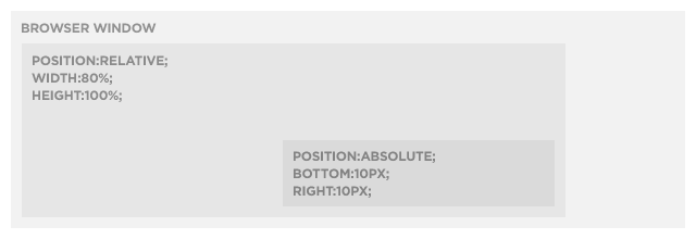
2008 Absolute Columns Figure 1 Figure 1.

However, what you may not know is that we can anchor more than two sides of an absolutely positioned element. Yes, that’s right, all four sides (top, right, bottom, left) can be set, though in this example we’re only going to require the services of three sides (see Figure 2 for the end result).
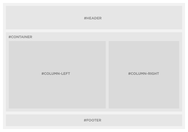
2008 Absolute Columns Figure 2 Figure 2.

Trust me, this will make you feel better

Our requirements are essentially the same as the standard “absolute-relative” trick—a container <div> set to position:relative, and our sidebar <div> set to position:absolute — plus another <div> that will serve as our main content column. We’ll also add a few other common layout elements (wrapper, header, and footer) so our example markup looks more like a real layout and less like a test case:

<div id="wrapper">
	<div id="header">
		<h2>#header</h2>
	</div>
	<div id="container">
		<div id="column-left">
			<h2>#left</h2>
			<p>Lorem ipsum dolor sit amet…</p>
		</div>
		<div id="column-right">
			<h2>#right</h2>
		</div>
	</div>
	<div id="footer">
		<h2>#footer</h2>
	</div>
</div>

In this example, our main column (#column-left) is only being given a width to fit within the context of the layout, and is otherwise untouched (though we’re using pixels here, this trick will of course work with fluid layouts as well), and our right keeping our styles nice and minimal:

#container {
	position: relative;
}
#column-left {
	width: 480px;
}
#column-right {
	position: absolute;
	top: 10px;
	right: 10px;
	bottom: 10px;
	width: 250px;
}

The trick is a simple one: the #container <div> will expand vertically to fit the content within #column-left. By telling our sidebar <div> (#column-right) to attach itself not only to the top and right edges of #container, but also to the bottom, it too will expand and contract to match the height of the left column (duplicate the “lorem ipsum” paragraph a few times to see it in action).
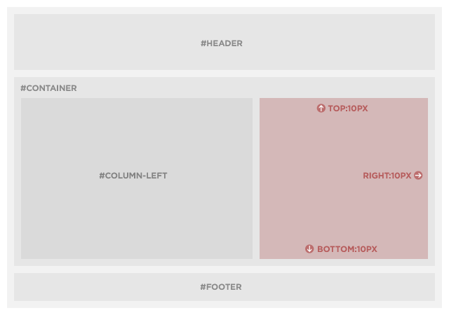
2008 Absolute Columns Figure 3 Figure 3.

On the rocks

“But wait!” I hear you exclaim, “when the right column has more content than the left column, it doesn’t expand! My text runneth over!” Sure enough, that’s exactly what happens, and what’s more, it’s supposed to: Absolutely positioned elements do exactly what you tell them to do, and unfortunately aren’t very good at thinking outside the box (get it? sigh…).

However, this needn’t get your spirits down, because there’s an easy way to address the issue: by adding overflow:auto to #column-right, a scrollbar will automatically appear if and when needed:

#column-right {
	position: absolute;
	top: 10px;
	right: 10px;
	bottom: 10px;
	width: 250px;
	overflow: auto;
}

While this may limit the trick’s usefulness to situations where the primary column will almost always have more content than the secondary column—or where the secondary column’s content can scroll with wild abandon—a little prior planning will make it easy to incorporate into your designs.

Driving us to drink

It just wouldn’t be right to have a friendly, festive holiday tutorial without inviting IE6, though in this particular instance there will be no shaming that old browser into admitting it has a problem, nor an intervention and subsequent 12-step program. That’s right my friends, this tutorial has abstained from IE6-abuse now for 30 days, thanks to the wizard Dean Edwards and his amazingly talented IE7 Javascript library.

Simply drop the Conditional Comment and <script> element into the <head> of your document, along with one tiny CSS hack that only IE6 (and below) will ever see, and that browser will be back on the straight and narrow

<!--[if lt IE 7]>
<script src="http://ie7-js.googlecode.com/svn/version/2.0(beta3)/IE7.js" type="text/javascript"></script>
<style type="text/css" media="screen">
	#container {
		zoom:1; /* helps fix IE6 by initiating hasLayout */
	}
</style>
<![endif]-->

Eggnog is supposed to be spiked, right?

Of course, this is one simple example of what can be a much more powerful technique, depending on your needs and creativity. Just don’t go coding up your wildest fantasies until you’ve had a chance to sleep off the Christmas turkey and whatever tasty liquids you happen to imbibe along the way…

Like what you read?

Comments

Comments are ordered by helpfulness, as indicated by you. Help us pick out the gems and discourage asshattery by voting on notable comments.

Got something to add? You can leave a comment below.

  • Henaway

    Nice trick. Far simpler than most I’ve seen or used. Only big snag is the overflow:auto; … some designs will let you get away with it, others will not.

    Thought off the crazy train – would adding a min-height on the right column supply a fix there? Or I suppose more appropriately, on the left column. So even if it was a one line error message, it would still give (browsers that support min-height) the needed appearance without scroll bars?

    Vote Helpful or Unhelpful

  • prisca http://graphiceyedea.co.uk

    Dan – brilliant article :-)
    I’ve been playing with this type of positioning recently, experimenting – getting confused, then getting somewhere… but always persisting. Now reading your clear description here just added fuel to my creative fire. Thanks :)

    Vote Helpful or Unhelpful

  • David http://www.davidstagg.com

    Great stuff, Dan! Learn something new everyday: Didn’t know you could absolutely position columns on all sides. Clever trick!

    Clients always seem to get bent out of shape when there’s more content in one column than the other. It never seemed to bother me that much.

    Vote Helpful or Unhelpful

  • Fat Lotus http://www.fatlotus.com/

    Great tutorial, though couldn’t you solve the scrolling problem by absolutely positioning both columns? I wonder if there’s such thing as an infinite CSS loop…

    Vote Helpful or Unhelpful

  • Nik Coughlin http://informationage.co.nz/

    I came up with something very similar about a year ago, except allowing for differing column heights by using a seperate element for the backgrounds:

    My old 3 column equal height positioned layout

    The backgrounds are always the same height as the longest column because they are positioned against the wrapper element.

    However, your excellent article inspired me to update it slightly:

    Newer 3 column equal height positioned layout, redux via 24 ways

    The changes I took from your article were mainly cosmetic but I also changed my handling of IE6 from my homemade CSS expressions to using the IE7 js. I also changed from 100% layout to fixed-but-flexible width.

    A variation on this technique can also be used for skinning elements, ie for custom rounded boxes with alpha, drop shadows etc.:
    Using positioning technique for skinning

    You can also combine the two. I have an example of this somewhere but I can’t seem to find it at the moment :(

    Vote Helpful or Unhelpful

  • Christopher Olberding http://www.stationfour.com

    Somewhat embarrassed that I had no idea that you could absolutely position on more than two sides. That tidbit was worth the price of admission.

    However I would have liked to see how to fix your example in IE6 without relying on javascript.

    Vote Helpful or Unhelpful

  • Josh http://voxxit.com/

    This is useful, I suppose. However, I think the simpler solution would have to be using a container layer, and then having a background image for the columns. That way, you can repeat it for dynamic height for both columns, but still have equal length columns due to your container layer’s height taking precedent in all cases. As @Henaway said, having a scrollbar in your sidebar doesn’t always work (although I would argue that it never really does).

    Just my two cents. :) Great writeup, though! Thanks for taking the time out to do it!

    Vote Helpful or Unhelpful

  • Razvan http://www.kolor-designs.com

    Great article Dan. really enjoyed it and I think it’s probably among the best of the articles posted this year.
    I have one problem though. The id names you used in your tutorial aren’t semantically meaningful.
    Don’t get me wrong, that doesn’t make it wrong but it would be better to have more meaningful names since it’s something that probably many will take after.

    Vote Helpful or Unhelpful

  • Drew McLellan http://allinthehead.com/

    I have one problem though. The id names you used in your tutorial aren’t semantically meaningful.

    Of course you can use any names you wish. In an article, it’s usually better to be explicit than semantically rich. The important part is that the reader understands the example.

    Vote Helpful or Unhelpful

  • Dan Rubin http://superfluousbanter.org

    @Nik Coughlin: Interesting twist on the topic, thank you for sharing :)

    @Christopher Olberding: As far as I’m aware, IE6 doesn’t support absolute positioning on more than 2 sides without Javascript. It also has issues with absolute/relative positioning (which don’t always cause problems, but Dean’s JS library fixes those issues as well).

    @Josh: You’re referring to “faux columns” which I noted in the beginning of the article — I’ve used that technique many times myself, and love it, but sometimes it either isn’t practical to use a background image to create “fake” columns, or there’s another effect you may wish to create, or your design may not quite work with background images for a specific set of columns (and so on). This is an option for those times :)

    @Razvan: As Drew already replied, the intention is for the IDs to be as clear as possible within the context of the examples within this article. Any IDs or classes will work, but as with many tutorials the onus is on the reader to practice their best practices of their own accord :)

    Vote Helpful or Unhelpful

  • Luke Dorny http://lukedorny.com

    Great writeup.
    A simple technique that i’d never considered (simple, meaning simple but still not obvious). The major topic here being that using 3-sided absolute positioning is powerful, despite it’s limitations mentioned.

    Thanks for the writeup, Sñr Rubin!
    Plus, there were drinks involved!

    Vote Helpful or Unhelpful

  • Sam Dwyer

    Great article.
    This site has really dug up some seriously quality content this festive season.

    Vote Helpful or Unhelpful

  • Drew McLellan http://allinthehead.com/

    (Thanks Sam, I’ve fixed the typo you noted!)

    Vote Helpful or Unhelpful

  • Hein Haraldson Berg http://haraldsonberg.net/

    I was thinking the ‘but wait, this only works if…’-thingy exactly where you said I’d do just that, and then you said you had a magical fix, if the right column’s content got taller than the left column’s.

    I was disappointed. I really can’t think of one single site where my customer would be satisfied with such a scroll bar fracking up his or hers design.

    What’s great though, is that I learned I can use more than two of the properties top, right, bottom and left at once. I guess the poor support in IE6 has stopped me from using it before, and so I forgot about it.

    Vote Helpful or Unhelpful

  • Giustino Borzacchiello http://jubstuff.netsons.org

    Thank you Mr Rubin, for sharing this!
    Three side absolute positioning: never heard before!

    Vote Helpful or Unhelpful

  • Matt Radel http://matt-radel.com

    Ah ha…nifty trick…I never would have thought of that. Usually faux columns work great for me, but this is a swell ace to have in the ‘ol back pocket. Thanks Dan!

    Vote Helpful or Unhelpful

  • mort

    adding a 32kb JS file to make this technique work in IE6 seems a little heavy handed.

    While the faux column method may take more time to develop, the final product would load faster for IE6 users.

    Vote Helpful or Unhelpful

  • Dan Rubin http://superfluousbanter.org

    @Mort: That’s definitely fair, and it ultimately depends on what level of support you have to (or want to) provide to IE6 users. For more on that discussion, see Jeremy Keith’s The IE6 Equation.

    Vote Helpful or Unhelpful

  • Jason Robb http://jasonrobb.com

    Ahhhh! Dan, 3-side absolute positioned sidebar, brilliant!

    @MORT: How much would a 32KB JS file slow down your users on IE6? All things considered, passing those few seconds to a slim slice of your total traffic, instead of slowing down your development process and subsequent launch to all users, might be worth it in many cases.

    To figure out it if it’s worth it to develop for IE6, use the IE6 equation: http://24ways.org/2008/the-ie6-equation

    Vote Helpful or Unhelpful

  • Bry

    This is cool, but the scrolling I think is a detractor. I’ve been meaning to look into the jQuery Equal Heights plug-in as a way of avoiding faux columns that I have resorted to in the past.

    Vote Helpful or Unhelpful

  • Dan Rubin http://superfluousbanter.org

    @Bry: Indeed, the scrolling may not work for every instance — then again, depending on the content requirements, it may not be needed at all (e.g. if the absolutely positioned column will always have less content than the primary). Javascript is also an acceptable solution, as you said.

    Something else worth noting for everyone: this isn’t intended to be a solution to the multiple column problem, as I stated in the article (we don’t yet have a perfect non-table solution that doesn’t require Javascript). Where this comes into play is less where main content columns are concerned (faux columns are a better solution in that instance), though in the context of this article it’s more difficult to show specific applications (that’s where your creativity and specific design requirements come into play).

    Vote Helpful or Unhelpful

  • Jason Grant http://www.flexewebs.com

    This is one of the approaches which may suit a particular circumstance.

    However, most of the time we are aiming to achieve as much as possible with as little code and maintainance overhead as possible.

    Also, still remains the issue of dreaded IE6 and the support for it (I am having to write this comment through IE6 at the moment).

    Your solution does not work in IE6 as you have described it and I am struggling to see which design template would tolerate horrible looking scroll bars on any box which has overflowing content in it (highly likely on most sites I have ever worked on).

    Nice writing style by the way.

    Vote Helpful or Unhelpful

  • Bruce Clark http://blog.imulus.com

    I have to agree with some of the other comments that having to use an overflow auto is the one downfall to this method. Ideally we could use display table cell positioning to do this sort of things, however, that won’t be feasible for at least another few years.

    Hence, it’s probably best to turn to a background image on the container div that creates a pseudo column feel while floating your columns accordingly. Still, in some cases I could see a site design that works well with a scrollbar and if that’s the case than this trick is solid.

    Beautiful site by the way.

    Vote Helpful or Unhelpful

  • Juarez P. A. Filho http://juarezpaf.com

    That’s a great method. “Javascript is also an acceptable solution” but sometimes is not the best solution.
    Thanks a lot

    Vote Helpful or Unhelpful

  • Aarem

    In terms of looking to the future, it’s probably worth noting that CSS tables will probably be the best way to handle this situation (once IE8 has made its presence felt).

    Vote Helpful or Unhelpful

  • Stuart http://www.edit-studios.com

    Awesome! Just what I’m looking for. You wont believe what stumbling across this article has done for me in reducing my development time to get a fix for this.

    As everyone has mentioned and Dan said, it’s not ideal for all but for me in my situation it is!

    What about absolute positioning the left hand column too? Does this work or am I missing something… will give it a try now.

    Cheers,

    S.

    Vote Helpful or Unhelpful

  • Jehzeel Laurente http://www.jehzlau-concepts.com

    Thanks for these awesome tips! Now I’m learning… I’m really astounded of CSS can do, specially with Absolute Columns.

    I’m gonna bookmark this nifty guide for sure :)

    Vote Helpful or Unhelpful

  • Rajveer Singh Rathore http://www.inspiredbuddy.com

    I will not hesitate to call it the best CSS read of the year (I know it’s late but I mean 2008 :-) ).

    It will not make any sense talking about the JavaScript issue, Rubin didn’t work for MS I suppose :-D. I know I am going to love using it under many circumstances in future.

    Thanks!

    Vote Helpful or Unhelpful

  • Steve Firth http://www.devolved.co.uk

    Have had this bookmarked for ages and glad I finally found time to sit and read it.

    I like to think I have a good handle on css but this concept was no where to be found in my understanding.

    Great to have a different and deeper knowledge of how things work, thank you.

    Vote Helpful or Unhelpful

  • Paul http://adventuresinbrackets.blogspot.com/

    I didn’t realise one could use absolute positioning on opposing sides of a DIV and get away with it – great trick! Of course, the overflow:auto thing is a stinker, but I can think of a few instances where I could get away with using this solution. Thanks!

    And as others have commented: Great looking site, this!

    Vote Helpful or Unhelpful

  • Paul O'Brien http://www.pmob.co.uk

    If you want to support IE6 without JavaScript then you can offer IE6 a greater height than you need but start it at bottom:0 and let the columns disappear through the top of the viewport (or simply hide the overflow).

    I did some examples quite a few years ago that used this method for multi equalising columns.

    http://www.pmob.co.uk/temp/equal-columns-3fluid.htm

    Vote Helpful or Unhelpful

  • Joao

    Nice. I’ve been trying to nest divs in the left div. And float them to make a set of aligned blocks.
    That doesn’t work. My nested divs appear outside the original left div when floated. Tried unordered lists and paragraphs. It won’t float, if you know what I mean.
    The horrendous scoldbar emerges, aligning the right div sidebar to what precedes my left side floating content.

    Ah, if I could only see the light…

    Vote Helpful or Unhelpful

  • DAVE_E

    Just come into this business, trying to be cutting edge!
    Question: Can the javascript fixes for IE6/7 be placed in a
    javascript file instead of at head of document, seems simpler,
    but don’t know how to do the link file text, crudedumbo, eh?

    Vote Helpful or Unhelpful

  • David Reimer

    Very helpful article! And this may be a daft question, but I’ve looked everywhere without success…

    What is the license on the code in this article? Is it Creative Commons of some flavour? Inquiring minds want to know!

    Thanks. :)

    Vote Helpful or Unhelpful

  • Christian

    Thank you for this great tutorial.

    I have a question about the left-column. In this picture http://media.24ways.org/2008/22/2008-absolute-columns-figure3.png it’s also 10px away from the left, bottom and top side of the container. Sure if you just write 0 0 0 for the right column it will pass in seamlessly.

    But how it’s achievable to also add somethin like a margin to it, so both columns are for example 10px away from the top line of the container div?

    THANK YOU IN ADVANCE

    Vote Helpful or Unhelpful

  • Elizabeth K. Barone http://ekbdesigns.com

    Finally — another option!

    Unfortunately, I don’t think it’s one I’d use often because of the overflow issue (I don’t like having to force users to scroll inside of the page itself). This is a great alternative for certain instances, though.

    Thanks!

    Vote Helpful or Unhelpful

  • James Meekins

    there is a better way to do this with floats

    Vote Helpful or Unhelpful

  • Michael Robbins http://www.michael-robbins.co.uk

    Great going to have a go at this, Hope this works ok with IE6 though.

    Vote Helpful or Unhelpful

  • Carl - Web Site Design Instructor http://www.webcoursesbangkok.com

    Yup, for sure this will be going in our CSS course. Thanks!

    Vote Helpful or Unhelpful

  • Michael Angrave http://www.crearedesign.co.uk

    Firstly, Love the design of this site. Nice to see people thinking outside the box.

    This looks nice. Looking forward to having a play around with it. I’m always grateful for much needed CSS expertise. I’ll let you know how I get on.

    Post more like this, thanks.

    Vote Helpful or Unhelpful

  • andrei http://none

    hi,
    i don’t know if anyone posted this yet in the comments, didn’t have the patience to read them all.

    wouldn’t have been simpler to use both columns with position: relative and the LAST element in each column (a div maybe?) to have the property clear: both? that way, they both will stretch till the bottom of the page (next element they encounter – maybe the footer div).

    or, use javascript as follows:

    document.getElementById(“column_right”).style.height = document.getElementById(“column_left”).offsetHeight + “px”;

    Vote Helpful or Unhelpful

  • kelly http://www.expression-web-tutorial.com

    I know this article is over a year old, but I could not get the right column to work in FireFox 3.5, which is the newest firefox. It worked perfectly in IE8. And we can only hope IE 6 will go away!! as more people upgrade.

    None the less, you helped many people by pointing our how to use ‘Relative’ positioning to create a new point of reference for the absolutely positioned div. CSS Positioning can be tough to understand at first.

    I will try out a few things and see what I can come up with. Usually firefox is not this picky.

    Vote Helpful or Unhelpful

Impress us

Be friendly / use Textile

About the author

Dan Rubin

Dan Rubin is a highly accomplished user interface designer and usability consultant, with over ten years of experience as a leader in the fields of web standards and usability, specifically focusing on the use of (X)HTML and CSS to streamline development and improve accessibility.

His passion for all things creative and artistic isn’t a solely selfish endeavor either—you’ll frequently find him waxing educational about a cappella jazz and barbershop harmony, interface design, usability, web standards, typography, and graphic design in general.

In addition to his contributions to sites including Blogger, the CSS Zen Garden, Yahoo! Small Business and Microsoft’s ASP.net portal, Dan is a contributing author of Cascading Style Sheets: Separating Content from Presentation (2nd Edition, friends of ED, 2003), technical reviewer for Beginning CSS Web Development (Apress, 2006), The Art & Science of CSS (SitePoint, 2007) and Sexy Web Design (SitePoint, 2009), coauthor of Pro CSS Techniques (Apress, 2006), and Web Standards Creativity (friends of ED, 2007), writes about web standards, design and life in general on his blog, SuperfluousBanter.org, and spends his professional time on a variety of online and offline projects for Sidebar Creative, Webgraph and Black Seagull, and consults on design, user interaction and online publishing for Garcia Media.

More information

Brought to you by:

Perch - a really little cms

The easiest way to publish fast, flexible HTML5 websites your clients will love.