The Neverending (Background Image) Story

Everyone likes candy for Christmas, and there’s none better than eye candy. Well, that, and just more of the stuff. Today we’re going to combine both of those good points and look at how to create a beautiful background image that goes on and on… forever!
Of course, each background image is different, so instead of agonising over each and every pixel, I’m going to concentrate on five key steps that you can apply to any of your own repeating background images. In this example, we’ll look at the Miami Beach background image used on the new FOWA site, which I’m afraid is about as un-festive as you can get.
1. Choose your image wisely
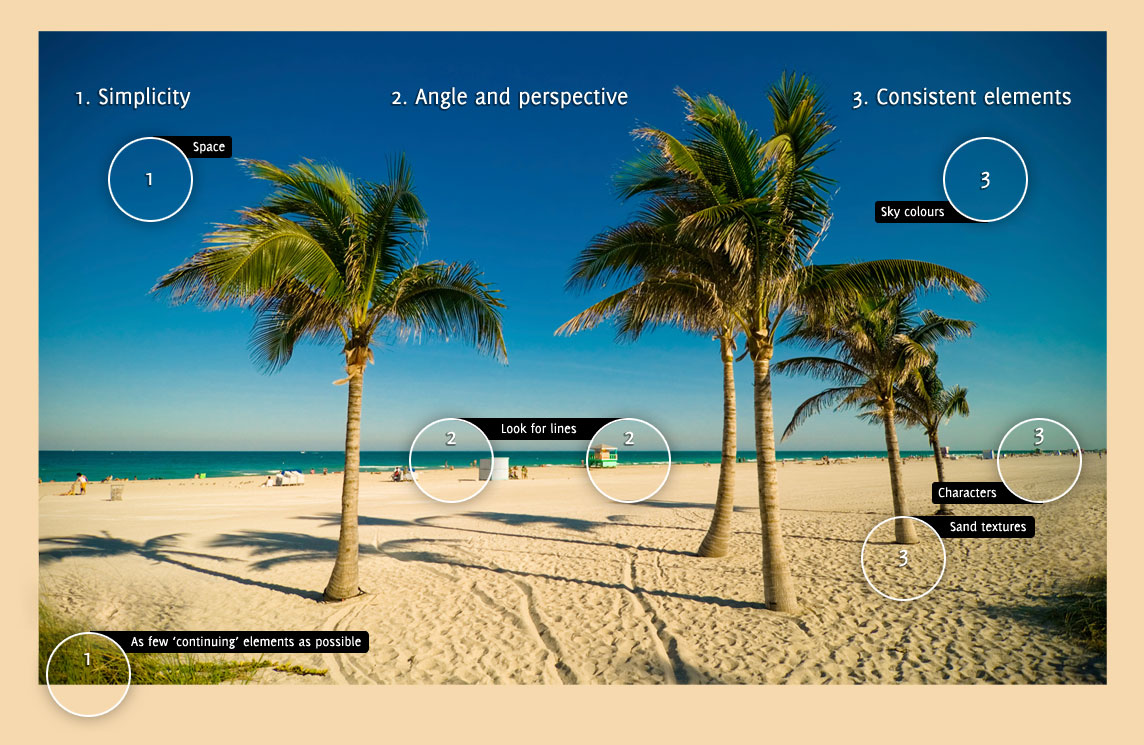
I find there are three main criteria when judging photos you’re considering for repetition manipulation (or ‘repetulation’, as I like to say)…
- simplicity (beware of complex patterns)
- angle and perspective (watch out for shadows and obvious vanishing points)
- consistent elements (for easy cloning)
You might want to check out this annotated version of the image, where I’ve highlighted elements of the photo that led me to choose it as the right one.
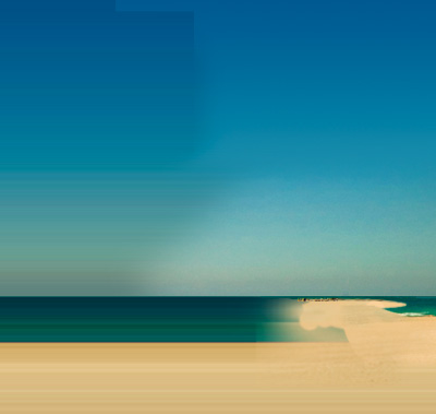
 The original image purchased from iStockPhoto.
 The Photoshopped version used on the FOWA site.
2. The power of horizontal lines
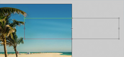
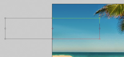
With the image chosen and your cursor poised for some Photoshop magic, the most useful thing you can do is drag out the edge pixels from one side of the image to create a kind of rough colour ‘template’ on which to work over. It doesn’t matter which side you choose, although you might find it beneficial to use the one with the simplest spread of colour and complex elements.
Click and hold on the marquee tool in the toolbar and select the ‘single column marquee tool’, which will span the full height of your document but will only be one pixel wide. Make the selection right at the edge of your document, press ctrl-c / cmd-c to copy the selection you made, create a new layer, and hit ctrl-v / cmd-v to paste the selection onto your new layer. using free transform (ctrl-t / cmd-t), drag out your selection so that it becomes as wide as your entire canvas.
 A one-pixel-wide selection stretched out to the entire width of the canvas.
3. Cloning
It goes without saying that the trusty clone tool is one of the most important in the process of creating a seamlessly repeating background image, but I think it’s important to be fairly loose with it. Always clone on to a new layer so that you’ve got the freedom to move it around, but above all else, use the eraser tool to tweak your cloned areas: let that handle the precision stuff and you won’t have to worry about getting your clones right first time.
In the example below, you can see how I overcame the problem of the far-left tree shadow being chopped off by cloning the shadow from the tree on its right.
 The edge of the shadow is cut off and needs to be ‘made’ from a pre-existing element.
 The successful clone completes the missing shadow.
The two elements are obviously very similar but it doesn’t look like a clone because the majority of the shape is ‘genuine’ and only a small part is a duplicate. Also, after cloning I transformed the duplicate, erased parts of it, used gradients, and — ooh, did someone mention gradients?
4. Never underestimate a gradient
For this image, I used gradients in a similar way to a brush: covering large parts of the canvas with a colour that faded out to a desired point, before erasing certain parts for accuracy.
 Several of the gradients and brushes that make up the ‘customised’ part of the image, visible when the main photograph layer is hidden.
 The full composite.
Gradients are also a bit of an easy fix: you can use a gradient on one side of the image, flip it horizontally, and then use it again on the opposite side to make a more seamless join.
Speaking of which…
5. Sewing the seams
No matter what kind of magic Photoshop dust you sprinkle over your image, there will still always be the area where the two edges meet: that scary ‘loop’ point. Fret ye not, however, for there’s help at hand in the form of a nice little cheat. Even though the loop point might still be apparent, we can help hide it by doing something to throw viewers off the scent.
The seam is usually easy to spot because it’s a blank area with not much detail or colour variation, so in order to disguise it, go against the rule: put something across it!
This isn’t quite as challenging as it may sound, because if we intentionally make our own ‘object’ to span the join, we can accurately measure the exact halfway point where we need to split it across the two sides of the image. This is exactly what I did with the FOWA background image: I made some clouds!
 A sky with no clouds in an unhappy one.
 A simple soft white brush creates a cloud-like formation in the sky.
 After taking the cloud’s opacity down to 20%, I used free transform to highlight the boundaries of the layer. I then moved it over to the right, so that the middle of the layer perfectly aligned with the right side of the canvas.
 Finally, I duplicated the layer and did the same in reverse: dragging the layer over to the left and making sure that the middle of the duplicate layer perfectly aligned with the left side of the canvas.
And there you have it! Boom! Ta-da! Et Voila! To see the repeating background image in action, visit futureofwebapps.com on a large widescreen monitor or see a simulation of the effect.
Thanks for reading, folks. Have a great Christmas!
About the author
Elliot Jay Stocks is a designer, speaker, and author. He is also the founder of typography magazine 8 Faces and, more recently, the co-founder of Viewport Industries. He lives and works in the countryside between Bristol and Bath, England.
Photo: Samantha Cliffe
Brought to you by
Related articles
-
Art Direction and the New WordPress Editor
Mel Choyce explores how the new WordPress editor (also know as Gutenberg) can be used to create more carefully art directed posts. Like gifts carefully arranged beneath the Christmas tree, it’s the contents that matters but the presentation that sells.
-
Be the Villain
Eric Bailey asks us to take on the role of King Herod in our projects to consider how the products, services and processes we design could be abused to cause harm rather than to do good. No matter how good our intentions, we must remember that not every user has pure motivations and that every tool is a weapon if you hold it right.
-
Creating a Weekly Research Cadence
Wren Lanier sets aside time to explore the benefits of a regular schedule for user research. Santa’s elves quickly discovered the benefits of working to a fixed schedule, which is of course why we don’t get presents at Easter.
-
How to Do a UX Review
Joe Leech offers a rundown on his UX review process, sharing tips about analysing data and creating personas, and setting out findings in a form that benefits clients. From quick wins to workshops, there are gifts here everyone will be grateful for.
-
How to Use Audio on the Web
Ruth John lets the bells ring out for Christmas with a look at a selection of inspiring sites with creative and effective use of audio. The days of jangly MIDI tunes to distract and annoy are thankfully long behind us, with browser APIs offering new and exciting ways to generate sound. Ahead is a beautiful sonic landscape. Ding dong!
-
What I Learned about Product Design This Year
Meagan Fisher casts a thoughtful glance back over her work this year and considers what it means to design a product rather than a marketing experience. Pour yourself a cup of eggnog, grab a mince pie or two and gather around the fireside. Are you sitting comfortably? Good, then we shall begin.


