"Z's not dead baby, Z's not dead"
While Mr. Moll and Mr. Budd have pipped me to the post with their predictions for 2006, I’m sure they won’t mind if I sneak in another. The use of positioning together with z-index will be one of next year’s hot techniques
Both has been a little out of favour recently. For many, positioned layouts made way for the flexibility of floats. Developers I speak to often associate z-index with Dreamweaver’s layers feature. But in combination with alpha transparency support for PNG images in IE7 and full implementation of position property values, the stacking of elements with z-index is going to be big. I’m going to cover the basics of z-index and how it can be used to create designs which ‘break out of the box’.
No positioning? No Z!
Remember geometry? The x axis represents the horizontal, the y axis represents the vertical. The z axis, which is where we get the z-index, represents /depth/. Elements which are stacked using z-index are stacked from front to back and z-index is only applied to elements which have their position property set to relative or absolute. No positioning, no z-index. Z-index values can be either negative or positive and it is the element with the highest z-index value appears closest to the viewer, regardless of its order in the source. Furthermore, if more than one element are given the same z-index, the element which comes last in source order comes out top of the pile.
Let’s take three <div>s.
<div id="one"></div>
 <div id="two"></div>
 <div id="three"></div>

 #one {
     position: relative;
     z-index: 3;
 }

 #two {
     position: relative;
     z-index: 1;
 }

 #three {
     position: relative;
     z-index: 2;
 }
As you can see, the <div> with the z-index of 3 will appear closest, even though it comes before its siblings in the source order. As these three <div>s have no defined positioning context in the form of a positioned parent such as a <div>, their stacking order is defined from the root element <html>. Simple stuff, but these building blocks are the basis on which we can create interesting interfaces (particularly when used in combination with image replacement and transparent PNGs).
Brand building
Now let’s take three more basic elements, an <h1>, <blockquote> and <p>, all inside a branding <div> which acts a new positioning context. By enclosing them inside a positioned parent, we establish a new stacking order which is independent of either the root element or other positioning contexts on the page.
<div id="branding">
     <h1>Worrysome.com</h1>
     <blockquote><p>Don' worry 'bout a thing...</p></blockquote>
     <p>Take the weight of the world off your shoulders.</p>
 </div>
Applying a little positioning and z-index magic we can both set the position of these elements inside their positioning context and their stacking order. As we are going to use background images made from transparent PNGs, each element will allow another further down the stacking order to show through. This makes for some novel effects, particularly in liquid layouts.
(Ed: We’re using n below to represent whatever values you require for your specific design.)
#branding {
    position: relative;
    width: n;
    height: n;
    background-image: url(n);
 }

 #branding>h1 {
    position: absolute;
    left: n;
    top: n;
    width: n;
    height: n;
    background-image: url(h1.png);
    text-indent: n;
 }

 #branding>blockquote {
    position: absolute;
    left: n;
    top: n;
    width: n;
    height: n;
    background-image: url(bq.png);
    text-indent: n;

 }

 #branding>p {
    position: absolute;
    right: n;
    top: n;
    width: n;
    height: n;
    background-image: url(p.png);
    text-indent: n;
 }
Next we can begin to see how the three elements build upon each other.

1. Elements outlined

2. Positioned elements overlayed to show context

3. Our final result
Multiple stacking orders
Not only can elements within a positioning context be given a z-index, but those positioning contexts themselves can also be stacked.

Two positioning contexts, each with their own stacking order
Interestingly each stacking order is independent of that of either the root element or its siblings and we can exploit this to make complex layouts from just a few semantic elements. This technique was used heavily on my recent redesign of Karova.com.
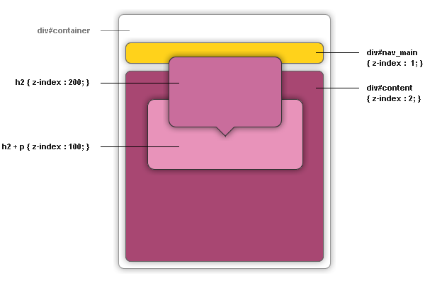
Dissecting part of Karova.com
First the XHTML. The default template markup used for the site places <div id="nav_main"> and <div id="content"> as siblings inside their container.
<div id="container">
     <div id="content">
          <h2></h2>
          <p></p>
     </div>
     <div id="nav_main"></div>
 </div>
By giving the navigation <div> a lower z-index than the content <div> we can ensure that the positioned content elements will always appear closest to the viewer, despite the fact that the navigation comes after the content in the source.
#content {
     position: relative;
     z-index: 2;
 }

 #nav_main {
     position: absolute;
     z-index: 1;
 }
Now applying absolute positioning with a negative top value to the <h2> and a higher z-index value than the following <p> ensures that the header sits not only on top of the navigation but also the styled paragraph which follows it.
h2 {
     position: absolute;
     z-index: 200;
     top: -n;
 }

 h2+p {
     position: absolute;
     z-index: 100;
     margin-top: -n;
     padding-top: n;
 }
Dissecting part of Karova.com
You can see the full effect in the wild on the Karova.com site.
Have a great holiday season!
About the author
Andy Clarke is one of the world’s best-known website designers, consultant, speaker, and writer on art direction and design for products and websites. Andy founded Stuff & Nonsense in 1998 and for 20 years has helped companies big and small to improve their website and product designs. Andy’s the author of four web design books including ‘Transcending CSS,’ ‘Hardboiled Web Design’ and ‘Art Direction for the Web’. He really, really loves gorillas.


