Jump to content

Year

Day

24 ways to impress your friends

finished version

The problem

Take a quote and render it within blockquote tags, applying big, funky and stylish curly quotes both at the beginning and the end without using any images – at all.

The traditional way

Feint background images under the text, or an image in the markup housed in a little float. Often designers only use the opening curly quote as it’s just too difficult to float a closing one.

Why is the traditional way bad?

Well, for a start there are no actual curly quotes in the text (unless you’re doing some nifty image replacement). Thus with CSS disabled you’ll only have default blockquote styling to fall back on. Secondly, images don’t resize, so scaling text will have no affect on your graphic curlies.

The solution

Use really big text. Then it can be resized by the browser, resized using CSS, and even be restyled with a new font style if you fancy it. It’ll also make sense when CSS is unavailable.

The problem

Creating “Drop Caps” with CSS has been around for a while (Big Dan Cederholm discusses a neat solution in that first book of his), but drop caps are normal characters – the A to Z or 1 to 10 – and these can all be pulled into a set space and do not serve up a ton of whitespace, unlike punctuation characters.

Curly quotes aren’t like traditional characters. Like full stops, commas and hashes they float within the character space and leave lots of dead white space, making it bloody difficult to manipulate them with CSS. Styles generally fit around text, so cutting into that character is tricky indeed. Also, all that extra white space is going to push into the quote text and make it look pretty uneven. This grab highlights the actual character space:

curly with emphasized character size shown

See how this is emphasized when we add a normal alphabetical character within the span. This is what we’re dealing with here:

using a letter a to emphasize character size

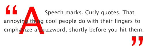
Then, there’s size. Call in a curly quote at less than 300% font-size and it ain’t gonna look very big. The white space it creates will be big enough, but the curlies will be way too small. We need more like 700% (as in this example) to make an impression, but that sure makes for a big character space.

Prepare the curlies

Firstly, remove the opening “ from the quote. Replace it with the opening curly quote character entity “. Then replace the closing “ with the entity reference for that, which is ”. Now at least the curlies will look nice and swooshy.

Add the hooks

Two reasons why we aren’t using :first-letter pseudo class to manipulate the curlies. Firstly, only CSS2-friendly browsers would get what we’re doing, and secondly we need to affect the last “letter” of our text also – the closing curly quote.

So, add a span around the opening curly, and a second span around the closing curly, giving complete control of the characters:

<blockquote><span class="bqstart">&#8220;</span>Speech marks. Curly quotes. That annoying thing cool people do with their fingers to emphasize a buzzword, shortly before you hit them.<span class="bqend">&#8221;</span></blockquote>

So far nothing will look any different, aside form the curlies looking a bit nicer. I know we’ve just added extra markup, but the benefits as far as accessibility are concerned are good enough for me, and of course there are no images to download.

The CSS

OK, easy stuff first. Our first rule .bqstart floats the span left, changes the color, and whacks the font-size up to an exuberant 700%. Our second rule .bqend does the same tricks aside from floating the curly to the right.

.bqstart {
     float: left;
     font-size: 700%;
     color: #FF0000;
 }

 .bqend {
     float: right;
     font-size: 700%;
     color: #FF0000;
 }

That gives us this, which is rubbish. I’ve highlighted the actual span area with outlines:

curlies without any positioning

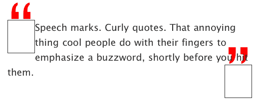
Note that the curlies don’t even fit inside the span! At this stage on IE 6 PC you won’t even see the quotes, as it only places focus on what it thinks is in the div. Also, the quote text is getting all spangled.

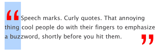
Fiddle with margin and padding

Think of that span outline box as a window, and that you need to position the curlies within that window in order to see them. By adding some small adjustments to the margin and padding it’s possible to position the curlies exactly where you want them, and remove the excess white space by defining a height:

.bqstart {
     float: left;
     height: 45px;
     margin-top: -20px;
     padding-top: 45px;
     margin-bottom: -50px;
     font-size: 700%;
     color: #FF0000;
 }

 .bqend {
     float: right;
     height: 25px;
     margin-top: 0px;
     padding-top: 45px;
     font-size: 700%;
     color: #FF0000;
 }

I wanted the blocks of my curlies to align with the quote text, whereas you may want them to dig in or stick out more. Be aware however that my positioning works for IE PC and Mac, Firefox and Safari. Too much tweaking seems to break the magic in various browsers at various times. Now things are fitting beautifully:

I must admit that the heights, margins and spacing don’t make a lot of sense if you analyze them. This was a real trial and error job. Get it working on Safari, and IE would fail. Sort IE, and Firefox would go weird.

Finished

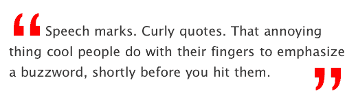
The final thing looks ace, can be resized, looks cool without styles, and can be edited with CSS at any time. Here’s a real example (note that I’m specifying Lucida Grande and then Verdana for my curlies):

Speech marks. Curly quotes. That annoying thing cool people do with their fingers to emphasize a buzzword, shortly before you hit them.

Browsers happy

As I said, too much tweaking of margins and padding can break the effect in some browsers. Even now, Firefox insists on dropping the closing curly by approximately 6 or 7 pixels, and if I adjust the padding for that, it’ll crush it into the text on Safari or IE. Weird. Still, as I close now it seems solid through resizing tests on Safari, Firefox, Camino, Opera and IE PC and Mac. Lovely.

It’s probably not perfect, but together we can beat the evil typographic limitations of the web and walk together towards a brighter, more aligned world. Merry Christmas.

Like what you read?

Comments

Comments are ordered by helpfulness, as indicated by you. Help us pick out the gems and discourage asshattery by voting on notable comments.

Got something to add? You can leave a comment below.

  • Brandon Pearce http://resume.brandags.com

    I did a similar thing on my www.musicteachershelper.com website. The only difference is that the right-end quote is displayed directly after the text ends, instead of flush right.

    But it never looked perfect in IE (still doesn’t) because the last line always has some extra white-space above it, due to the enlarged font-size of the quote. It’s beautiful in Firefox, though.

    This article gave me hope that it still might be possible to get this effect looking good in IE with just a little more tweaking. Thanks for the great tip!

    Vote Helpful or Unhelpful

  • aarplane http://techinflux.com

    Very cool. Me likes.

    I’ve been looking for a good way to do these sort of quotations.

    Vote Helpful or Unhelpful

  • wrtlprnft http://wrtlprnft.de

    I actually looks kind of strange in my Opera under Linux: Screenshot

    Vote Helpful or Unhelpful

  • Mats Lindblad http://slipsnisse.se/

    There is just one problem, your code is invalid.

    Blockquotes can not contain text, text has to be wrapped inside a block element like "p", "h1", "h2", "h3", "h4", "h5", "h6", "div", "pre", "address", "fieldset", "ins", "del"

    But that’s easy to fix. Just wrap the sucker.

    Vote Helpful or Unhelpful

  • Simon Collison http://www.collylogic.com

    Thanks for the feedback folks. I should say that I consider this technique experimental, and not 100% resolved, so I expected to see a few (more actually) error reports.

    The important thing is that more people start to think “Hang on, is this something that can be done WITHOUT images?”, which is a very healthy way to approach problems.

    Wrtlprnft: (Good name by the way). It looks fine on Mac Opera. Judging by the screenshot you linked to, a negative top margin on .bqend should pull it up a little.

    Brandon: The testimonials page on that site looks great. It was by chance that my curlies looked OK in IE – I didn’t do anything special. Stay hopeful…

    Mats: Ah. My stand-alone example ( which is here ) validates as Transitional or Strict. That does have the paragraph tags – which I seem to have left off this tutorial. Be sure to set paragraphs to margin: 0 and padding: 0.

    Vote Helpful or Unhelpful

  • Martin Smales

    Why do blockquotes contain opening and closing tags as part of text as quotes are already defined semantically?

    We know that < blockquote >this is a quote< /blockquote > and specifying opening and closing quotation characters (such as ” ”) as part of text for the blockquote element is not really necessary, right?

    Clearleft’s testimonials are examples treating quotation marks as simply presentational.

    Vote Helpful or Unhelpful

  • Simon Collison http://www.collylogic.com

    Martin: Look at the clear:left site without a stylesheet. How clear is it that the indented paragraph is a quote? Blockquote text is rendered exactly the same as normal paragraph text aside form the small default indent.

    Personally I feel that the addition of quote-marks would make it much more apparent that it’s a quote when styles are off, especially important in this case where it’s pretty much the first bit of information on the page.

    That said, Andy and co’s image-based quote-marks are beautifully applied…

    Vote Helpful or Unhelpful

  • Alex Sherwood

    ”...shortly before you hit them.”

    Brilliant! Love it!

    Vote Helpful or Unhelpful

  • ShawnHartsock

    No dice. Neither example looks good in Firefox on Linux. Screenshots from my Firefox browser:

    article example and posted update

    Vote Helpful or Unhelpful

  • Simon Collison http://www.collylogic.com

    ShawnHartsock: Thanks Shawn. Hmm. It’s not even scaling the quote-marks to 700% is it? The Linux examples are so radically wrong it’s difficult to know where to start. Good old browsers…

    Vote Helpful or Unhelpful

  • Scott

    Indeed, as Martin pointed out and as I recall from English class, quotation marks are not required for blockquotes, only for inline quotes.

    Vote Helpful or Unhelpful

  • Bill O' Reilly http://www.oreillynet.com

    It doesn’t work in Firefox 1.5

    What a waste of time.

    Vote Helpful or Unhelpful

  • Dustin Diaz http://www.dustindiaz.com

    Cool Stuff Colly. Looks great. Now get Jeremy to spruce this up with his DOM Scripting blockquotes :) and append those quotes auto-magically.

    Other than that, I’ve actually been looking for something cool like this as it hadn’t occurred to me to just blow up the quotes like that. Thanks for sharing Colly. I’ll tell Papá.

    Vote Helpful or Unhelpful

  • Dustin Diaz http://www.dustindiaz.com

    @Bill: This works completely fine in Firefox 1.5. You either have styles disabled or had a bad page load ‘cause I’m seeing them just fine.

    Vote Helpful or Unhelpful

  • Simon Collison http://www.collylogic.com

    Bill O’ Reilly: Thanks. Fine on my copy, but I appreciate the feedback. Sorry to waste more of your time…

    Dustin: Thanks, Sir. You’re a gent.

    Vote Helpful or Unhelpful

  • patrick h. lauke http://www.splintered.co.uk

    hmmm..looks just like that linux/opera screenshot on my IE6/PC and FF1.5/PC.

    i’d echo martin’s comment: the fact that unstyled blockquotes do not get quotes by default is on par with IE’s lack of quotes around the Q element…a shortcoming in the browser default stylesheets and thus not my personal concern. but yeah, if i had to do it, this would be an interesting way around the issue.

    Vote Helpful or Unhelpful

  • patrick h. lauke http://www.splintered.co.uk

    part of the issue may well be that verdana’s quotes just look like daggers. i’ve had better results (at least closer to your images) with

    font-family: Helvetica, Arial, sans-serif;

    font-weight: bold;

    the margin/padding is still off though, so it may also need some tweaking for PC.

    Vote Helpful or Unhelpful

  • ph0tik

    Good article. I had the same issue as wrtlprnft but I suspect I could fix that on my own no problem.

    Vote Helpful or Unhelpful

  • whiteinge http://eseth.org/

    Simon, I do like the visuals of your technique, however Martin and Scott are correct that blockquotes should not contain quotation marks.

    From the Chicago Manual of Style section 11.11:

    [Q]uotations may be either run in … or set off from the text as block quotations, or extracts. Block quotations are not enclosed in quotation marks and always start a new line. They may be indented or set in smaller type of a different font from the text; they may have unjustified right-hand margins or less space between lines.

    If blockquotes are not immediately apparent as a quotation it is the fault of the typographer or perhaps another method of quotation should be used. I agree with you that the default unstyled presentation of blockquotes is sorely lacking.

    Cheers.

    Vote Helpful or Unhelpful

  • Simon Collison http://www.collylogic.com

    whiteinge, I do agree now. Thanks for the clarification. Regarding blockquotes, you are correct.

    Still, many, many designers continue to use image-based quote-marks for quotes, comments and so on, and if they still wish to enhance blockquotes that way, this method becomes useful.

    My main reason for writing this article was to show that irregular characters can be used as drop caps, where many of us had previously found it too difficult. Bring on the exclamation marks, question marks, colons, hashes and so on.

    I hope designers will at least reconsider using images in such situations.

    Vote Helpful or Unhelpful

  • rossh

    Well, if you are going to use them they should be hung, not indenting the line like that. Typography 101 ;)

    But I still prefer images. They look better, and they are (rightly so) a visual element as opposed to a (technically illegitimate) semantic element.

    Vote Helpful or Unhelpful

  • AceKid

    Nice one. Iam using this on my blog for sure.

    Vote Helpful or Unhelpful

  • Sonu Singh http://sonusingh27.tripod.com

    The final design looks crap.

    No offence, your other pieces of work are much better.

    Vote Helpful or Unhelpful

  • blueshade

    “Secondly, images don’t resize, so scaling text will have no affect on your graphic curlies.”

    ahem… mind you, they do – in selected browsers though…

    i always wondered why Firefox people can’t follow Opera’s example on this one…

    Vote Helpful or Unhelpful

  • michael

    “Secondly, images don’t resize, so scaling text will have no affect on your graphic curlies.”

    I think people should know what they’re talking about before they say things like this.

    Images WILL scale with text if you code them in a way that will allow them to do so.

    Here are some links to help ‘em’lighten you and your readers.

    http://www.wats.ca/resources/relativesizing/20

    http://host.sonspring.com/em-image/

    Vote Helpful or Unhelpful

  • Robin http://civ2boss.weblogs.us

    I think the quotes should really be hung, as rossh above commented.

    All it took was:

    .bqstart {

    …margin-left: -50px;…

    }

    .bqend {

    …margin-right: -50px;…

    }

    Pull-quotes Example

    Tested to work on: Fx1.5/Win ; IE6/Win ; Opera 7.54/Win ; Opera 8.51/Win ; Opera 9.0 Preview 1/Win

    Vote Helpful or Unhelpful

  • David Spurr http://www.defusion.org.uk

    I liked the idea of this and it was quite timely for me as I was just about to apply this effect within my current project.

    However as Simon stated playing around with the margin, padding and height values and getting it to work cross-browser was quite hit and miss.

    So I ended up playing around a bit more, with absolute positioning, text-indent and an extra span I have a solution which, I think, is easier to implement.

    I’ve explained my solution on my site and added a demo of the final result.

    This works on Firefox 1.5, IE 5, 5.5, 6, NS 7.1 and Opera 8.5 on Windows. I haven’t had chance to test on a Mac yet.

    Vote Helpful or Unhelpful

  • Mike S.

    Typographically speaking, I think I’m more in favor of hung quotes than ones that flow with the text. But that’s not what I want to discuss.

    From a CSS-purist point of view, I would argue that it’s most important to consider the semantics of the blockquote element. As Martin mentioned, the blockquote element alone conveys the fact that the contents have been quoted. Thus, having quotation marks inside the blockquote is redundant.

    whiteinge made the following observation: If blockquotes are not immediately apparent as a quotation it is the fault of the typographer… This distinction between the content and its typography is part of what makes (X)HTML+CSS so powerful—its ability to separate content and presentation.

    Whether a blockquote should have quotation marks or not has nothing to do with the content of the quotation itself; the marks are decorations used by typographers to set the quotation apart from normal text. The presentational nature of such decorations, be they special colors, italics, margins, or quotation marks, means that they should exist in the CSS.

    Quotation marks exist as boundaries to the content of a quotation. There are CSS pseudo-elements that exist to create exactly these items: :before and :after. If you read up on the W3C docs on generated content, you’ll find that the current recommendations for generated content deal specifically with ordinary text, numbering schemes, and the correct presentation of [ta-da] quotations.

    I would argue that the semantically correct way to display quotation marks around blockquote elements is to use CSS blockquote:before and :after rules. The problem is that not all browsers support these rules. IE ignores them completely. Firefox doesn’t support them fully (positioning is missing, which limits what you can do). I don’t know about other browsers, as I don’t have access to them.

    Right now, you can’t use :before or :after and expect them to display correctly across all browsers. In some circumstances, that can be okay, but how much cutting-edge CSS to use and which browsers to support is a different debate that I won’t get into here. You can sleep peacefully, though, knowing that your markup is semantically sound, you’ll be able to change the presentation of your site at a whim without changing its content, and that, maybe someday, browser makers will fully support CSS generated content.

    Vote Helpful or Unhelpful

  • leslie

    Nice write up Simon. It brings up a lot of interesting ideas.

    Don’t let the semantic police get you down. While they have a point or two, this is a fun exercise to play around with css and have some fun with a current fad in web design. You managed to marry the big text fad with the curly quote fad in a way that teaches us a little something about css. Good job I say and hats off to ya.

    Vote Helpful or Unhelpful

  • priya

    not to sound dense or anything – but why is this better thank just using an image for the pullquote (blockquote)? As far as testing the million browsers it seems like a lot of work for a simple thing.

    I understand the need to go css-all-the-way (or as much as one can) but my problem has always been the bad rendering in some browsers – when I have paying customers I nearly always go “traditional” since it gives me hella lot of control no matter what browser is being used. So apart from the browser-upgrade-project-vision is there any other reason to use css to do this?

    I’d appreciate your comments as I am looking for reasons to get more css-ified. Thanks.

    Vote Helpful or Unhelpful

  • priya

    “but why is this better thank just” should obviously read “but why is this better THAN just”...we need an edit button :P

    Vote Helpful or Unhelpful

  • AndyM

    Simon thanks for an interesting article. I’ve been playing around with this as a learning exercise. One thought – if the aim is to handle text resizing why not specify the margins and padding in ems – and keep a consistent relationship between the line and the quote? (Works fine on Safari – but Firefox is still way off on the close quotes).

    Vote Helpful or Unhelpful

  • JR

    I ran into this exact problem while putting together my portfolio for university. Of course the use of curly quotes to demarcate blockquotes is a stylistic function completely removed from the proper use of English grammar, but as anyone familiar with William Shakespeare will tell you, “pedantic” isn’t a dialect of the english language (his grammar was so poor he even spelled his own name 4 different ways).

    The curly quote style, specifically as Simon attempts it, is a visual reflection of print media employed in the use of selected word-bites quoted from the main article as a visual draw through the flow of the article itself. And damnit they are simply more appealling in some circumstances than straight blockquoted, undemarcated text.

    I didn’t find a way to successfully position the curly quotes as I’d like them in IE (that is behind the text). And so decided to use images, this gave me the added benefit of keeping the font face I wanted to use. Although as michael rightly pointed out, an image can be scaled, I couldn’t do this as i had chosen to use the background property in favour of adding yet more markup, but frankly the large quotes looked fine with any sized text. Given that the only way to include an endquote is by adding extra markup, I don’t see why it is so unreasonable to make the jump to a background image. The semantics are impure either way.

    Here’s my example of curly quotes:

    http://www.truthinertia.com/bsu/html/docs/usability.htm

    Here it is without author style sheets:

    http://www.truthinertia.com/bsu/html/docs/cssoff/usability.htm

    and here is the markup (Note: I used 2 types of curly quote since there was a quote within a quote so I needed to display not just double quotes but single quotes as well, also the additional markup for the endquote is only added as a div around the last paragraph of the blockquote. I could have used child selectors but as we then IE wouldn’t have handled that either hmph):

    ‹blockquote class=”q1”› ‹p›...‹/p›

    ‹blockquote class=”q2”› ‹div class=”endquote2”› ‹p›...‹/p› ‹/div› ‹/blockquote›

    ‹div class=”endquote”› ‹p›...‹/p› ‹/div› ‹/blockquote›

    And lastly the CSS:

    blockquote {

    margin: 20px;

    border-top: 0px;

    border-right: 1px solid #eee;

    border-bottom: 0px;

    border-left: 1px solid #eee;

    }

    .q1 {

    background: url(../html/pics/blockbga.gif) no-repeat 5px -5px;

    font-size: 90%;

    line-height: 90%;

    padding: 2em 40px 0px;

    }

    .endquote {

    background: url(../html/pics/blockbgb.gif) no-repeat right bottom;

    margin: 0px -40px 0px 0px;

    padding: 7px 40px 2em 0px;

    }

    .q2 {

    background: url(../html/pics/qwinqa.gif) no-repeat left -5px;

    font-size: 100%;

    line-height: 90%;

    padding: 1em 40px 0px;

    }

    .endquote2 {

    background: url(../html/pics/qwinqb.gif) no-repeat right bottom;

    margin: 0px -40px 0px 0px;

    padding: 7px 40px 2em 0px;

    }

    Vote Helpful or Unhelpful

  • Adrian Gould

    Lovely example of something I’ve fiddled with unsuccessfully before. Now, can anyone shed any light on why IE hides part of my opening curly when I combine the above with some rounded boxes based on 456bereastreet’s demos?

    And a happy New Year to you all!

    Curly Quotes meet Rounded Box. Rounded:Curly

    Vote Helpful or Unhelpful

  • Stuart Robertson http://www.designmeme.com

    Very nice technique! I wrote something today about creating CSS Curly Quotes using the :before and :after pseudo-elements—although it only works in modern browsers.

    Vote Helpful or Unhelpful

  • ShawnHartsock

    Nice example JR, looks nice even in my browser.

    Vote Helpful or Unhelpful

  • Bastiaan T. http://vivified.net

    One of your arguments is that images don’t scale… Well, your technique doens’t scale (well) either. Because you are using pixel values to offset the quotes, they’ll end up in the weirdest places.

    I also think the added markup is just not worth it. I consider the visual quotes an extra, not an essential. The blockquote element already shows the user (in text-only or speech browsers, orcourse) that they are dealing with quoted text.

    Vote Helpful or Unhelpful

  • Frode Danielsen http://frode.danielsen.net

    JR: Why the extra div? You only need two elements to hang your start- and endquotes on, so I’d think you could do just as well with the blockquote and p elements. I see that you use some margin/padding-adjustments on the divs, but they could probably be done in the images themselves, although sacrificing a few extra bytes maybe. Just a thought :-)

    Vote Helpful or Unhelpful

  • david http://climaxdesigns.com

    I appreciate the time you took to show this. whether people agree or disagree i wish the decsentors would not be so rude. ( not all but some ) i mean if you disagree then disagree but can we keep this polite? you would think that these people know you personally and you drink beers regularly :)

    Vote Helpful or Unhelpful

  • Treo http://treo.8k.com

    @ David Spur

    I used the example you made for the opening quote on my treo site and it works great. I think the absolute positioning helps with IE.

    Vote Helpful or Unhelpful

  • flanagan! http://www.magiamagia.com

    I just wanted to thank you for the definition of what “speech marks” are.

    I started to think that I was the only one who got pissed off when people does this “quoation move” with their fingers.

    I’d chop them all!

    Congratulations from Barcelona for your 24 ways. Can’t wait til next year.

    Vote Helpful or Unhelpful

  • Julie Taha http://www.suite16designs.com

    Thanks so much. This is exactly what I am looking for. Really nicely delivered also. Great job.

    Vote Helpful or Unhelpful

Impress us

Be friendly / use Textile

About the author

Simon Collison

Simon Collison is a designer, author and speaker with a decade of experience at the sharp end. He co-founded Erskine Design back in 2006, but left in early 2010 to pursue new and exciting challenges, including writing an ambitious new book, and organising the New Adventures in Web Design event. Simon has lived in London and Reykjavik, but now lives back in his hometown of Nottingham, where he is owned by a cat.

Photo: Lachlan Hardy

More information

Brought to you by:

Perch - a really little cms

The easiest way to publish fast, flexible HTML5 websites your clients will love.